A brand carousel on Instagram works best as a short, numbered sequence of 1080 x 1350 px slides: a cover that makes people swipe, one idea per slide in the middle, and a last slide with one action. Instagram lets you put up to 20 photos and videos in one post, but every slide shares one orientation, so you design the whole set as one system rather than as separate images.
This is our hub for Instagram, TikTok and X visuals. Platform facts link to Instagram's and Meta's own pages, checked on October 5, 2026. Anything labeled as our recommendation is our judgment, not an Instagram rule.
What size should Instagram carousel slides be?
Instagram's image resolution page says a photo 320 to 1,080 px wide keeps its original resolution when its ratio is between 1.91:1 and 3:4, which at 1,080 px wide means a height from 566 to 1,440 px. Other ratios are cropped to fit. The carousel help page adds the rule that matters most for design: the orientation you pick (square, portrait or landscape) applies to every photo and video in the post.
Organic carousels and carousel ads follow different specs, so check which one you are making.
| Organic carousel post | Carousel ad in the Instagram feed | |
|---|---|---|
| Number of slides | Up to 20 photos and videos | 2 to 10 cards |
| Shape | One orientation for every slide | 4:5 for image-only carousels, 1:1 when it contains video |
| Resolution | Kept at full quality from 1.91:1 to 3:4, up to 1,080 px wide | At least 1080 x 1080 px |
| First slide shown | Always your first slide | May be the card a person is most likely to respond to |
The two Meta pages do not contradict each other: 20 is the organic limit and 10 is the ad limit. Our recommendation is 1080 x 1350 px (4:5) for every slide. It fits both the organic range and the ad spec, so one template can serve both. If a carousel is organic only and you care about the profile grid, 1080 x 1440 px (3:4) also works and fills a grid tile with no crop; our grid planning guide has the measurement. For every other feed size, see Instagram post sizes.
How many slides should a brand carousel have?
Instagram publishes no ideal length. The limit is 20, and the most useful research we know on swiping comes from the web, not from Instagram: Nielsen Norman Group's mobile carousel guidelines advise putting the items people care about first, because many people stop after a few. That study looked at carousels inside apps and sites, so treat it as a principle, not an Instagram metric.
Our recommendation:
- 5 to 10 slides for a how-to, a list or a framework.
- 3 to 5 slides for an announcement or a launch.
- Put the payoff by slide 3, not at the end.
- Cut any slide whose point you cannot say in one short sentence.
What goes on each slide?
Here is a full four-slide carousel rendered from our AURORA demo brand, all at 1080 x 1350 px. The same header, page counter and swipe cue repeat on every slide, which is what makes four images read as one post.
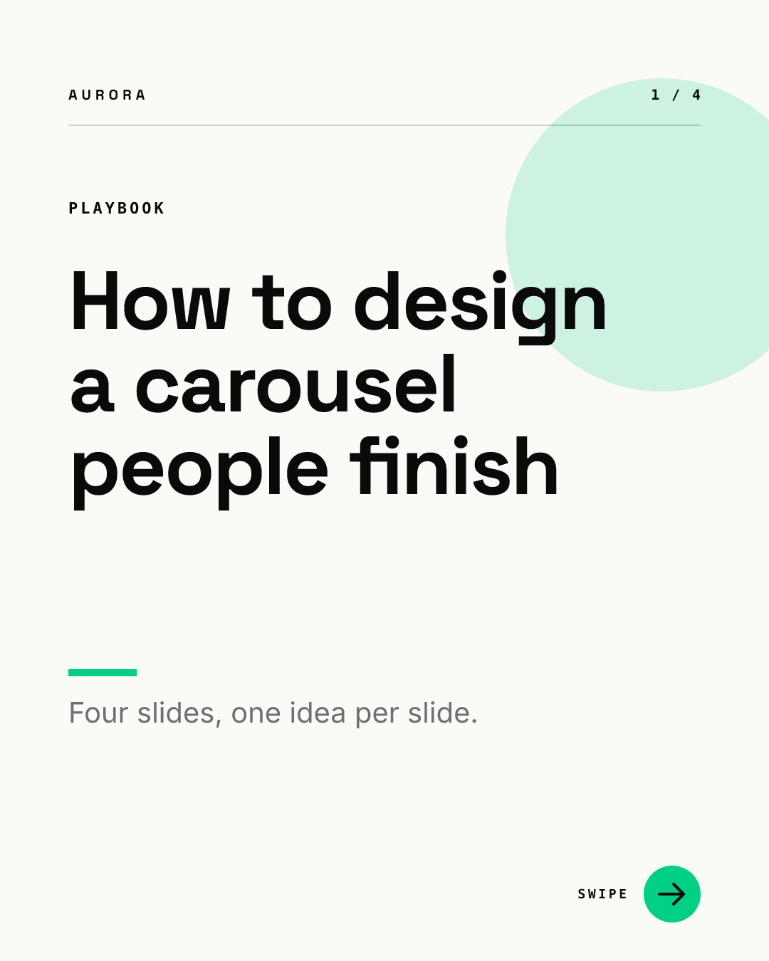
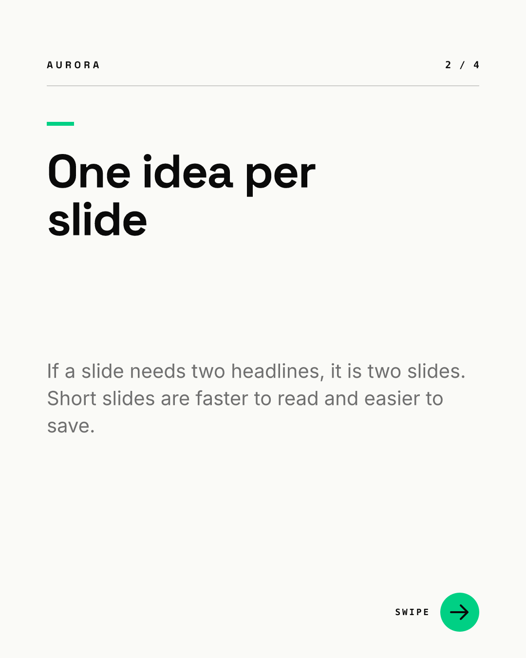
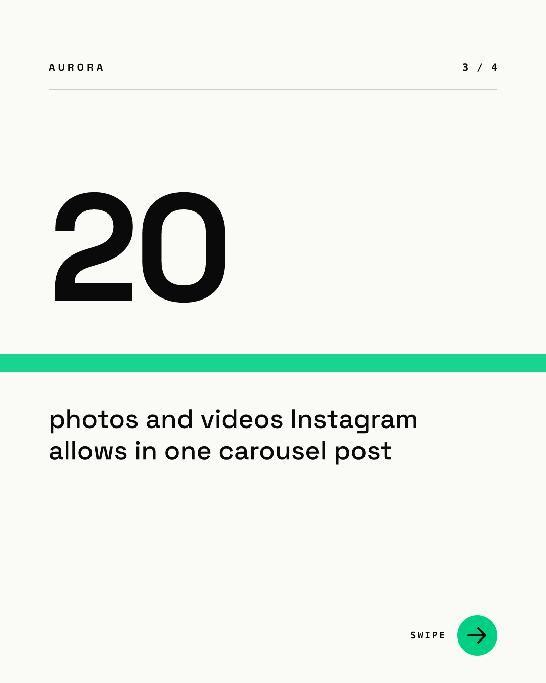

Each slide has one job:
| Slide | Job | What to put on it (our recommendation) |
|---|---|---|
| Cover | Stop the scroll and promise a payoff | A headline of 10 words or fewer, a short promise line, a swipe cue |
| Text | Deliver one point | One short headline, one to three sentences of support |
| Number | Prove one point | One figure with its meaning; put the source in the caption |
| End | Ask for one action | Save, comment, follow or visit, never all four; drop the swipe cue |
Notice that the last slide changes color and loses the arrow. In our view that contrast tells people they reached the end, so the action stands out.
How do you design a cover slide that earns the swipe?
The cover does two jobs. According to Instagram's carousel help page, the feed shows your first slide with a row of dots below it, and your profile shows the first slide with a small carousel icon. So the cover is both the hook in the feed and the tile on your grid.
NN/g calls dots a weak signal and suggests stronger cues, such as content that visibly continues past the edge or an arrow. Our recommendations for the cover:
- Make the headline readable at thumbnail size. If it fails as a grid tile, it fails in the feed.
- Add a visible swipe cue, such as an arrow or a counter like 1 / 6.
- Keep words and logos away from the left and right edges. On the profile grid, a 4:5 cover loses a thin strip on each side.
- For ads, design every card so it could be first. Meta's ads guide says delivery may lead with whichever card a person is most likely to respond to.
If you want the slides to flow into each other, read how the seamless panorama trick works before you start, because it changes how you build the file.
How do you keep every carousel on brand?
Lock the parts that should never change, and leave only the words open. In practice that means one template per slide role (cover, text, number, end) with fixed margins, fonts, colors, header and counter. Chikaboom works this way: a designer builds each slide layout once, teammates fill in the text, and text shrinks to fit its box instead of spilling over the edge. You can try the four slides above in the live demo.
Our recommendation for a brand team:
- Keep one carousel template set per content type, not one per post.
- Number slides on the slide itself. It helps people who screenshot one slide and share it.
- Repeat the same header position on every slide so the set reads as one piece.
- Proof the whole set before publishing. Instagram lets you reorder, remove and recaption items later, but you cannot add a new slide to a live carousel.
For B2B examples of what to post, see our Instagram design guide for B2B teams.
How does a carousel fit with your grid, Stories and highlights?
A carousel never lives alone. Its cover sits in your grid, its key slide often gets reshared as a Story, and that Story may end up in a highlight.
- Grid: plan covers as a set. Our Instagram grid planning guide shows patterns that hold up with the current tall tiles.
- Stories: a 4:5 slide inside a 9:16 Story needs room above and below for the interface. See the Story and Reel safe zones and our Story templates for brands.
- Highlights: if you save carousel teasers to a highlight, give it a cover that matches the set. Our guide to highlight covers that match your brand covers sizes and patterns.
How do you make a carousel accessible?
Write alt text for each image. Instagram generates automatic alt text, but its alt text help page lets you replace it before posting or edit it afterward, and a screen reader reads that description aloud. For a text-heavy slide, put the slide's words in the alt text.
Contrast matters on small screens too. WCAG 2.2 asks for at least 4.5:1 for normal text and 3:1 for large text. Social posts are not web pages, but the ratios are a sound floor. For type size, see our guide to the minimum font size for social media.
Can you reuse a carousel on other platforms?
Yes, with a resize rather than a copy. TikTok, X, Threads and Bluesky each crop and display images differently:
- Repurpose one visual across platforms for the general method.
- TikTok visual branding for covers and text overlays.
- X header and post visuals for how X shows images.
- Threads and Bluesky image specs for the newer apps.
- A product launch visual kit when a carousel is one piece of a bigger launch.
For the full list of formats, start with our social media image sizes table.
Carousel checklist before you post
- Every slide is 1080 x 1350 px (or 1080 x 1440 px for an organic-only set), and all slides share the orientation.
- The cover reads at thumbnail size and has a visible swipe cue.
- One idea per slide, with the payoff by slide 3.
- Text stays clear of the side edges on the cover.
- Every number has a source in the caption.
- The last slide asks for one action and drops the swipe cue.
- Each slide has alt text you wrote yourself.
- For ads: 2 to 10 cards, 4:5 for images, each card able to stand alone.