A brand needs about eight Story templates to post daily without repeating itself: an announcement, a number of the week, a customer quote, a tip, a poll, an event reminder, a question box and a multi-day series. Build each one at 1080 x 1920 px, keep the headline in the upper middle, and leave the bottom third for stickers and interface, not for words.
Below are all eight, rendered from our AURORA demo brand at full Story size. We measured where each one puts its text against Meta's published margins, because a template that works as a feed post can still fail as a Story. Platform facts were checked on October 5, 2026.
Why do brands need Story templates at all?
Because Stories are frequent and short-lived. Instagram's help page says photos and videos in your Story disappear after 24 hours unless you add them to a Highlight. Instagram's own Stories guide adds that there is no daily limit on how many you post, and that a single Story clip can run up to 60 seconds.
That combination, high volume and a one-day life, is exactly where hand-made design breaks down. Nobody wants to spend 30 minutes on a frame that is gone tomorrow, so people grab whatever is fastest, and the account stops looking like one brand. Templates turn each Story into a fill-in-the-blank job. The Stories guide itself points the same way: it calls templates a starting point that lets you focus on the content rather than the design.
What size and safe zone should a Story template use?
Use 9:16. Meta's Stories image ad specs list 9:16 at 1440 x 2560 px, JPG or PNG, up to 30 MB. We build at 1080 x 1920 px, which is the same ratio, so the layout carries over.
The same Meta page suggests keeping roughly 14% of the top, 35% of the bottom and 6% on each side free of text, logos and other key elements, so the profile icon and call to action do not cover them. Meta publishes those margins for ads. Applying them to organic Stories is our inference, since the same profile row and reply controls appear there. At 1080 x 1920 px, that leaves a usable band from about 269 px to 1,248 px from the top. Our Story and Reel safe zones guide has the full pixel table.
What are the 8 Story formats a brand can post every day?
Each format below pairs with an Instagram sticker. The Stories guide describes the poll sticker with two answer options, the quiz sticker with four, the questions sticker for open replies, a link sticker whose text you can customize, and a countdown sticker that followers can subscribe to.
| # | Format | Use it for | Sticker to pair | What our render put in the bottom 35% |
|---|---|---|---|---|
| 1 | Announcement | Launches, features, news | Link | The call-to-action button |
| 2 | Number of the week | One metric with context | Poll or quiz | Change pill and footnote |
| 3 | Customer quote | Social proof | Link to the case study | Attribution line |
| 4 | Tip of the day | Short, useful advice | Questions | Byline |
| 5 | Poll | Product input, opinions | Poll | Footer strip |
| 6 | Event reminder | Lives, webinars, meetups | Countdown | Location label |
| 7 | Ask us | Open questions from followers | Questions | Nothing but decoration |
| 8 | Multi-day series | Five-day tips, behind the scenes | None, or Add Yours | Next-frame hint |
The last column is our own measurement, explained after the renders.
1. Announcement
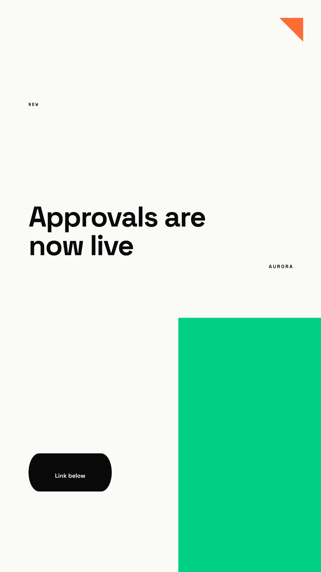
Lead with what changed for the viewer. Put the link sticker in the empty space between the headline and the green block, not on top of the button, which in this render sits about 83% of the way down.
2. Number of the week
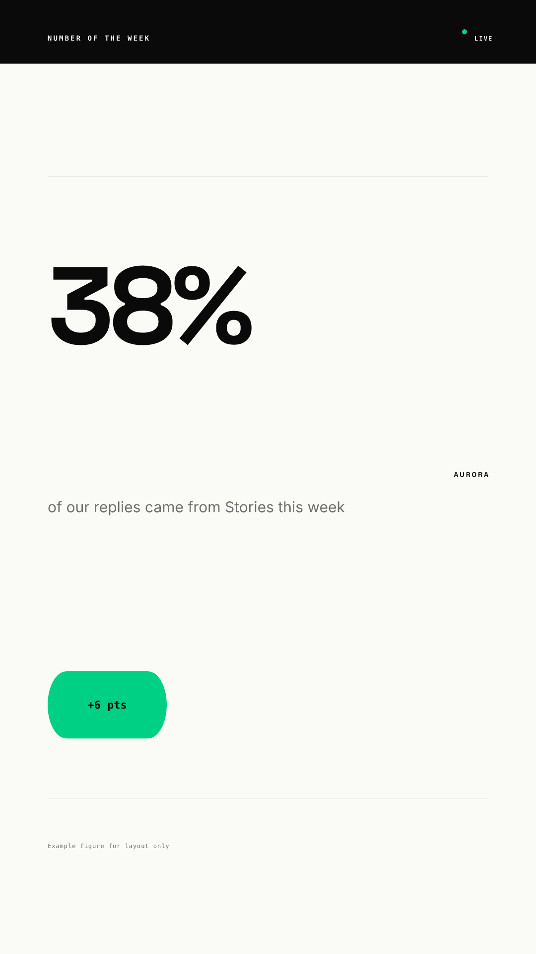
One number, one sentence of context. Add a quiz sticker ("guess the number") on a frame before it if you want a two-frame sequence. The figure here is a placeholder for layout only.
3. Customer quote
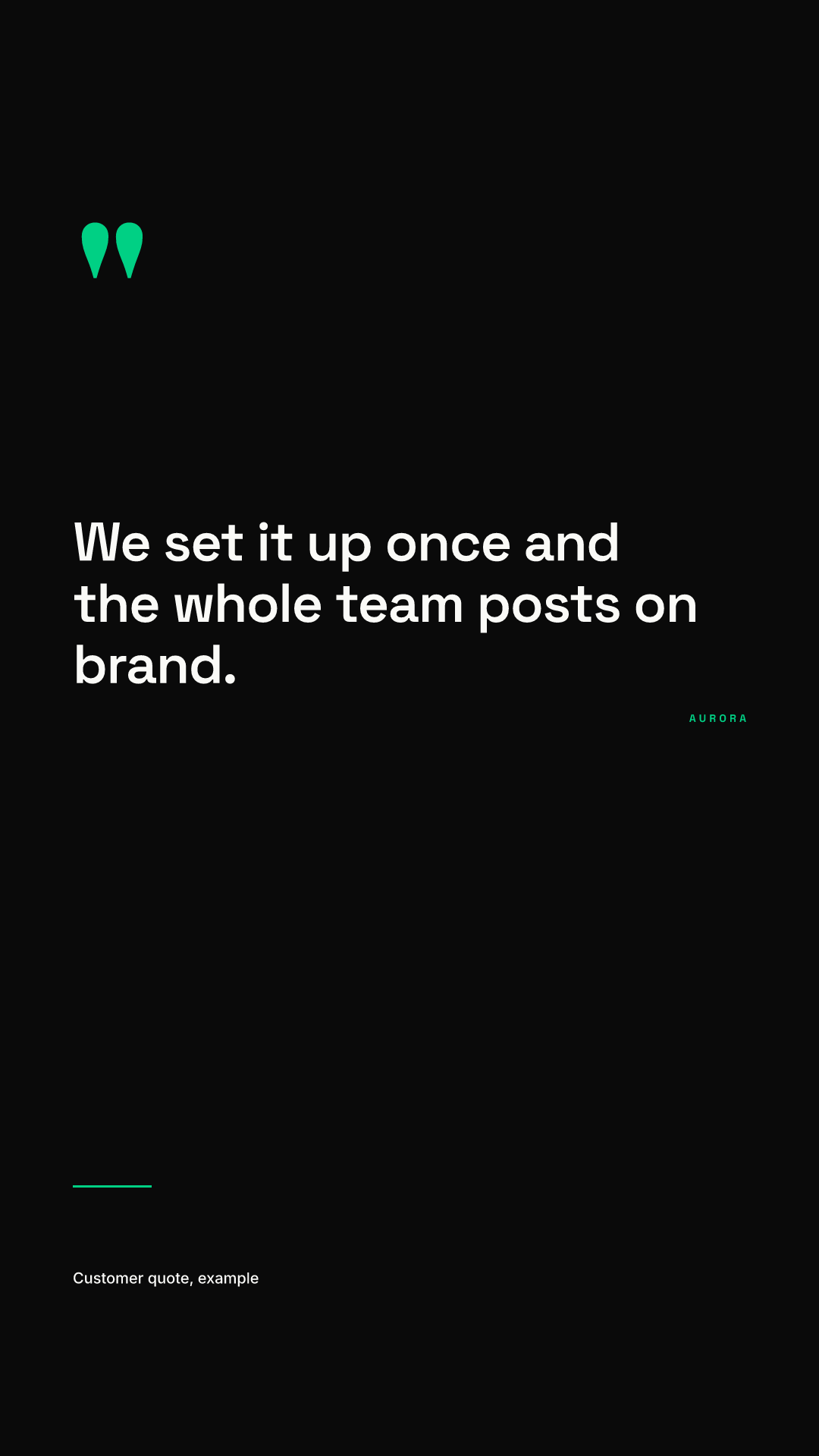
One sentence, named source. The dark background makes it visibly different from the light formats, which helps when several Stories play in a row.
4. Tip of the day
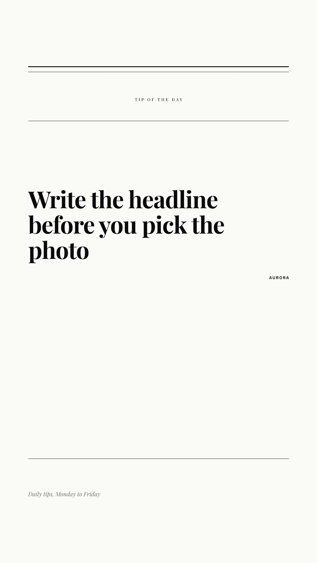
A serif headline signals a considered tip rather than news. Pair it with a questions sticker asking what tip people want next.
5. Poll
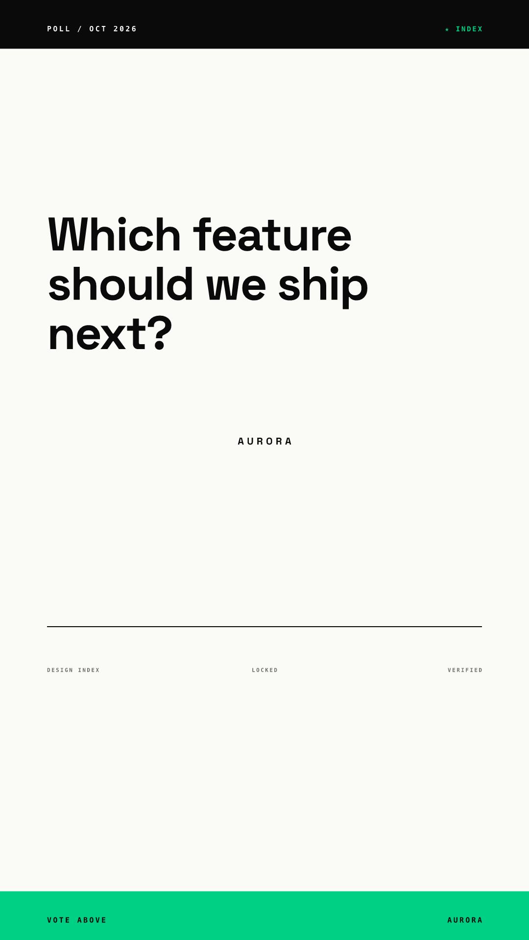
The question sits high so the poll sticker fits in the open middle of the frame. The footer text points up to the sticker on purpose: it is low in the frame, so even if the interface covers it, nothing is lost.
6. Event reminder
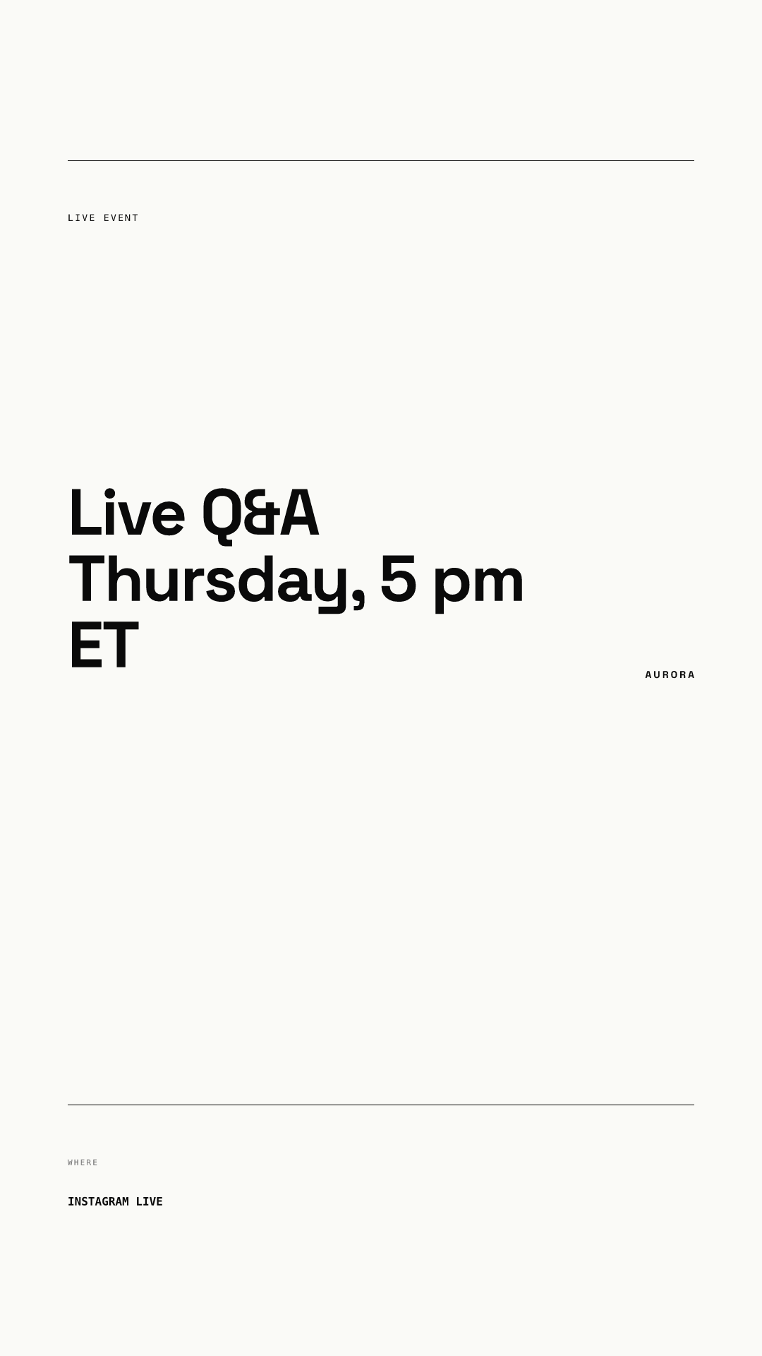
Date, time and time zone in the headline, not in small print. Add a countdown sticker in the middle so followers can subscribe to a reminder.
7. Ask us
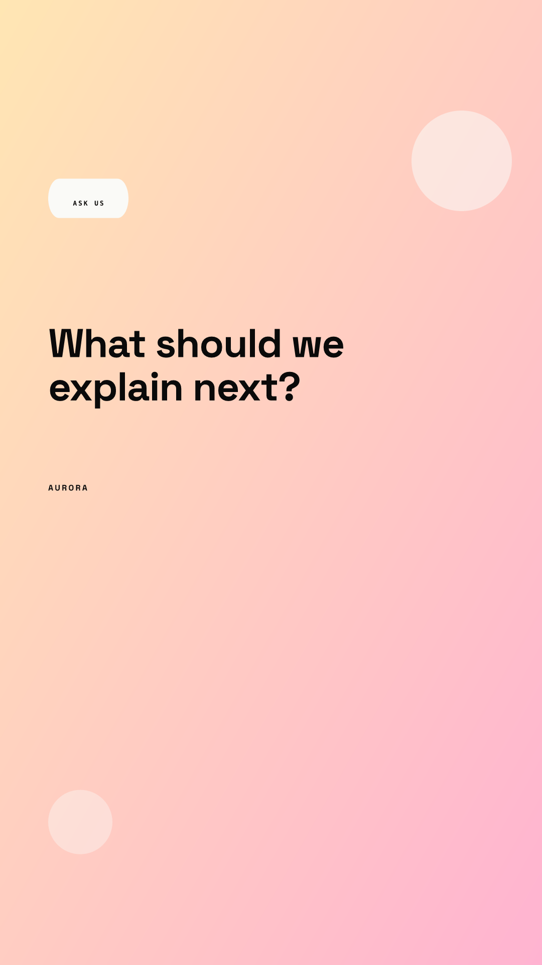
The only template of the eight with nothing important in the bottom third, which is why it works well as a sticker frame. The questions sticker goes in the space under the headline.
8. Multi-day series
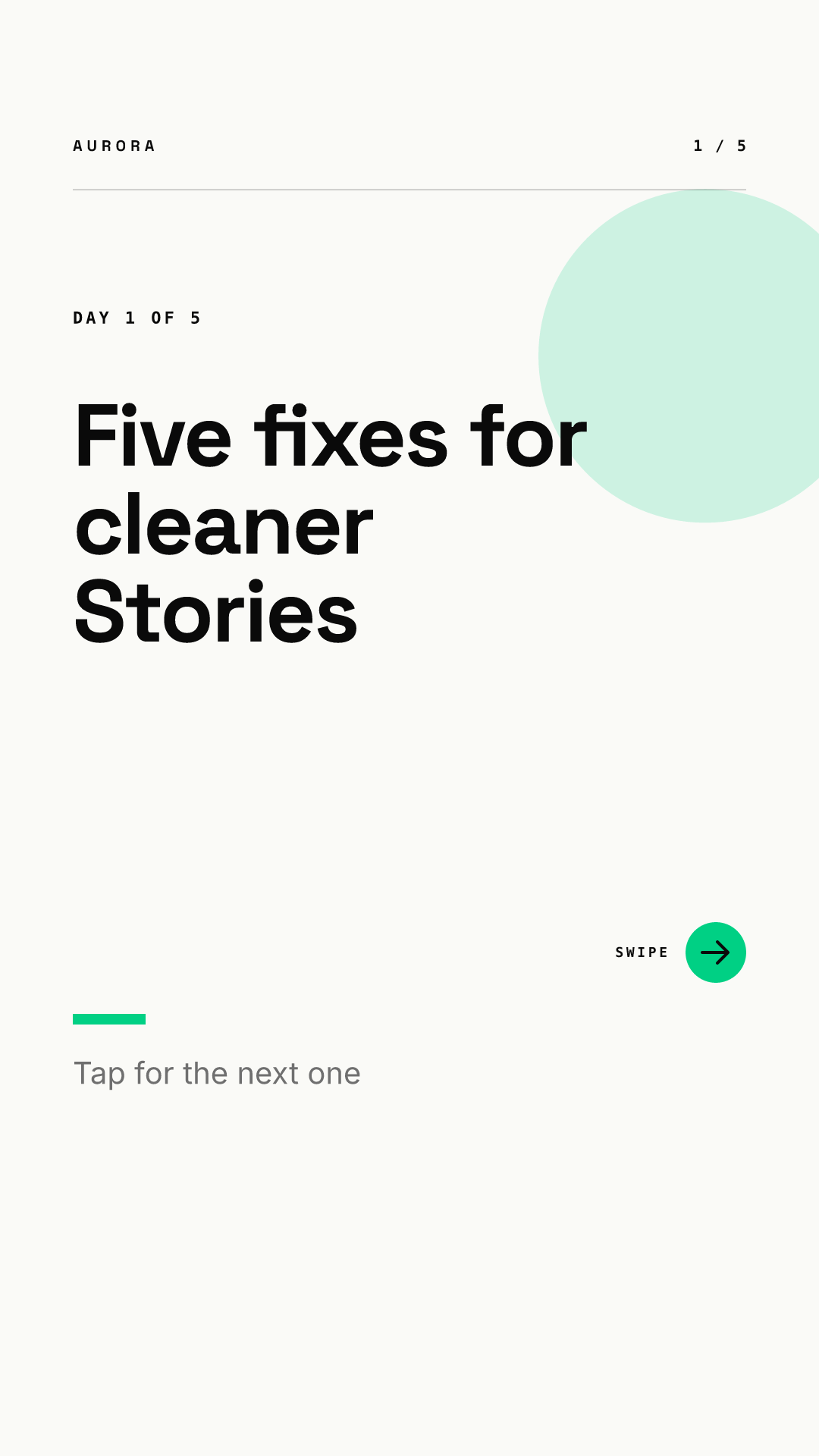
A numbered series ("Day 1 of 5") brings people back the next day. This render comes from our carousel template set, so it carries a swipe arrow and a page counter; for Stories, we would hide the arrow, since viewers tap to move on.
What did our renders show about the bottom 35%?
We checked all eight renders against Meta's margins. Every headline landed inside the safe band, between roughly 22% and 49% of the frame height. But seven of the eight templates placed a secondary element in the bottom 35%: a button, an attribution, a footnote, a location label or a footer strip. Only the Ask us layout kept that area empty.
The reason is how a layout scales. These templates anchor small elements to the bottom edge, which works on a 1:1 or 4:5 feed post. Stretched to 9:16, the bottom edge falls inside the interface zone, and the anchored elements go with it. Our recommendation:
- Treat the bottom 35% of a Story template as decoration or footer space only. If a line there disappears, nothing should be lost.
- Move any call to action up, or replace it with a link sticker placed above the 1,248 px line.
- Leave an empty band under the headline for stickers. Polls, countdowns and question boxes need room, and they are the reason many people tap a Story at all.
- Check each template at Story size before the team uses it, instead of assuming the feed version scales.
How do you keep eight templates looking like one brand?
Share the system, vary the layout. All eight renders use the same two typefaces, the same green accent and the same wordmark, so they read as one account even though no two layouts match. Our Instagram carousel design hub covers the same idea for feed posts, and the TikTok visual branding guide applies it to vertical video covers.
Assign each format a day and an owner so the templates actually get used. In Chikaboom, the designer builds each layout once, teammates fill in the text fields, and long text shrinks to fit its box instead of drifting into the bottom margin. You can try that behavior in the live demo. Stories you want to keep can move to your profile as Highlights; our guide to Instagram Highlight covers shows how to make those match, and the product launch visual kit shows where Stories fit in a launch week.
Story template checklist
- Eight formats, each with one job and one sticker type.
- Canvas 1080 x 1920 px (or 1440 x 2560 px), 9:16.
- Headlines between about 270 px and 1,248 px from the top.
- Nothing you need people to read in the bottom 672 px or within 65 px of the sides.
- An empty band under the headline for a sticker.
- Same fonts, colors and wordmark on every template.
- Every template previewed on a phone at full size before rollout.