To repurpose one visual across Instagram, TikTok and LinkedIn, keep the message and the brand system fixed and rebuild the layout for each shape: 1:1 or 4:5 for feeds, 9:16 for TikTok, Reels and Stories, and 1.91:1 for LinkedIn link posts. Cropping one file into every size cuts off text and leaves the composition wrong; re-laying out the same content does not.
Below is the proof: one template from our AURORA demo brand, filled once with the same text, rendered at four sizes. Our renderer re-lays out a template at any size, so the headline, button and shapes move to fit each frame instead of being cut. Platform facts were checked on October 5, 2026.
What sizes do Instagram, TikTok and LinkedIn actually need?
Fewer than you might think, because their accepted ranges overlap. The table separates what each platform states from what we recommend.
| Placement | Shape | Size we export | What the platform says |
|---|---|---|---|
| Instagram feed | 4:5 or 1:1 | 1080 x 1350 or 1080 x 1080 px | Keeps ratios from 1.91:1 to 3:4 at up to 1,080 px wide and crops others |
| Instagram Stories and Reels | 9:16 | 1080 x 1920 px | Stories image ads: 9:16 at 1440 x 2560 px, with 14% top, 35% bottom, 6% side margins |
| TikTok | 9:16 | 1080 x 1920 px | Vertical 9:16 recommended, at least 540 x 960 px for in-feed ads |
| LinkedIn link post | 1.91:1 | 1200 x 627 px | Custom images on a Page post with a URL: 1.91:1, 1200 x 627 px |
| LinkedIn image post | 1:1 or 4:5 | 1080 x 1080 or 1080 x 1350 px | Other ratios show in full on mobile with light padding; ads accept 1:1 and 4:5, vertical on mobile only |
| X (bonus) | 4:5 or 1.91:1 | Reuse either file | Single photos from 2:1 to 3:4 show in full |
Instagram's help page also explains what happens outside the range: a photo with an unsupported ratio is cropped to fit a supported one. That is the risk of posting one file everywhere. For every other network, our social media image sizes cheat sheet has the full table.
What does one visual look like at four sizes?
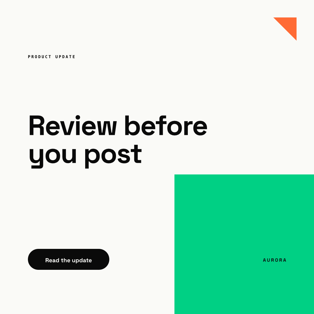
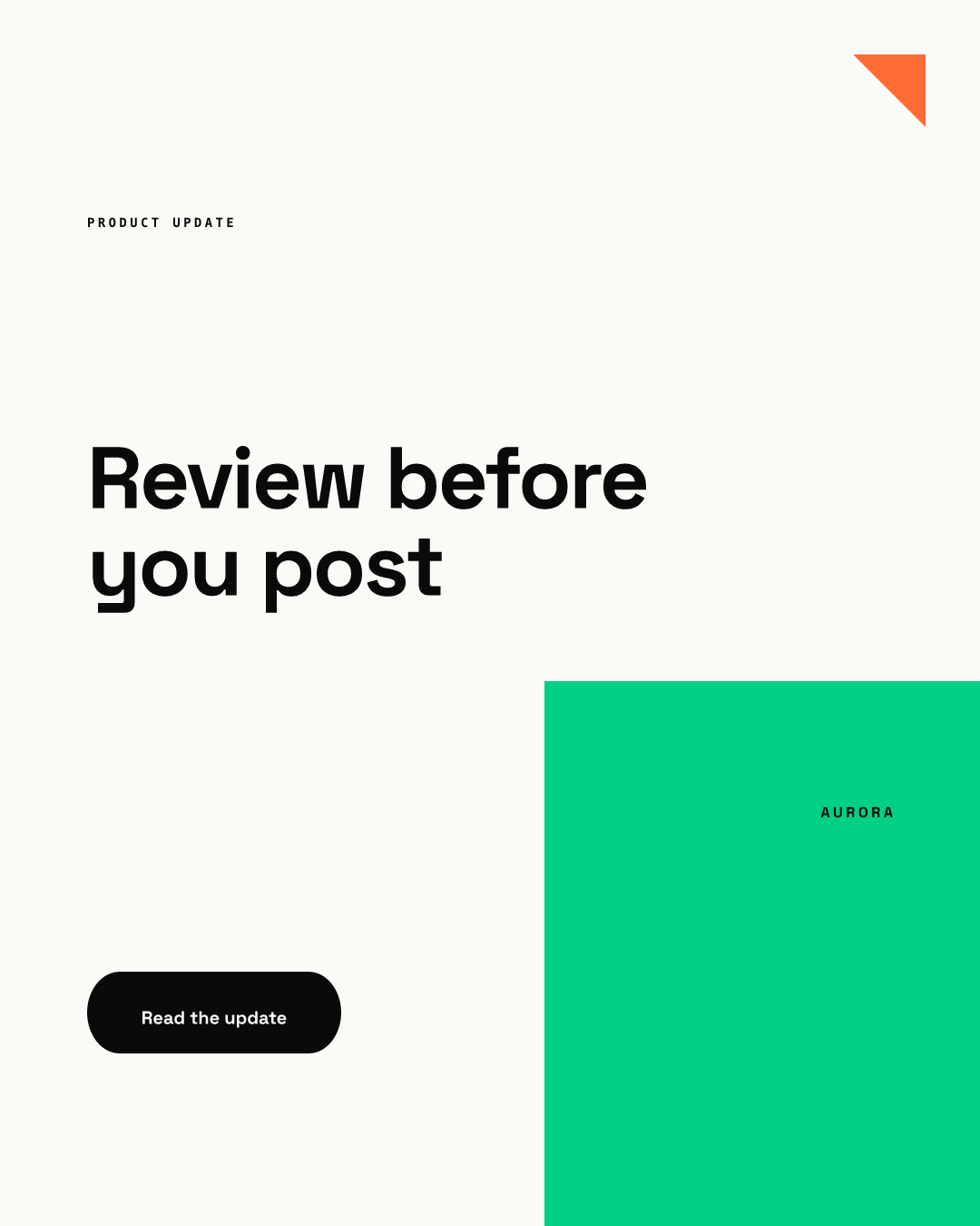
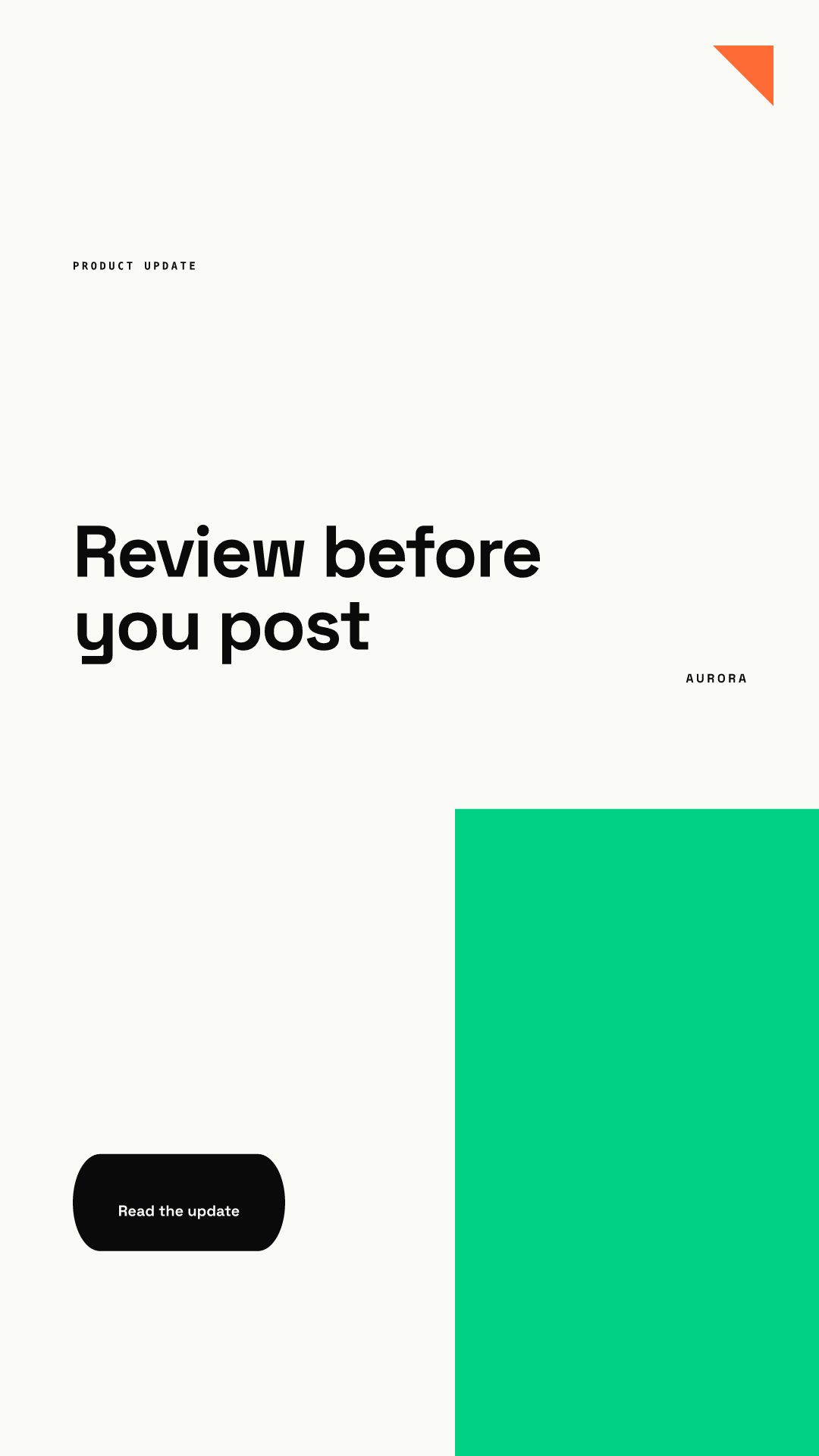
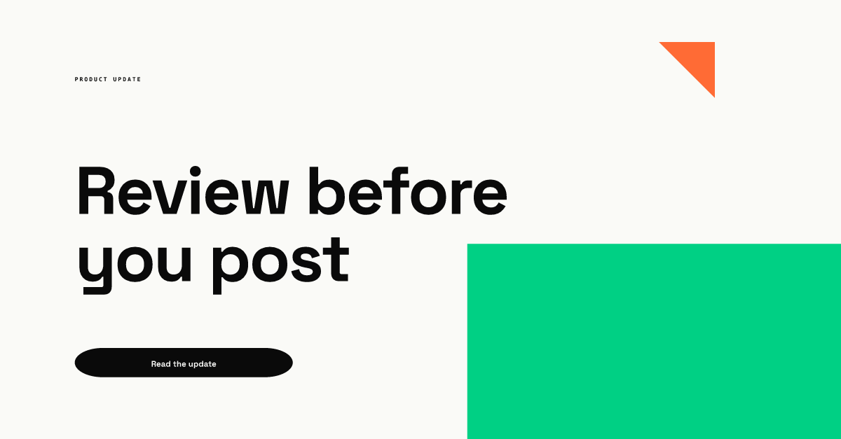
Same template, same three text fields, four sizes. The fields were filled once: a PRODUCT UPDATE label, the headline "Review before you post" and a button reading "Read the update". Nothing was moved by hand.
What changed between the sizes, from our own renders:
| Size | Headline position | Button position | Brand shapes | Verdict |
|---|---|---|---|---|
| 1080 x 1080 | Upper middle | Lower left, beside the green block | Corner triangle, green block bottom right | Works for Instagram and LinkedIn feeds |
| 1080 x 1350 | Upper middle, more air above | Lower left | Green block grows taller | Our master for feeds |
| 1080 x 1920 | About 36% to 45% of the height | About 79% to 86% of the height | Green block becomes a tall column | Headline safe; move the button up or use a link sticker |
| 1200 x 627 | Upper left, two lines | Just under the headline | Green block sits low on the right; wordmark not visible | Works for LinkedIn link posts and X |
The vertical version is the one that needs attention. Its headline sits inside the band Meta's margins leave free, but the button lands in the bottom 35%, where the caption and buttons of Stories, Reels and TikTok sit. Our Story and Reel safe zones guide has the exact pixel numbers.
How short should the headline be for reuse?
Shorter than for a single-platform post. Our first attempt used a seven-word headline. It fit cleanly at 1:1, 4:5 and 9:16, but at 1.91:1 it wrapped to three lines and collided with the green block and the button. Cutting it to four words fixed every size at once.
That is our rule now, based on this test rather than any platform guidance: if a visual will be reused across shapes, keep the headline to about 4 to 6 words and put everything else in the caption. Wide formats like 1.91:1 have the least vertical room, so they fail first. TikTok's creative best practices point the same way for video, recommending 5 to 10 words per second when text appears on screen.
Why re-lay out instead of crop or resize?
Because the three common shortcuts each break something.
- Crop. Converting a 4:5 post to 9:16 by cropping the sides throws away width, and the headline often loses its first or last letters. Converting to 1.91:1 throws away the top and bottom, which is usually where the logo and button live.
- Letterbox. Placing the 4:5 post on a colored 9:16 background keeps everything, but the visual shrinks and the frame looks like a repost. LinkedIn does a gentle version of this itself, showing other ratios on mobile with white padding.
- Stretch. Scaling to a new ratio distorts type and logos. Never do this with a brand mark.
Re-laying out keeps the brand system and the copy, and recomputes positions for the new frame. You can do it by hand with a master file per ratio, or with templates that do it for you. In Chikaboom, one template renders at any size this way, which is how the four images above were made from one set of fields.
What is the workflow for repurposing one visual?
- Write the message once. One headline of 4 to 6 words, one supporting line, one call to action.
- Pick the master. We use 1080 x 1350 px (4:5) because it sits inside Instagram's range, and X shows it in full.
- Make the vertical version. 1080 x 1920 px for TikTok, Reels and Stories. Check that nothing important sits in the top 14% or bottom 35%.
- Make the wide version if you post links. 1200 x 627 px for LinkedIn link posts.
- Check each size at phone size. Read the headline at arm's length. If any version needs a different line break, shorten the headline for all of them.
- Adapt the caption, not the visual. Each network has its own tone. Change the words around the image, keep the image system fixed.
Steps 3 to 5 are where teams lose time. If you want to see a template re-lay itself out without manual work, try the live demo.
Where does this fit in a content plan?
Repurposing works best when one idea has a planned set of outputs from the start. Our guide on repurposing blog posts for LinkedIn shows how one article becomes several posts. For vertical formats, the TikTok visual branding guide covers covers and overlays, and Story templates for brands covers eight daily Story layouts. A launch is the biggest repurposing job of all, so the product launch visual kit lists every asset by size and owner. For the wider rules behind consistent feed design, start at our Instagram carousel design hub.
Repurposing checklist
- One message, one headline of about 4 to 6 words.
- Master at 1080 x 1350 px, plus 1080 x 1920 px and, for link posts, 1200 x 627 px.
- Every version rebuilt from the template, none cropped or stretched.
- Vertical version checked against the 14% top and 35% bottom margins.
- Wide version checked for collisions between headline, button and shapes.
- Logo, fonts and colors identical across all sizes.
- Captions adapted per network.