A seamless Instagram carousel is one wide image cut into equal slides, so the picture continues when you swipe. With N slides at 1080 x 1350 px, you design on a 1080N x 1350 px canvas (3240 x 1350 px for three slides) and export it as N slices of 1080 px each, uploaded in order.
Instagram has no panorama feature; the effect comes entirely from how you cut the file. Platform facts below link to Instagram's and Meta's own pages, checked on October 5, 2026. The math and the layout rules are ours. For the wider picture of carousel design, start with our Instagram carousel design guide.
How does the panorama trick work?
Instagram shows one slide at a time and lets people swipe to the next. If the right edge of slide 1 matches the left edge of slide 2 pixel for pixel, the eye reads the two as one continuous image.
Two rules from Instagram's carousel help page make this possible and also limit it:
- One post holds up to 20 photos and videos.
- The orientation you choose applies to every item in the post. You cannot mix a square slide with a portrait one.
So every slice must be exactly the same size. If one is even a few pixels off, the edges stop lining up.
Nielsen Norman Group's mobile carousel research explains why the trick works as a design cue: content that visibly continues past the edge of the screen signals that there is more to see, and NN/g rates that a stronger cue than the row of dots under a carousel.
What canvas size do you need?
Multiply the slide width by the number of slides and keep the height. Instagram keeps photos at full quality up to 1,080 px wide and between 1.91:1 and 3:4, according to its image resolution page, so each slice should be exactly 1,080 px wide.
| Slides | Canvas at 4:5 (1350 px tall) | Canvas at 3:4 (1440 px tall) | Canvas at 1:1 (1080 px tall) | Cut at (px from left) |
|---|---|---|---|---|
| 2 | 2160 x 1350 | 2160 x 1440 | 2160 x 1080 | 1080 |
| 3 | 3240 x 1350 | 3240 x 1440 | 3240 x 1080 | 1080, 2160 |
| 4 | 4320 x 1350 | 4320 x 1440 | 4320 x 1080 | 1080, 2160, 3240 |
| 5 | 5400 x 1350 | 5400 x 1440 | 5400 x 1080 | every 1080 |
| 6 | 6480 x 1350 | 6480 x 1440 | 6480 x 1080 | every 1080 |
| 10 | 10800 x 1350 | 10800 x 1440 | 10800 x 1080 | every 1080 |
| 20 (the limit) | 21600 x 1350 | 21600 x 1440 | 21600 x 1080 | every 1080 |
The general rule: slide k (counting from 1) covers the pixels from 1080 x (k minus 1) to 1080 x k. Slide 2 of any panorama is always x = 1080 to 2160.
Our recommendation is 4:5 for most brands. It is the shape we suggest for normal carousels too, so your panorama and your other posts share one template size.
What does a good panorama look like?
Below is a 3240 x 1350 px canvas rendered from our AURORA demo brand. The dashed lines mark where the canvas is cut into three 1080 px slides.
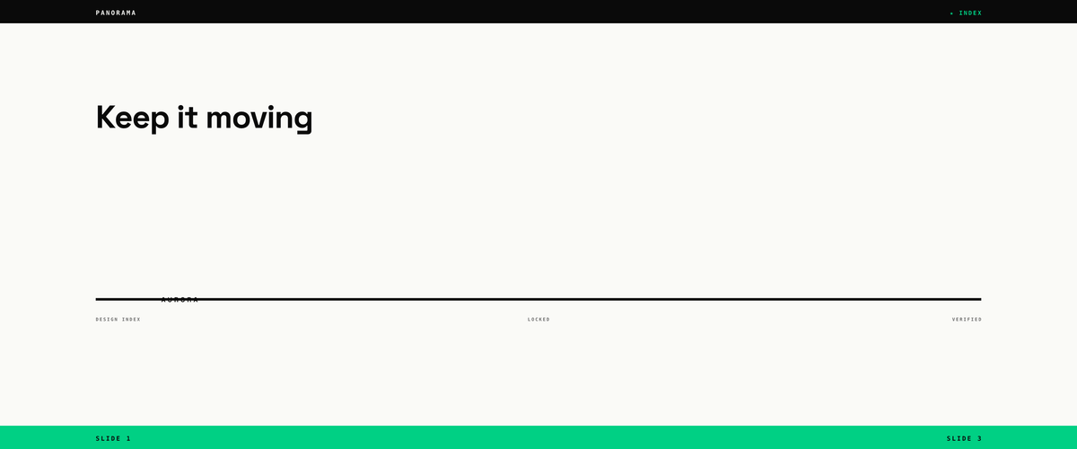
What makes it work: the top bar, the bottom bar and the middle rule cross every cut, so the swipe feels continuous. The headline, the label and each small footer word sit fully inside one slice, so no word is ever split between two slides.
What goes wrong with text across a cut?
Here is the same canvas size with a layout that was not planned for slicing.
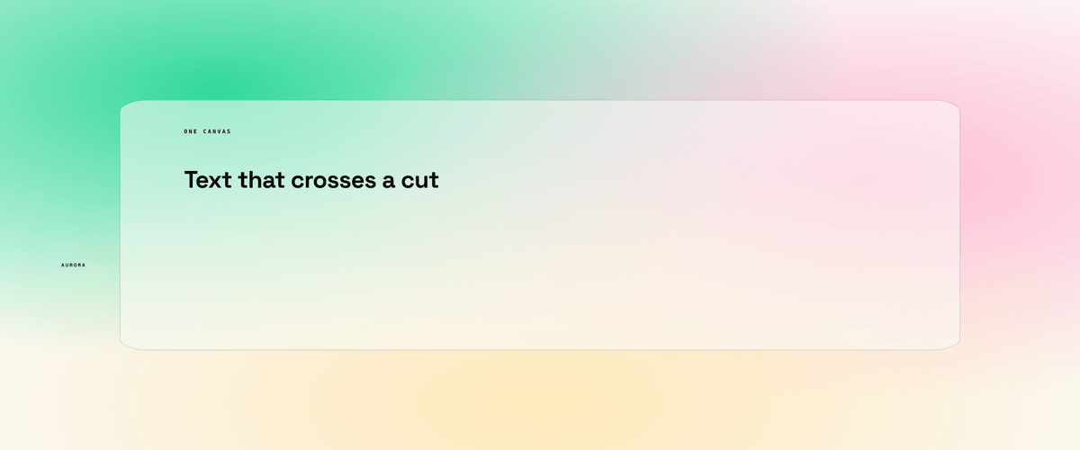
The gradient background is a good panorama element, since it flows across both cuts. The headline is not: once cut, slide 1 ends mid-sentence and slide 2 starts with half a word. The card has the same problem, with its edges landing on different slides.
Which elements should cross a cut?
| Element | Cross the cut? | Why (our recommendation) |
|---|---|---|
| Background color, gradient, texture | Yes | It is what makes the slides feel joined |
| Lines, bars, arrows, paths | Yes | They lead the eye to the next slide |
| Large shapes or product photos | Yes, with care | Fine if the part on each slide still makes sense alone |
| Headlines and body text | No | A split word is hard to read and looks like an error |
| Logo | No | Keep it whole on the first or last slide |
| Faces | No | A face cut in half reads badly on its own slide |
As our rule of thumb, keep every word at least 96 px away from each cut line. That is the side margin our own carousel templates use, and it leaves room if a viewer's screen shows a sliver of the next slide. You can see how those fixed text boxes behave in our live demo.
How do you build and post a seamless carousel?
- Pick the slide count and shape, then set the canvas from the table above.
- Draw guides at every 1,080 px, plus a 96 px margin on each side of every guide.
- Design the background and connecting elements across the full width first.
- Place text and logos inside single slices only.
- Export each 1,080 px slice as its own file, numbered 01, 02, 03 so the order is obvious.
- Upload all slices in order in one post, and check the preview before you share.
If the order comes out wrong, Instagram's help page says you can reorder items after posting. You cannot add a new slice to a live carousel, though, so a missing slice means reposting.
How does a panorama look on your profile grid?
Only slide 1 appears on your grid, and Instagram shows it with a small carousel icon. That makes slide 1 your grid tile, so it has to work alone. In our check of the profile grid on October 5, 2026, tiles were 3:4, which trims a 4:5 slice by about 34 px on each side. Our grid planning guide shows the measurement and how to plan around it.
Should you use a panorama for an ad?
Our recommendation is no. Meta's carousel ad specs say the delivery system may show first whichever card a person is most likely to respond to, while keeping the overall card order. If the panorama starts on slide 3, the picture no longer makes sense. Ads are also limited to 2 to 10 cards, with 4:5 for image-only carousels.
For ads, design each card to stand on its own. For organic posts, a panorama of 3 to 6 slides is our suggested range: long enough to feel like a reveal, short enough that people reach the end.
Panorama checklist
- Canvas width is exactly 1,080 x the number of slides.
- All slices share the same height, so they share one orientation.
- Backgrounds and lines cross the cuts; words, logos and faces do not.
- Every word sits at least 96 px from a cut line.
- Slide 1 works on its own as a grid tile.
- Files are numbered in upload order.
Want to make the static slides in the same set? See Instagram post sizes for the full range of feed formats, and our Story templates for brands for reusing a panorama slice as a teaser.