On a 1080 px wide social graphic, our minimum is 40 px for any text the reader must understand and 32 px for anything at all, which comes to about 14.4 and 11.6 CSS pixels when the post fills a 390 point phone screen. No social platform publishes a minimum font size for images, so these are our numbers, built from Apple's 11 pt iOS minimum and the arithmetic of scaling a 1080 px image down to a phone.
Our typography hub gives the full type scale. This post zooms in on the floor: the math, how it changes with canvas size, and what happens when longer copy pushes a template's type down.
Is there an official minimum font size for social media?
No. The platforms publish image dimensions and file limits, and we found no smallest text size for images on the help pages of LinkedIn, Instagram, X or Threads that we checked on October 5, 2026. The closest official numbers come from interface guidelines and accessibility standards:
- Apple's typography guidelines give 17 pt as the default and 11 pt as the minimum text size on iOS and iPadOS. The same page advises avoiding Ultralight, Thin and Light weights, which are hard to see at small sizes.
- WCAG sets no minimum size at all. Its contrast criterion asks for 4.5:1 below 18 pt (or 14 pt bold) and 3:1 above, and says those sizes are roughly 24 px and 18.5 px in CSS. It also covers images of text, which is what a social graphic is.
Apple's 11 pt is written for live interface text that people can enlarge. Text baked into a PNG cannot be enlarged by the reader, which is our reason to treat 11 pt as the absolute floor, not a target.
How do you convert canvas pixels to sizes on a phone?
Three steps, using one phone as the reference. An iPhone 16 has a 1179 px wide display and draws 3 device pixels per point, so it is 1179 / 3 = 393 points wide. We round that to 390 points as our reference width. Our working assumption is that a CSS pixel in a phone browser equals one point, so the two units are interchangeable here.
- Scale factor. A 1080 px post that fills a 390 point screen is scaled by 390 / 1080 = 0.361.
- Pixels per point. Turned around, 1 point = 1080 / 390 = 2.77 canvas px.
- Apple's floor on your canvas. 11 pt x 2.77 = 30.5 canvas px.
That 30.5 px only holds when the image runs edge to edge. Many feeds show the image narrower than the screen, beside an avatar column or inside margins. As our working assumption for those feeds, take an image about 300 points wide: the factor drops to 300 / 1080 = 0.278, 1 point becomes 3.6 canvas px, and Apple's 11 pt becomes 11 x 3.6 = 39.6 px. Round that up and you get our 40 px rule for essential text.
| Size on a 1080 px canvas | Full width, 390 pt (x 0.361) | Inset feed, 300 pt (x 0.278) | Our verdict |
|---|---|---|---|
| 110 px | 39.7 | 30.6 | Headline |
| 72 px | 26.0 | 20.0 | Smallest headline we recommend |
| 48 px | 17.3 | 13.3 | Comfortable supporting text |
| 40 px | 14.4 | 11.1 | Minimum for text people must read |
| 32 px | 11.6 | 8.9 | Labels, handles, page numbers only |
| 24 px | 8.7 | 6.7 | Too small for anything that matters |
| 20 px | 7.2 | 5.6 | Decoration |
The middle columns are CSS px, which we treat as points. Every figure in the table is our own arithmetic.
How does the minimum change with canvas size?
The same rule gives a different pixel number on every canvas, because a wider canvas is scaled down harder. Divide the canvas width by the displayed width to get canvas px per point, then multiply by 11.
| Canvas | Shown at | Canvas px per point | 11 pt in canvas px | Our minimum for essential text |
|---|---|---|---|---|
| 1080 px post (1:1, 4:5, 9:16) | 390 pt full width | 2.77 | 30.5 | 40 px (inset feeds) |
| 1080 px post | 300 pt inset | 3.60 | 39.6 | 40 px |
| 1200 px landscape or ad | 300 pt inset | 4.00 | 44.0 | 44 px |
| 1500 px X header | 390 pt full width | 3.85 | 42.3 | 48 px |
| 720 px vertical ad | 300 pt inset | 2.40 | 26.4 | 26 px |
This is why a font size copied from one format to another goes wrong. A 32 px label that is fine on a 720 px ad is too small on a 1500 px header. For the header itself, see the X header and post visual guide; for ads, the LinkedIn single image ad guide.
What happens to font size when the copy gets longer?
A template with fixed text boxes has to do something when the words do not fit. Our renderer shrinks the type step by step down to a floor the designer sets, and only then cuts the text. Here is one quote template from our AURORA demo brand with three lengths of copy. The quote starts at 72 px, has a floor of 44 px and allows six lines; the sizes below are read from the renderer's output.
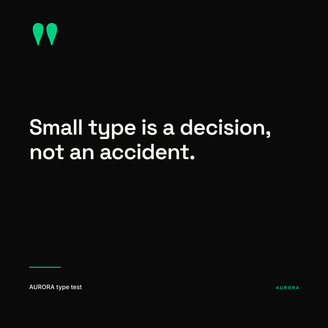
42 characters: the quote stays at 72 px, about 26 points at full phone width.
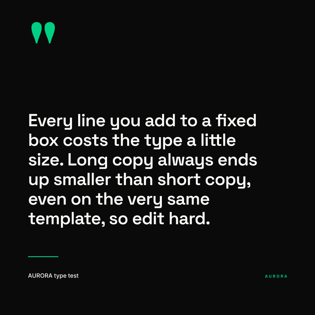
159 characters: the type drops to 60 px, about 21.7 points.
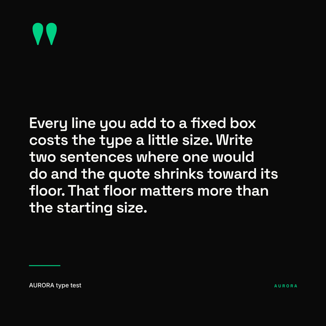
190 characters: 50 px, about 18 points at full width or 13.9 in an inset feed. Even at the 44 px floor the quote would stay above our 40 px rule, which is the point of setting the floor there. A floor at 26 px would let the same template quietly drop below anything a phone can show well.
One honest note on our own demo: the attribution line in this template is fixed at 20 px, about 7 points on a phone. That is fine for a decorative credit, but if the name matters, it belongs in the caption too.
What do these sizes look like at phone width?
Below is the long quote shown at 390 CSS px wide, the width it gets when it fills a typical iPhone screen. On a desktop monitor a CSS pixel is physically larger than on a phone, so open this page on your phone to judge it at true size.
And here is a portrait post whose supporting line is a fixed 24 px, first at full size and then at 390 CSS px.
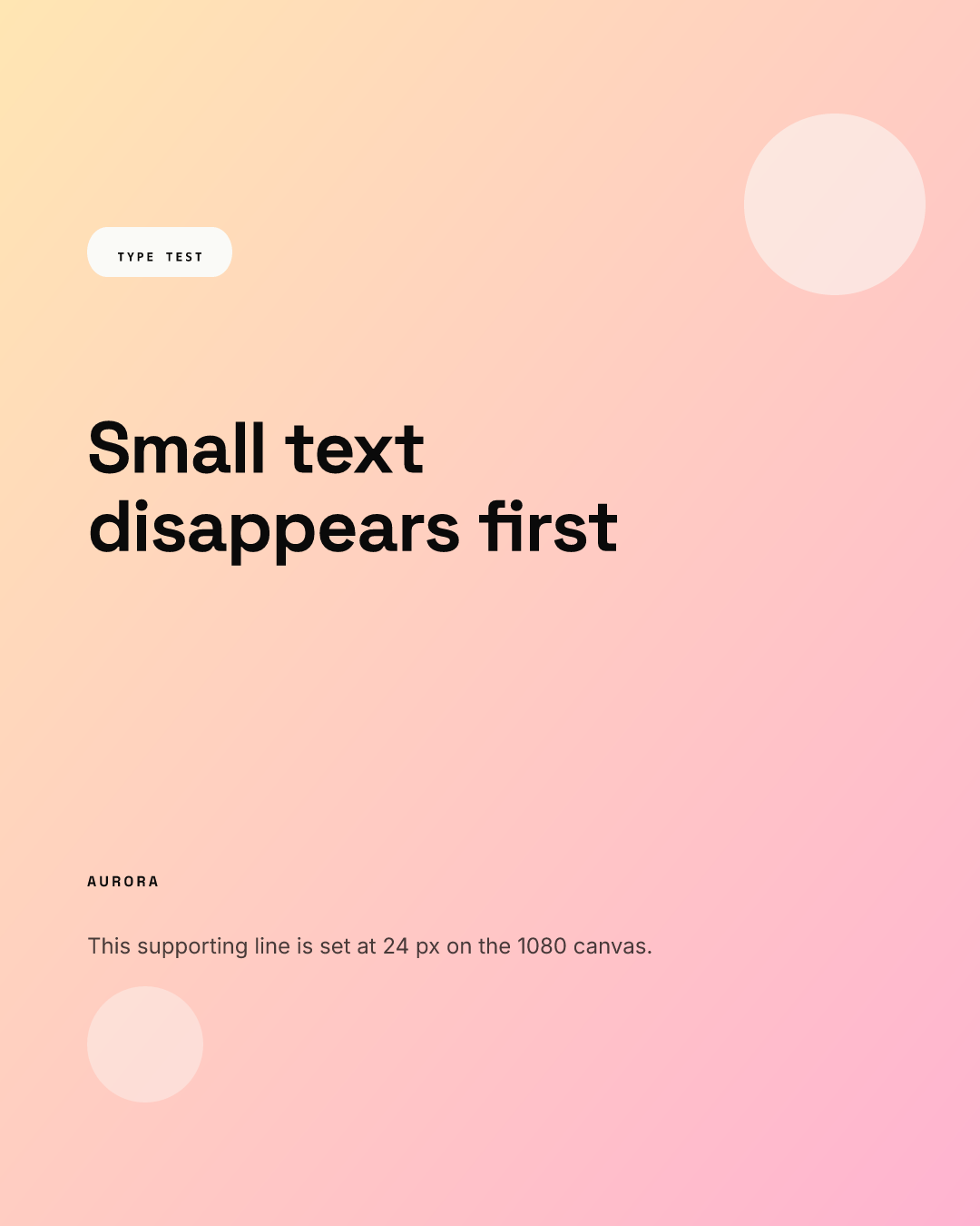
At 390 px the 24 px line is 8.7 points and the 13 px eyebrow in the pill is under 5. The headline survives, the details do not. That is the usual failure: nobody makes the headline too small, they make the second line too small.
How do you build minimums into a template?
Our checklist, for whoever builds the templates:
- Set a floor on every text box: 72 px for headlines, 40 px for anything essential, 32 px for labels, on a 1080 px canvas.
- Scale those floors by canvas width using the table above, never by eye.
- Cap the character count so the longest allowed copy lands at or above the floor.
- Test the longest copy, not the sample copy, and look at it 390 px wide.
- Keep light weights out of anything under 48 px.
- Check contrast on every small line; our color contrast guide has the WCAG ratios.
- Keep small text inside safe zones as well as above the floor; see Story and Reel safe zones.
- Repeat anything essential in the caption and alt text, since nobody can zoom a feed image.
In Chikaboom, the designer sets the starting size and the floor for each text box once, and teammates who fill the template cannot push text below it. You can try the shrink behavior in the live demo. For the layout side of the same problem, read our layout principles for social graphics.