Highlight covers match your brand when every cover in the row uses one shared style: the same background, the same accent color and one centered word or icon, sized to stay readable in a small circle. Design each cover as a 1080 x 1080 px square, keep everything inside the central circle, and give each highlight a name of one or two short words.
Instagram does not publish a highlight cover size, so the sizes below come from our own measurement and are labeled as such. Platform behavior links to Instagram's Help Center, checked on October 5, 2026. Highlights sit right above your grid, so they belong to the same plan as your posts; our Instagram carousel design guide is the hub for that plan.
What are Instagram highlights, and where does the cover show?
Highlights keep stories on your profile after the 24 hours are up. Instagram's highlights help page says a story added to a highlight stays there until you remove it, and that anyone allowed to see your stories can see your highlights too.
The cover is the round image in the row between your bio and your grid, with the highlight's name below it. When you create a highlight, the same page says you pick the stories, then tap Edit cover to choose the cover image and enter a name. You can change both later: open the highlight, tap More, then Edit highlight, or tap and hold it on your profile, as the edit or delete help page describes.
What size should a highlight cover be?
Instagram's Help Center gives no cover size, and we found no official figure. So we measured what the website shows.
Our measurement: on October 5, 2026 we opened a public profile on instagram.com in a desktop browser 1,024 px wide. Each highlight cover appeared as a 77 x 77 CSS pixel circle. The image behind it was a 150 x 150 px square, cut to a circle by the page. We did not measure the phone apps.
| Item | Value | Source |
|---|---|---|
| Cover shape | Circle cut from a square | Our measurement on instagram.com |
| Display size on the website | 77 px across at a 1,024 px window | Our measurement |
| Image file the website loaded | 150 x 150 px | Our measurement |
| Size to design at | 1080 x 1080 px | Our recommendation |
| Safe area | The circle inside the square, about 1,080 px across | Our recommendation |
| Word or icon size | About half the circle's width | Our recommendation |
Why design at 1080 px if the website loads 150 px? Our reasoning: phone screens and apps may load larger versions than the website does, and a large, sharp source scales down cleanly. The corners of your square never show, so treat them as empty.
What does a branded cover set look like?
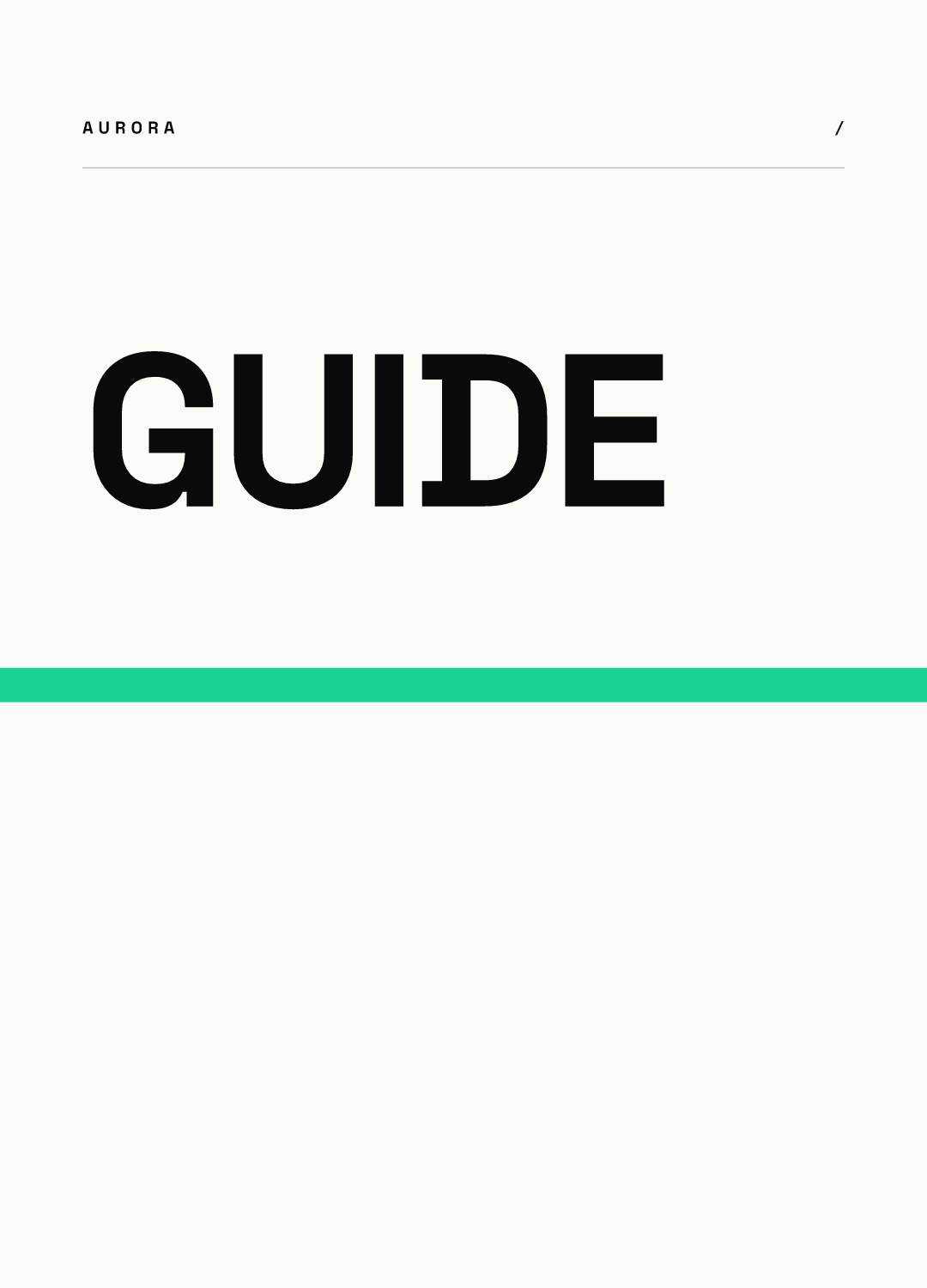
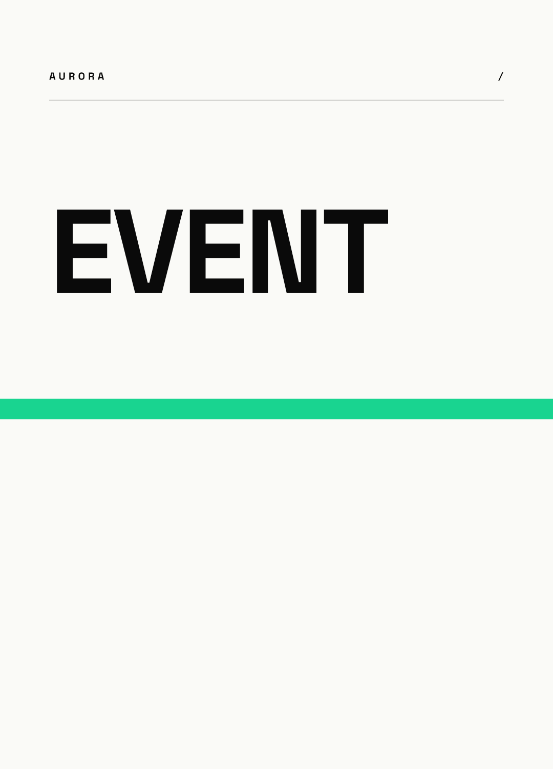
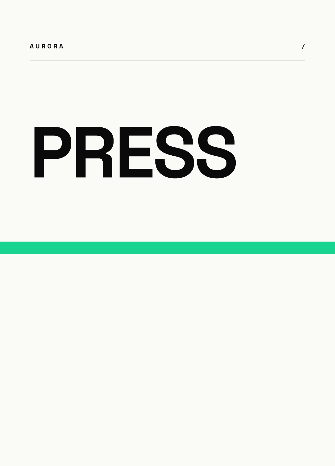
Below is a set of four covers rendered from our AURORA demo brand. We used one template and changed only the word. Each render is a taller canvas; we show a square from its upper part inside a circle, the way a profile displays a cover.

The same four covers at 77 px, the size we measured on Instagram's website:
What we learned from making them: at 77 px, four or five letters are the limit before the word gets hard to read, and the word sits a little left of center because the template aligns text left. If we built a dedicated cover template, we would center the word and leave more room at the sides. The repeated stripe does most of the brand work: even before you read the word, the row looks like one set.
Icons or words: which cover style should you use?
| Style | Works when | Watch out for (our recommendation) |
|---|---|---|
| Single word | Topics are abstract, such as Press or Careers | Keep it to about 5 letters at heavy weight |
| Line icon | The topic has a symbol people know, such as a question mark or a calendar | Thin strokes vanish at 77 px; use a bold stroke |
| Solid color only | You rely on the highlight name below the circle | All covers look alike; use a different color per topic |
| Photo crop | People, places or products are the point | Busy photos turn to mush in a small circle |
| Number or monogram | A series, such as Part 1 or Episode 2 | Only meaningful inside the series |
Whichever you pick, use it for every highlight. A row that mixes photos, icons and words looks unplanned, even if each cover is fine on its own.
How much contrast does a cover need?
Instagram sets no rule, so we borrow the web's. WCAG 2.2 asks for at least 3:1 contrast for graphical objects needed to understand content, such as an icon, and at least 4.5:1 for normal text and 3:1 for large text. A highlight cover is not a web page, but at 77 px everything on it is small, so our recommendation is to treat 4.5:1 as the floor for both the word and the icon.
In practice: dark ink on a light background, or white on your darkest brand color. Avoid pastel on pastel, and avoid gradients where the icon crosses from a light area into a dark one.
How should you name and order highlights?
- Use one or two short words per name, in the same case across the row.
- Put the highlight a new visitor needs first (for example, About or Start here) at the left.
- Keep the row to the topics you update. A highlight last touched two years ago tells visitors the account is quiet.
- With word covers, make the name match the cover word, so visitors never see two different labels for one highlight.
How do covers connect to stories and the grid?
The stories inside a highlight should follow the same style as the cover. Our Story templates for brands give eight formats to fill highlights with, and the Story and Reel safe zones show where the interface covers a story.
Covers also sit directly above your grid, so pick the cover background from the same palette as your grid pattern. Our grid planning guide explains the patterns and the tall 3:4 tiles.
How do you keep a cover set consistent across a team?
Make the cover a template where only the word or icon changes. Chikaboom works this way: a designer locks the layout, colors and type, a teammate types the new word, and the text shrinks to fit its box. You can see how a locked template behaves in our live demo.
Highlight cover checklist
- One style for every cover: same background, accent and type.
- Designed at 1080 x 1080 px, with everything inside the central circle.
- One word of about 5 letters or fewer, or one bold icon, about half the circle wide.
- Contrast of at least 4.5:1 between the word or icon and the background (our floor).
- Names of one or two short words, most useful highlight first.
- Checked at 77 px before you publish.