Build your X header at 1500 x 500 px, the size X recommends, and keep every word and logo out of the top and bottom 60 px, because X says that strip can be cropped on some screens. For post visuals, choose a ratio between 2:1 and 3:4 so a single photo shows in full, and reuse the header's typeface, colors and margins so your profile and your posts read as one brand.
This guide is about design. For the full table of X image sizes and multi-image crops, see our X image sizes guide. Platform facts below come from the X Help Center, checked on October 5, 2026. Anything labeled as our recommendation is our judgment, not an X rule.
What size is the X header, and what gets cropped?
X lists the header, which it also calls a banner, at 1500 x 500 pixels, a 3:1 ratio. Its troubleshooting page adds the detail that matters most for design: even at the recommended size, 60 pixels on the top and bottom could be cropped, depending on the monitor and browser.
| Asset | What X says | Source |
|---|---|---|
| Header (banner) | 1500 x 500 px recommended; JPG, GIF or PNG; no animated GIFs | Customize your profile |
| Header crop | Up to 60 px at top and bottom may be cropped | Profile photo help |
| Profile photo | 400 x 400 px recommended; JPG, GIF or PNG; 2 MB maximum | Profile photo help |
| Bio | 160 characters maximum | Customize your profile |
| Single post photo | Ratios from 2:1 to 3:4 display in full; photos up to 5 MB; GIF, JPEG or PNG | Posting photos |
| Image description (alt text) | Up to 1,000 characters, readable by everyone | Image descriptions |
X's Help Center does not state a file size limit for header images; the 2 MB figure is given for profile photos. Our X image sizes guide notes that X's developer docs also accept WEBP for posts, a format the Help Center page does not list.
Here is the arithmetic for the safe area. Take 60 px off the top and bottom of a 500 px tall header and 380 px remain, so your safe band is 1500 x 380 px, a little under 4:1. On a phone about 390 points wide, the whole header is scaled by 390 / 1500 = 0.26, which makes the safe band only about 99 points tall. That is the space your message has to live in.
Where should text and logos go on an X header?
Inside the middle band, away from the edges, and away from the profile photo. X does not document where the round profile photo overlaps the header, and the overlap differs between the app and the web. Our recommendation is to keep the lower-left quarter free of anything important and to check your live profile on both a phone and a desktop after uploading.

This layout keeps the headline in the middle band, at 72 px on the 1500 px canvas, which is about 19 points on a 390 point phone (72 x 0.26). The small AURORA label above it is only 6 px, so treat it as texture: nobody will read it at phone size.
Now a layout built for a square post, stretched into a header:
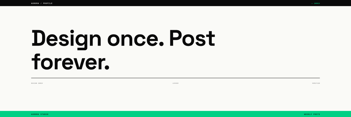
The black top strip and the green bottom strip, with all the labels on them, sit entirely inside the 60 px bands X says may be cropped. The headline survives, but the framing does not. In our view this is the most common header mistake: a design that depends on its edges. Keep edge decoration optional, so losing it changes nothing.
Our header rules (our recommendation, not X rules):
- One line of text at most, or a short headline over two lines. The bio does the explaining.
- Text at 48 px or more on the 1500 px canvas (about 12.5 points on a phone), headline 72 px or more.
- Nothing important in the top 60 px, the bottom 60 px or the lower-left quarter.
- No call-to-action button drawn in the header. It is not clickable, and the real link goes in the bio or a pinned post.
- Update it when your campaign changes, then put it back. A stale launch banner dates the whole profile.
How should X post visuals be designed?
A post image has a different job from the header: it competes in a feed, at small size, next to other people's posts. X's Help Center says a single photo with a ratio between 2:1 and 3:4 is displayed in full, and that what you see in the composer is what you get. Inside that range, pick by content:
| Post type | Our recommended ratio | Why |
|---|---|---|
| Announcement, release note | 16:9 (1200 x 675 px) | Matches the landscape feed card and link previews |
| Quote, stat, opinion | 1:1 (1080 x 1080 px) | Reusable on other networks |
| Step, checklist, chart | 4:5 or 3:4 | Taller canvas holds more lines at a readable size |
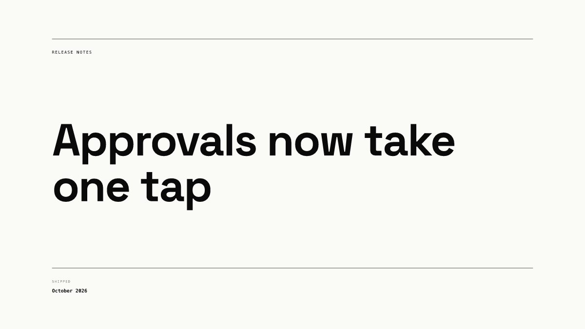
This release-note layout shares its typeface, rules and margins with the square posts in the same brand, so it reads as part of a family. Keep post headlines to two or three lines, and put the detail in the post text.
Write an image description every time. X allows up to 1,000 characters, says the description is the only guaranteed place an image is described, and notes that everyone can read it. If the image contains words, include them in the description.
How do the header and posts work as one system?
Treat the header as the cover of your profile and the posts as its pages. A visitor who taps your name sees the header, the profile photo and your recent images together, so they should share the same parts.
| Element | Header | Post visual |
|---|---|---|
| Typeface | Brand headline face | Same face and weights |
| Colors | Brand background, one accent | Same background and accent |
| Margins | Inside the 1500 x 380 px safe band | At least 5 percent from every edge |
| Logo | Optional: the profile photo already carries it | Small, same corner every time |
| Text amount | One short line | Headline of two or three lines |
| Refresh | With each campaign | Every post, from a fixed template |
In Chikaboom, a designer builds the header and each post layout once with these rules locked, and teammates only fill in the text, which shrinks inside its box rather than spilling toward the edges. You can try the layouts in the live demo.
For the same approach on other networks, see our hub on Instagram carousel design, the guide to repurposing one visual across platforms, and whether Threads and Bluesky need their own visuals.
Checklist before you update your X profile
- Header exported at 1500 x 500 px as JPG or PNG, not animated.
- Nothing important in the top 60 px or bottom 60 px.
- Lower-left quarter kept clear for the profile photo.
- Header text at 48 px or more, headline 72 px or more.
- Profile photo at 400 x 400 px, under 2 MB, readable as a small circle.
- Post images between 2:1 and 3:4, built from the same type and colors as the header.
- An image description on every post image, including any words in it.
- Live profile checked on a phone and a desktop after upload.