Our recommendation: design a 1080 x 1350 px (4:5) post first, because it sits inside the ranges both platforms document. Instagram keeps 1.91:1 to 3:4 at original resolution; X shows single photos from 2:1 to 3:4 in full. No single size is published for every platform, so the table below separates what each platform states from what we suggest.
What size should a social media image be on each platform?
| Platform | Format | Size | Source |
|---|---|---|---|
| Page post | 1200 x 627 px (1.91:1) | Published by LinkedIn | |
| Single image ad | 1200 x 628, 1200 x 1200 or 720 x 900 px (mobile only) | Published by LinkedIn | |
| Carousel document | PDF, up to 100 MB and 300 pages | Published by LinkedIn | |
| Feed photo | 1.91:1 to 3:4 kept at original resolution, up to 1080 x 1440 px | Published by Instagram | |
| Story, Reel | No size published; 9:16 (1080 x 1920 px) is the usual full-screen shape | Our recommendation | |
| TikTok | Cover image | 1080 x 1920 px (9:16) | Our recommendation, no organic size published |
| TikTok | Vertical video ad | 540 x 960 px minimum | Published by TikTok |
| X | Single photo | 2:1 to 3:4 shown in full | Published by X |
| Feed ad | 1440 x 1800 px (4:5) | Published by Meta | |
| Page cover | 851 x 315 px upload (400 x 150 px minimum), 16:9 on computers, 2.4:1 on mobile | Published by Facebook | |
| Page profile picture | 320 x 320 px, cropped to a circle | Published by Facebook | |
| YouTube | Thumbnail | 3840 x 2160 px (16:9), minimum 640 px wide | Published by YouTube |
| Standard Pin | 1000 x 1500 px (2:3) | Published by Pinterest |
Facebook does not publish a size for organic posts, and the Feed row is the ad size Meta recommends. TikTok's organic cover size is not published either, so that row is ours. Where a row says "Our recommendation," treat it as a safe working size, not a quote from the platform.
What does a template render look like at 1080 x 1080?
The two images below are renders from our AURORA demo brand, made with two different templates at square size. They show what two different templates produce from the same brand fonts and colors. Our recommendation is to export your own template once per ratio from the table instead of stretching one file.
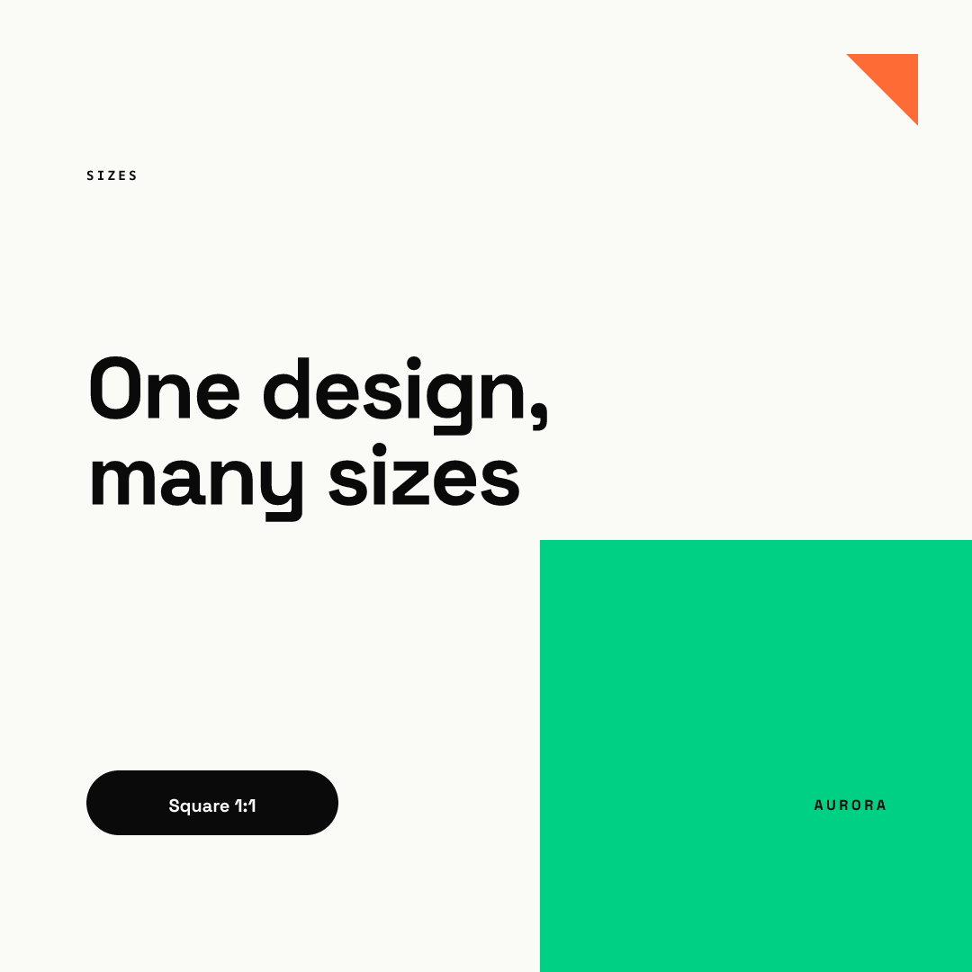
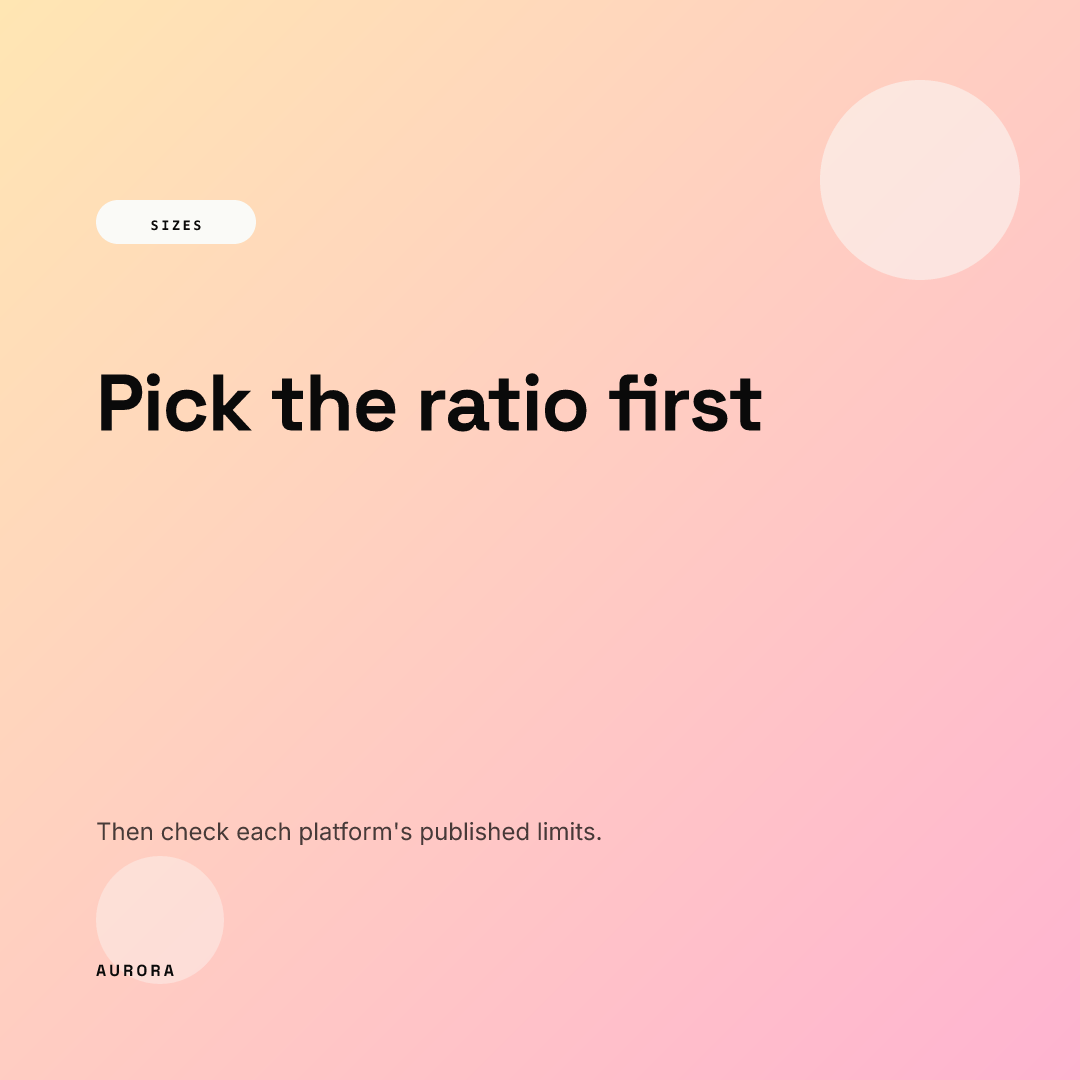
Both use a native 1080 x 1080 px canvas. You can try a template yourself in the live demo.
Why does the ratio matter more than the pixels?
Platforms rescale files, but they crop what falls outside the range they display. Instagram's help page says unsupported ratios are cropped to a supported one, and X says single photos inside its range are shown in full. Our working assumption is that the same logic applies elsewhere: a file that matches the expected ratio keeps its composition, and one that does not loses its edges. That is why the table lists ratios beside pixels, and why we recommend placing key text well inside the frame.
Which sizes go where?
Each platform has its own crops and limits. Here is the short version, with the full guide linked.
Page posts use 1200 x 627 px, ads have their own sizes, and carousels are PDF documents. See LinkedIn image sizes and the LinkedIn carousel guide.
Feed photos are kept at original resolution from 1.91:1 to 3:4, so 4:5 fits. Stories and Reels are full screen, and Meta's ad specs publish margins for the interface. See Instagram post sizes, Story and Reel safe zones and Instagram post design for B2B.
TikTok
TikTok publishes no organic cover size, so we recommend a full 9:16 frame. See TikTok cover image size.
X
A single photo is shown in full between 2:1 and 3:4. See X (Twitter) image sizes.
Covers, profile photos and Feed ads each have their own numbers. See Facebook image sizes.
YouTube
Thumbnails are 16:9, and YouTube lists a vertical size for Shorts. See YouTube thumbnail size.
Pinterest recommends 2:3 for standard Pins. See Pinterest Pin size.
Which file format should I use?
Per their help pages, YouTube accepts JPG and PNG thumbnails, and Pinterest accepts PNG or JPEG among other types. Our recommendation for graphics with text is PNG. The PNG vs JPG vs WebP comparison has measured file sizes.
How do I keep one design consistent across all these sizes?
Resizing by hand is where brands drift: a logo moves, a font changes, text gets cut off. This checklist is our recommendation.
- Design one master ratio first (4:5 works for most teams).
- Keep key text away from the edges, so a crop costs only margin.
- Set headline length limits in the template, so a long title cannot break a narrow format.
- Export the other ratios from the same template, not from a screenshot.
- Check each export at phone size before you publish.
Chikaboom exports one locked template in platform sizes, so a teammate fills in text and the layout does not move. Our brand kit explainer covers what to lock, and social media design automation covers how templates scale.