To plan an Instagram grid that looks intentional, pick one repeating pattern (a light and dark checkerboard is the easiest to keep up), design posts for the tall 3:4 profile tile, and preview the next nine posts together before you publish any of them. The grid is no longer made of squares, so a plan built for 1:1 tiles will crop in places you did not expect.
Platform facts below link to Instagram's own pages, checked on October 5, 2026. Where Instagram publishes nothing, we say so and give our own measurement or recommendation. Grid planning is one part of carousel and post design; our Instagram carousel design guide is the hub for the rest.
What shape is the Instagram profile grid now?
Instagram's Help Center does not publish the grid tile ratio. We searched it on October 5, 2026 and found pages on feed photo sizes, carousels and pinning, but none on the grid shape. So we measured it.
Our measurement: on October 5, 2026 we opened a public profile on instagram.com in a desktop browser with a 1,024 px wide window. The grid had three columns. Every tile, photo or Reel, measured 310.7 x 414.2 CSS pixels, which is a 0.75 ratio, or 3:4, with about 1 px between tiles. Each thumbnail filled its tile and was centered, so anything outside the 3:4 area was cropped equally from both sides or from top and bottom. We did not measure the iPhone or Android app, so check your own profile there.
This matches the direction of the image resolution help page, which now lists 3:4 (1080 x 1440 px) as the tallest feed photo kept at full quality. For history: Instagram's 2015 announcement said non-square posts appeared on the grid as center-cropped squares. Many grid plans are still built on that older rule.
How much does the grid crop each post size?
Here is what a center crop to a 3:4 tile removes, by our calculation, for posts 1,080 px wide.
| Your post | Size | Cropped on the grid | What to keep clear |
|---|---|---|---|
| Square, 1:1 | 1080 x 1080 px | About 135 px from each side (25% of the width) | Words and logos near the left and right edges |
| Portrait, 4:5 | 1080 x 1350 px | About 34 px from each side (about 6%) | A thin strip on each side |
| Tall, 3:4 | 1080 x 1440 px | Nothing | Nothing |
| Reel, 9:16 | 1080 x 1920 px | About 240 px from the top and from the bottom | Captions at the very top or bottom of the frame |
| Reel cover | 420 x 654 px | About 47 px from the top and from the bottom | The top and bottom edges of the cover |
The Reel cover row uses the 420 x 654 px (1:1.55) size that Instagram's Reels help page recommends. The same page says you cannot edit a Reel cover after you upload it, so check the grid crop before you post.
Our recommendation: use 4:5 for posts that also run elsewhere, and 3:4 when the grid look matters most. Either way, keep text at least 60 px from the side edges. For all feed ratios, see Instagram post sizes.
What does a planned grid look like?
Below are six posts rendered from our AURORA demo brand at 1080 x 1350 px and shown here the way the grid shows them: cropped to 3:4 from the center. They follow a checkerboard of light and dark tiles.
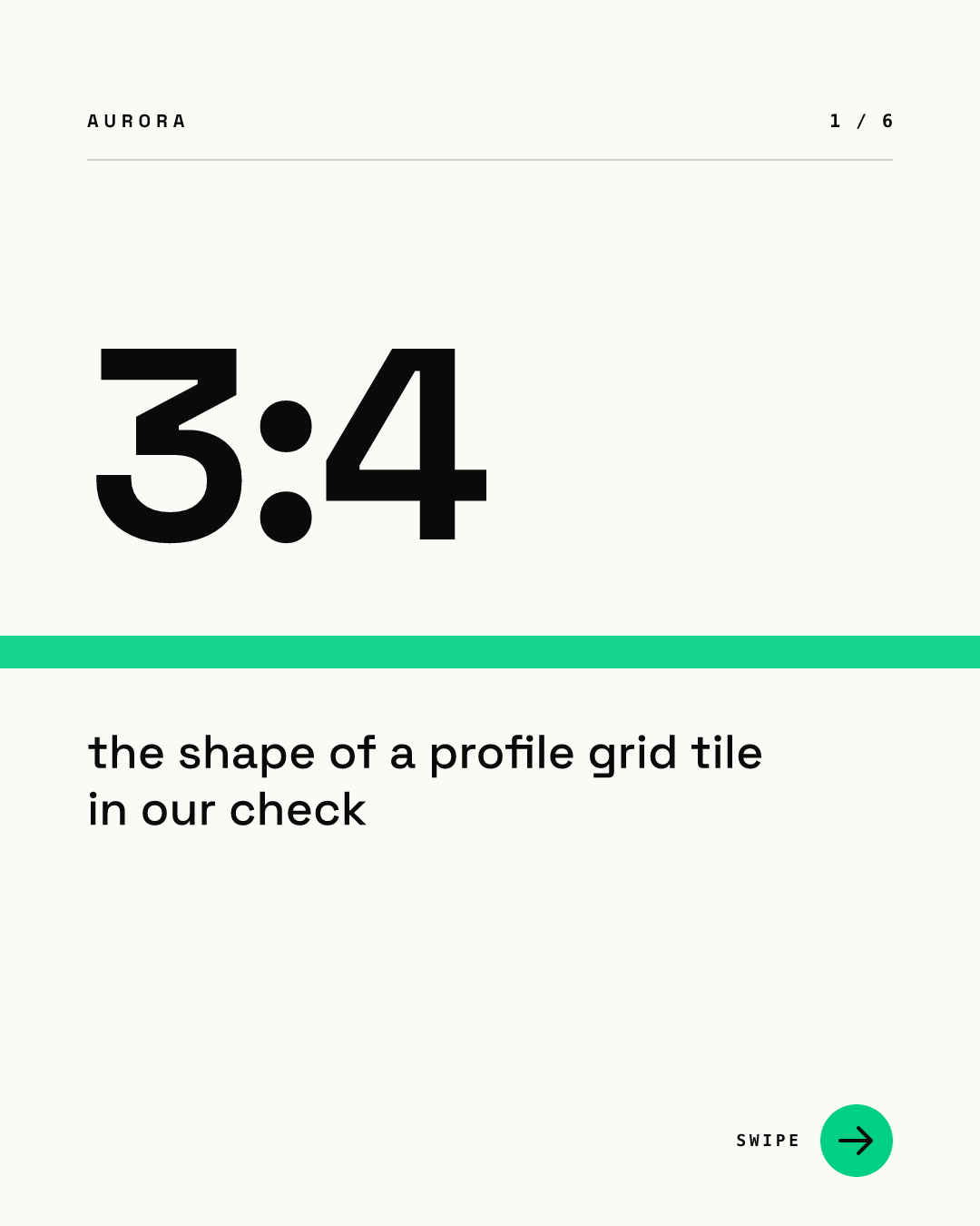
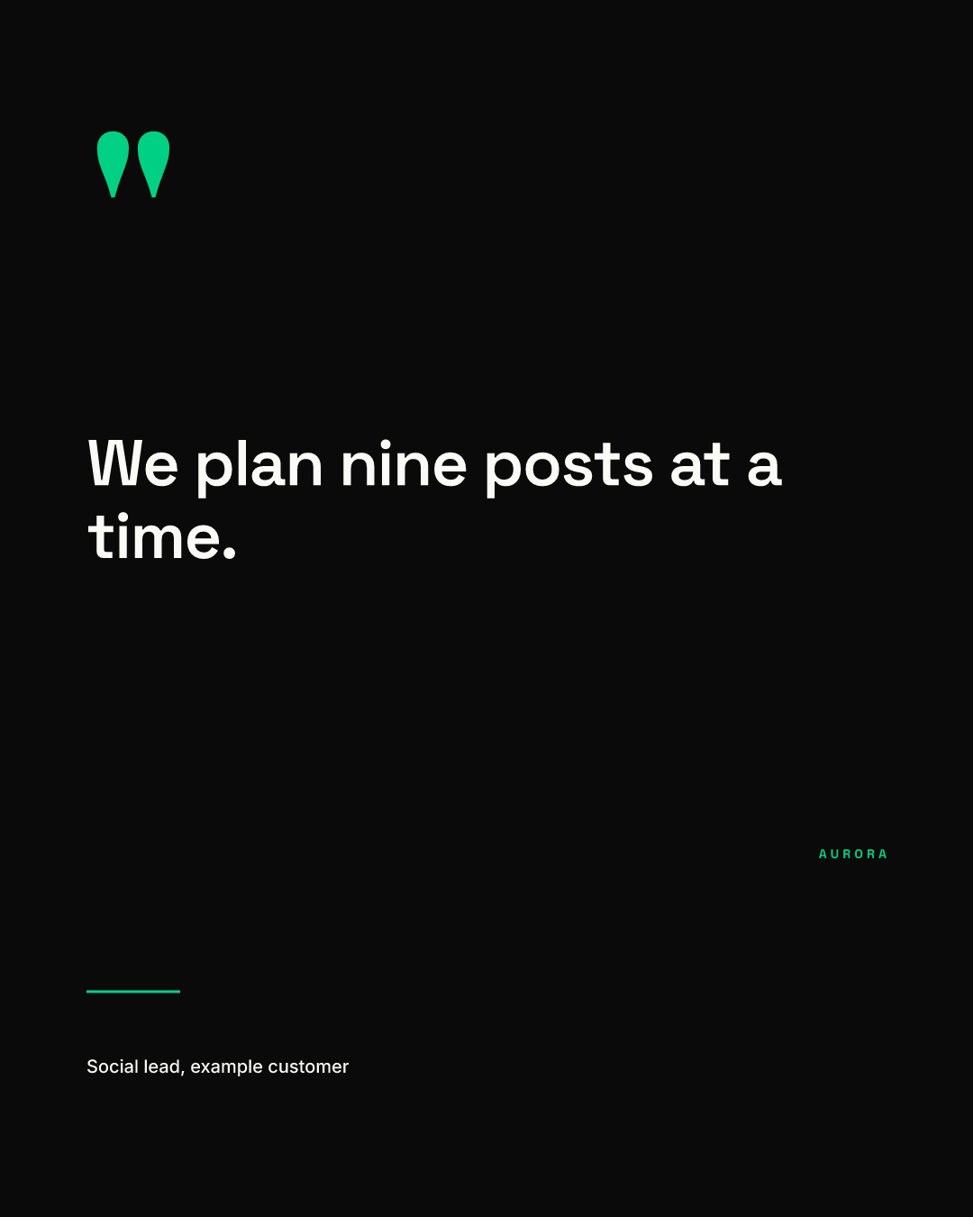
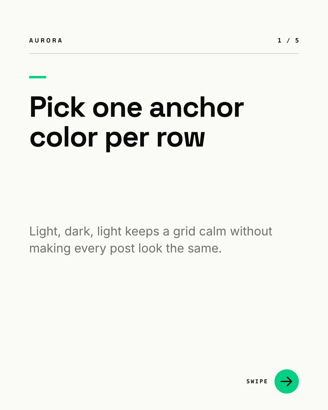
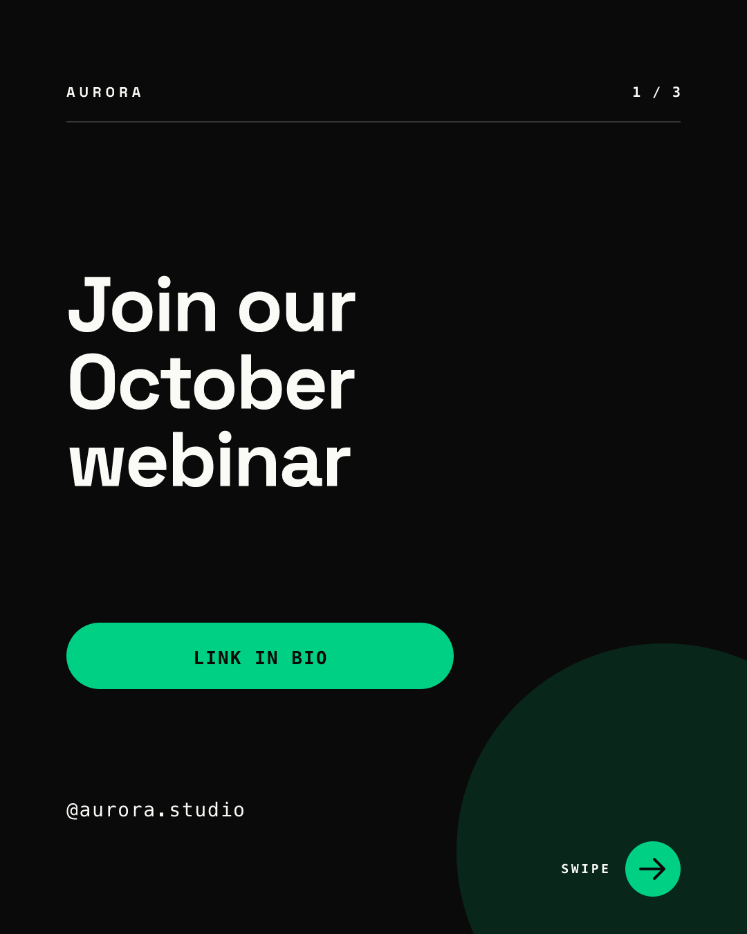
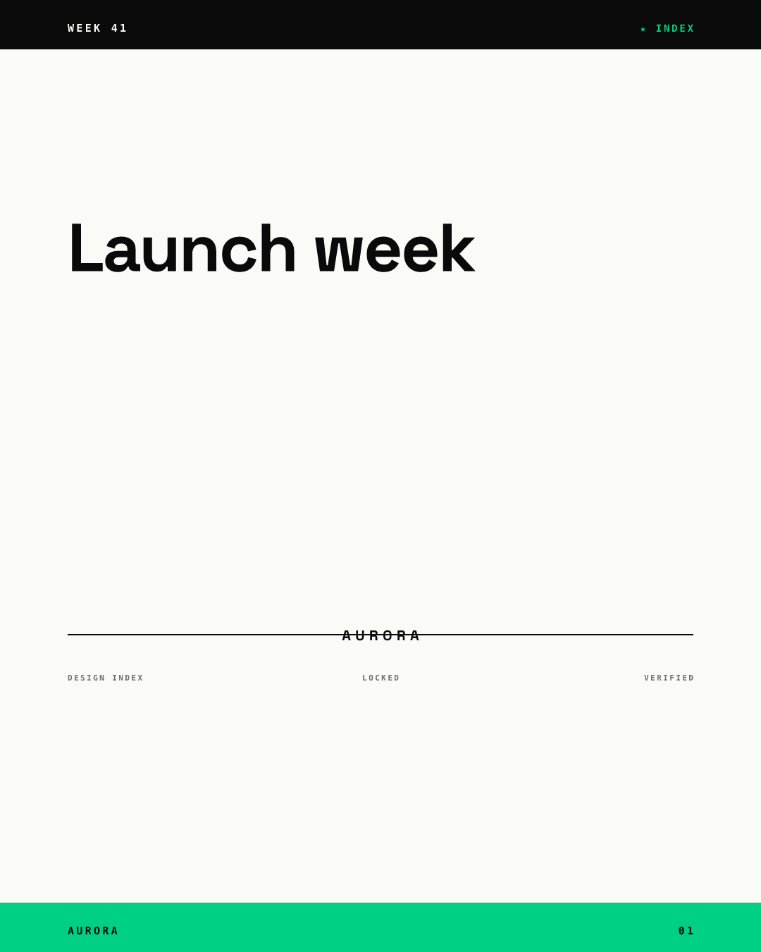
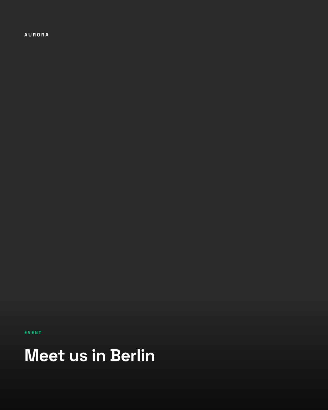
Three things make this read as planned rather than random: light and dark alternate in both directions, every tile uses the same type family, and the green accent appears on most tiles but never as the whole background. None of the words sits close enough to the side edges to be trimmed.
Which grid patterns look intentional?
| Pattern | How it works | Survives an extra or missed post? | Our verdict |
|---|---|---|---|
| Checkerboard | Alternate light and dark (or photo and type) posts | Mostly; one slip flips the order, but the grid still looks mixed | Easiest to keep up |
| Rows | Each row of three shares a theme or color | No; one extra post shifts every row by one | Only if you always post in threes |
| Columns | Each column holds one content type | No; same shifting problem as rows | Rarely worth it |
| Color drift | The palette moves slowly from one hue to the next over weeks | Yes | Good for brands with a wide palette |
| Frame | Every post uses the same border or header strip | Yes | Strong recognition, little planning |
| Puzzle | One large image split across 3, 6 or 9 posts | No; breaks the moment the posts shift | Avoid unless you can reorder |
The shifting problem comes from how the grid fills: every new post lands top left and pushes everything else one place along. A pattern that depends on exact positions breaks unless you post in multiples of three.
Can you rearrange posts to fix a broken grid?
Partly. Instagram's help page on pinning says you can pin up to three posts to the top of your profile, and an unpinned post returns to its original spot.
Full reordering is newer. On June 8, 2026, ABC News reported that Meta launched grid reordering: you long-press a post and drag it to a new position, while pinned posts stay at the top. We could not find an Instagram Help Center article for it on October 5, 2026, so check that it is available on your account before you plan around it.
Even with reordering, our recommendation is to pick a pattern that does not depend on it. Moving dozens of posts by hand each week does not scale for a team.
How do carousels and Reels fit the plan?
Only the first slide of a carousel shows on the grid, marked with a small icon, according to Instagram's carousel help page. So plan carousel covers as grid tiles, and treat the rest of the slides as free. A seamless panorama carousel puts only its first slice on the grid, so that slice must work alone.
Reels sit on the same grid, cropped to the same 3:4 tile in our check. Give them a cover that follows your pattern rather than a random frame from the video. Highlights sit above the grid; our guide to Instagram highlight covers shows how to make them match.
How do you plan nine posts at once?
- Pick a pattern from the table and write it down as a rule, for example "light, dark, light".
- Make one template per tile type, so the rule is built in. Chikaboom works this way: the designer sets the layouts once, teammates fill in the words, and the colors and margins stay fixed. You can try a template in the live demo.
- Draft the next nine posts and view them together, cropped to 3:4, before you schedule any.
- Check that no word or logo sits in the outer 34 px of a 4:5 post, or the outer 135 px of a square.
- Schedule them in order. If something urgent goes out in between, slot it where the pattern expects that tile type.
Grid planning checklist
- One pattern, written down as a rule the whole team can follow.
- Posts at 1080 x 1350 px or 1080 x 1440 px, with text clear of the side edges.
- Carousel covers and Reel covers designed as grid tiles.
- Nine posts previewed together before scheduling.
- At most three pinned posts, chosen on purpose.
For B2B ideas on what those nine posts should say, see our Instagram design guide for B2B teams.