TikTok visual branding comes down to three decisions you make once: a cover layout every video in a series shares, one style for on-screen text, and a safe zone that keeps your words away from the app's buttons and caption. TikTok's own creative guide puts it plainly: people should recognize you even without a logo, because your colors, tone and style stay the same.
This post is about those branding choices. For raw pixel numbers, see our TikTok cover image size guide, and for the vertical interface margins on Meta's apps, the Instagram Story and Reel safe zones guide. Platform facts below were checked on October 5, 2026. Anything marked as our recommendation is our judgment, not a TikTok rule.
What makes a TikTok account look branded?
Repetition you can see in a split second, both in the full-screen feed and on the grid of covers on your profile.
TikTok's creative advertising guide lists building a clear and consistent identity as its first point, and asks you to design vertically and mobile first. Its performance ad best practices add the basics: vertical 9:16, at least 720p, sound on, and content kept inside the UI safe zone. Those are written for ads, but the same screen and the same buttons apply to organic posts, so we treat them as the floor for any brand account.
Here is how we split the work into decisions you lock and decisions you leave open.
| Element | Lock it? | Our recommendation | What TikTok says |
|---|---|---|---|
| Cover layout | Yes | One template per series, same headline position every time | Covers preview your video on your profile and in search |
| Text overlay style | Yes | One font, one text color, one background highlight | The in-app text tool lets you pick font, color, background and alignment |
| Brand colors | Yes | Two colors plus black or white | Keep colors, tone and style consistent |
| Logo | Partly | Small, on covers only, same corner | Recognition should not need a logo |
| Text placement | Yes | Middle band of the frame | Elements outside the safe zone may be covered or cropped |
| Video content, hooks, trends | No | Let creators improvise | Lean into trends and hook in the first 6 seconds |
TikTok's guide also asks for content that feels native to the platform, so lock the frame and the type, and leave the performance free.
How do you design TikTok covers that read as a series?
TikTok's help page defines a video cover as the thumbnail that previews your video on your profile and in search results. The page describes choosing it by dragging to a frame of the video on the post screen. It does not publish a pixel size or a profile grid crop, so we design covers at 1080 x 1920 px and keep the headline away from the top and bottom, as explained in the cover size guide.
The branding move is to give each recurring series one cover layout. Same label position, same headline size, same colors; only the episode number and the headline change. Below are two covers from one template in our AURORA demo brand, rendered at 1080 x 1920 px.
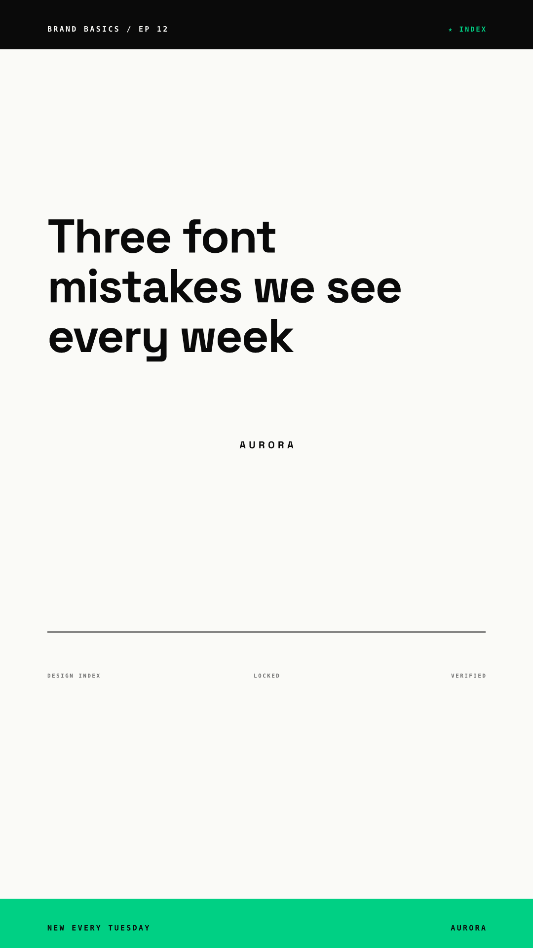
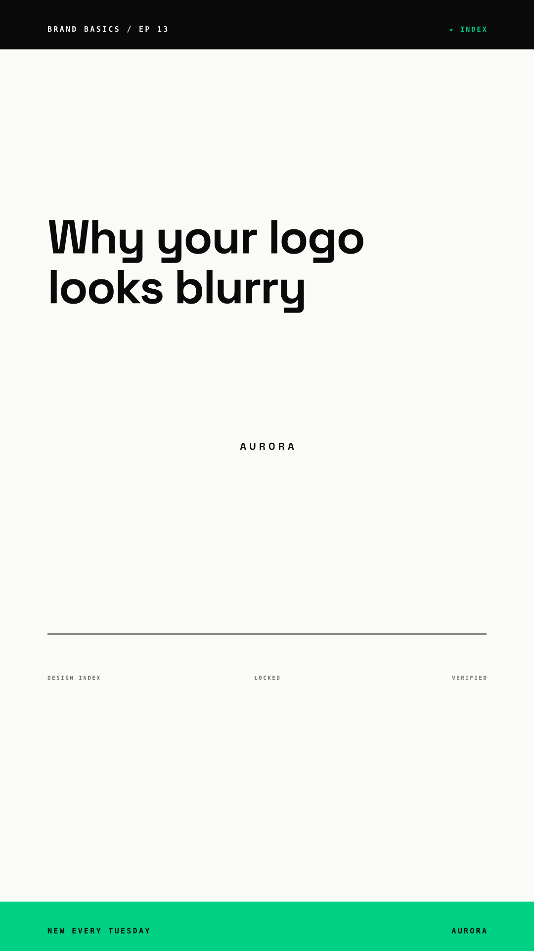
Side by side on a profile, covers like these read as one show, and a returning viewer finds the next episode by shape alone.
Our cover rules for a branded series:
- One template per series, and no more than three series on one account, so the grid still has a pattern.
- A label with the series name and episode number in the same corner every time.
- A headline of 3 to 8 words. Covers show small on the profile grid.
- Headline in the middle of the frame, never pinned to the bottom edge.
- Different series can use different templates, as long as they share your fonts and colors.
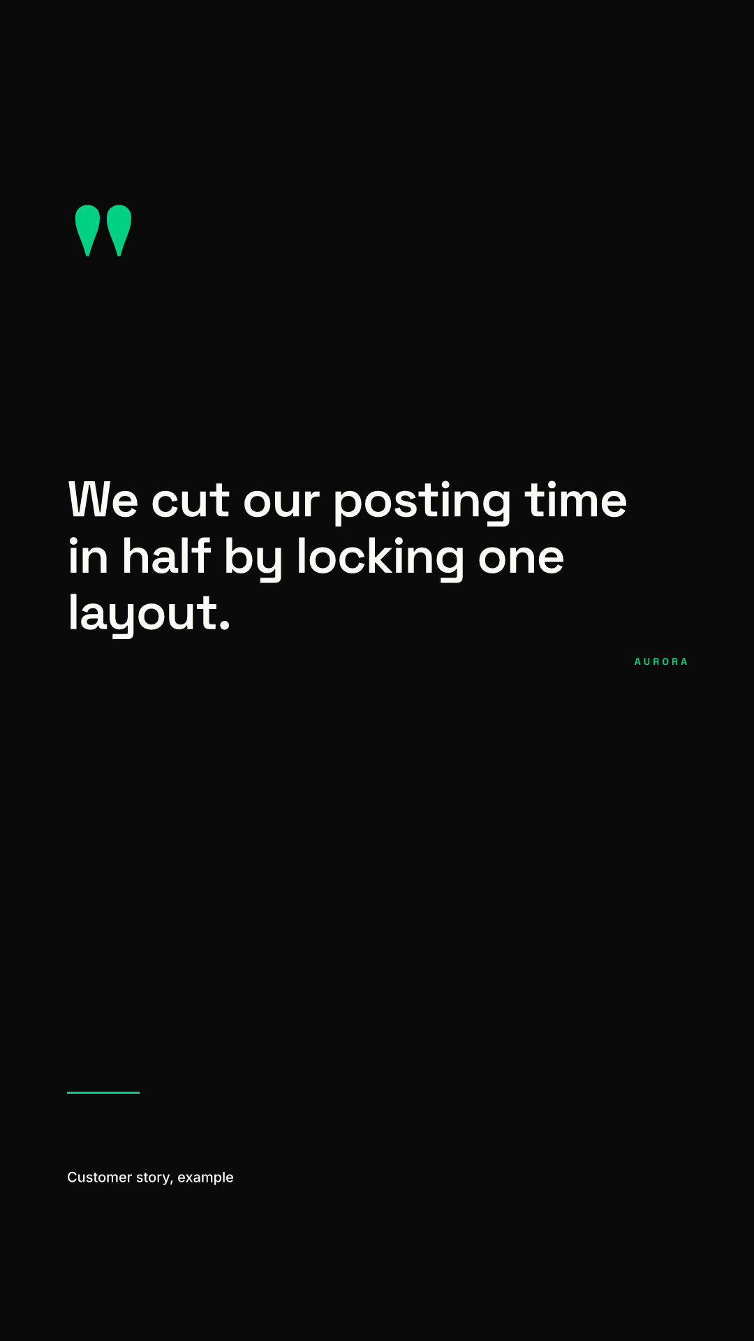
A quote or testimonial series works the same way. The render below uses a darker quote template from the same brand, so it is visibly a different series while still matching the fonts and accent color.
If you make covers outside TikTok, as we do here, add them as a frame in your edit so you can pick that frame as the cover. TikTok's help page only describes selecting a frame from the video.
How should branded text overlays look on TikTok?
Pick one style and use it on every video. TikTok's text tool lets you choose a font, set the text and background color with the color wheel, change alignment and add highlights, as its help page describes. That is enough to define a house style, as long as everyone on the team picks the same options.
A text style that holds up, in our experience:
| Decision | Our recommendation |
|---|---|
| Font | One of TikTok's in-app fonts, or your brand font if you add text in your editor |
| Color | Black text on a white highlight, or white on your main brand color |
| Size | Large enough to read at arm's length; see our minimum font size guide |
| Length | 3 to 8 words per overlay |
| Count | One overlay on screen at a time |
| Timing | Long enough to read twice, then gone |
On timing, TikTok's ad best practices recommend displaying 5 to 10 words per second when you use text, and to introduce the main point in the first 3 seconds. The video editing help page explains how to drag the ends of a text item to change how long it stays on screen. Our view is that brand accounts should sit at the low end of that range: fewer words, held a little longer.
TikTok's creative guide also asks for captions or on-screen text so your video still makes sense with the sound off. That is the strongest argument for an overlay style: it is not decoration, it carries the message for viewers who are not listening. For more on type choices, see our typography guide for social posts.
Where are the safe zones on a TikTok video?
TikTok publishes safe zone guidance for ads, not for organic posts. Its in-feed ad specifications say key elements such as text and logos belong inside the safe zone, because anything outside it may be covered or cropped. The size of that zone depends on the video shape, on the length of the ad caption and on interactive add-ons: the longer the caption, the smaller the safe zone. TikTok offers downloadable safe zone files on that page, in left-to-right and right-to-left versions, instead of a single number.
TikTok does not state safe zone margins as pixels or percentages on the pages we read, so we will not invent them. What follows is our recommendation, based on our observation that the caption, username and buttons also sit over the lower part and the right side of organic videos:
- Keep all text in the middle band of the frame, roughly between one fifth and three fifths of the height.
- Leave a clear margin on the right, where the action buttons sit.
- Keep the bottom area free of anything you need people to read.
- Write shorter captions when the video has text low in the frame, since a long caption takes more space.
- Download TikTok's safe zone files and lay them over your template once, then build the template around them.
Doing that once in a template is far cheaper than checking every video by eye.
Should your logo appear on TikTok videos?
Not on every frame. TikTok's creative guide says your creative should communicate who you are even without a logo, and it puts its weight on consistent colors, tone and style instead. Our recommendation: place a small logo or wordmark on covers, in the same corner each time, and let the overlay style and colors do the work inside the video. A watermark in a bottom corner is likely to sit under the interface anyway.
How do you keep a team on the same TikTok look?
Put the decisions into templates instead of a style guide PDF. When several people make covers, small drift adds up: a headline slides lower, a color gets picked by eye. In Chikaboom, a designer builds the cover layout once, teammates only fill in the text, and long headlines shrink to fit their box instead of spilling into the unsafe area. You can see how a locked layout behaves in the live demo.
The same discipline carries across platforms. If one series also runs as Instagram Stories, our Story templates for brands post shows eight daily formats, and the guide on repurposing one visual across platforms shows how one template re-lays itself out for 9:16, 4:5 and 1.91:1. For the wider picture of brand rules across feeds, start at our Instagram carousel design hub.
TikTok branding checklist
- Each recurring series has one cover template, designed at 1080 x 1920 px.
- Covers carry a series label, an episode number and a headline of 3 to 8 words.
- The team uses one text overlay style: same font, colors and highlight.
- Overlays follow TikTok's 5 to 10 words per second guidance, one at a time.
- Text sits in the middle band, clear of the right-side buttons and the caption area.
- Your template was checked once against TikTok's downloadable safe zone files.
- The logo appears on covers only, small and in the same place.