Use one clean sans serif, a headline between 72 and 110 px on a 1080 px canvas, supporting text of 40 to 48 px, and nothing smaller than about 32 px. Those numbers are our recommendation, built from Apple's 11 pt iOS text minimum and the way a 1080 px image is scaled down to a phone screen.
In our view, most social posts are read in a thumb-scroll, at arm's length, in a second or two. Typography has one job there: be recognized instantly. This guide is the hub for our typography cluster. It gives you a type scale you can copy, the math behind it, and a test of what happens to a headline at real phone size.
How big is 1080 px on a phone?
An iPhone 16 has a 2556 by 1179 pixel display. A 1080 px wide post that fills the screen width is therefore shown at roughly the same pixel count as the screen is wide, so you can think of one canvas pixel as about one device pixel. Apple's guidelines, however, are written in points, not pixels. Dividing the 1179 px width by 3 (our working assumption for the 3x display) gives a screen about 393 pt wide. In short: 1 pt = 3 device px, so 1 canvas px is about 1 device px and 2.75 canvas px is about 1 pt.
The conversion we use: 1080 / 393 = about 2.75 canvas px per point. That works when the post fills the screen edge to edge. Feeds add margins, and some surfaces show the image smaller, so treat 2.75 as a best case and add a margin of safety.
| Apple iOS value | Points | Canvas px at 1080 wide (x 2.75) |
|---|---|---|
| Minimum text size | 11 | about 30 |
| Caption 1 | 12 | about 33 |
| Footnote | 13 | about 36 |
| Default body | 17 | about 47 |
| Title 2 | 22 | about 61 |
| Large Title | 34 | about 94 |
All point values come from Apple's iOS text styles; the pixel column is our own arithmetic. Apple's own design tips also cite 11 pt as the smallest legible text.
What font sizes work on a 1080 px post?
Here is the scale we recommend for 1080 px wide canvases. It is our recommendation, not a platform rule. No social network publishes a minimum font size for images.
| Role | Size at 1080 px | Roughly on a phone | Weight | Line height |
|---|---|---|---|---|
| Headline | 72 to 110 px (floor 72) | 26 to 40 pt | 700 to 800 | 1.0 to 1.15 |
| Subhead | 48 to 60 px | 17 to 22 pt | 600 | 1.2 |
| Supporting text | 40 to 48 px | 15 to 17.5 pt | 400 to 500 | 1.3 to 1.5 |
| Eyebrow or label (caps) | 32 to 36 px | 12 to 13 pt | 600, tracked wide | 1.2 |
| Fine print (never essential) | 32 px minimum | 12 pt | 500 | 1.3 |
Three rules sit behind the table. Anything the reader must understand stays at 40 px or above. Anything below 32 px is decoration, legal copy or a handle. Keep the headline at least 1.5 times the supporting text: 72 px over 48 px is the tightest pair in our table, and at 110 px over 40 px the gap reaches about 2.75 times, so the hierarchy survives a glance. For the layout around these sizes, see our layout principles pillar.
Which fonts are easiest to read at small sizes?
Pick for legibility first. The Nielsen Norman Group separates legibility from readability: legibility is whether people can physically recognize the characters, and it depends on size, contrast and typeface clarity. A social post tests legibility harder than almost any medium.
Our recommendations:
- One workhorse sans serif with a generous x-height (the height of lowercase letters) and open letterforms. Inter, Roboto and system sans families all fit.
- Three weights at most: regular for body, semibold for labels, bold for headlines.
- Avoid light weights. Apple's guidelines say Ultralight, Thin and Light are difficult to read at small sizes.
- Reserve a serif or display face for quotes and editorial headlines, and test it at 390 px wide before you commit.
- Keep tracking tight on big text and open on small caps. Headlines at 90 px or more usually want slightly negative letter spacing, and a 32 px eyebrow wants a little positive.
Choosing fonts is also a brand decision, so write the pairing down once. Our brand guidelines for small teams guide covers how.
What happens when the headline is too long?
This is where a fixed canvas bites. Here is one template, rendered from our AURORA demo brand, with a headline set at 92 px in an 888 by 440 px box. First, a two-word headline.
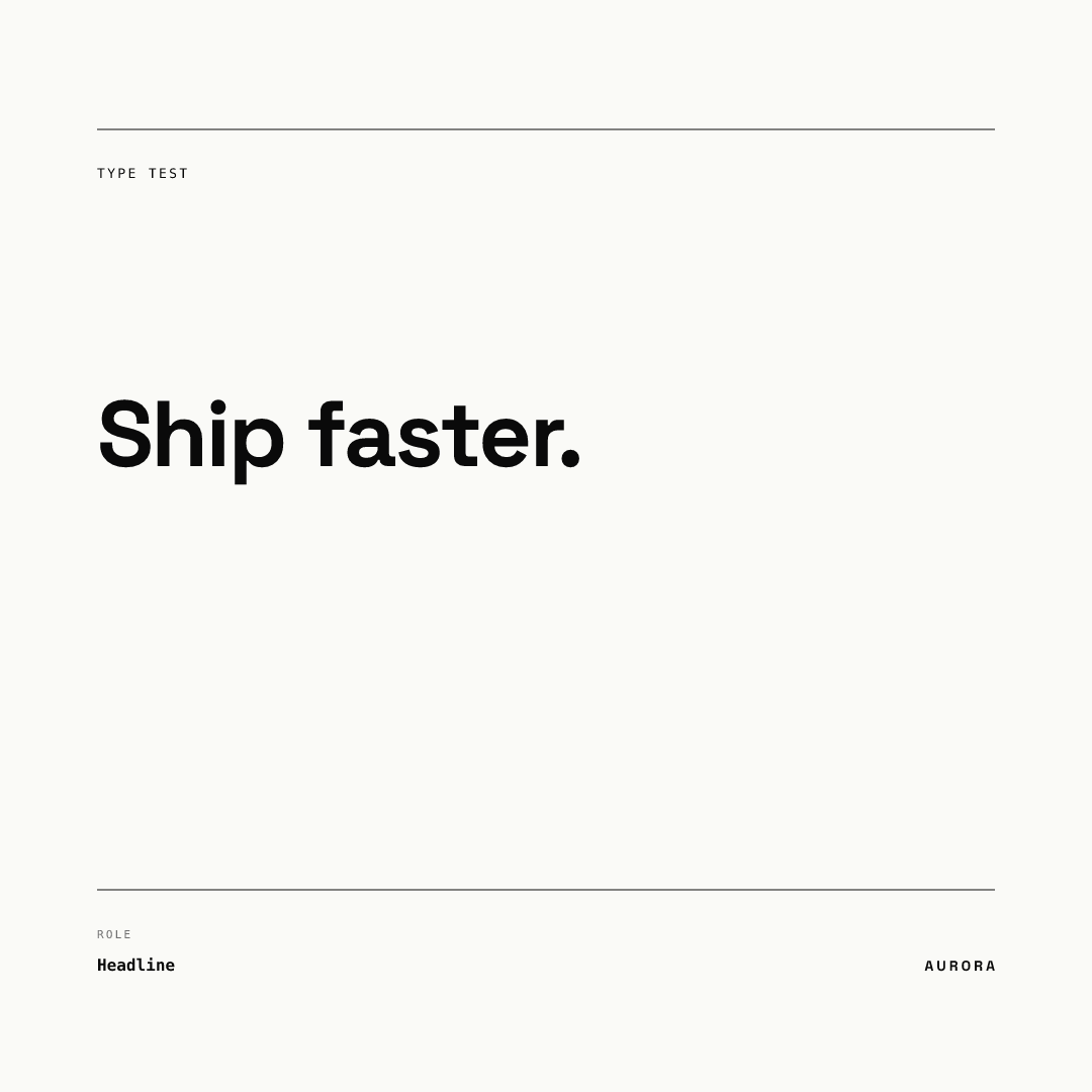
Now the same template with a 99 character headline.
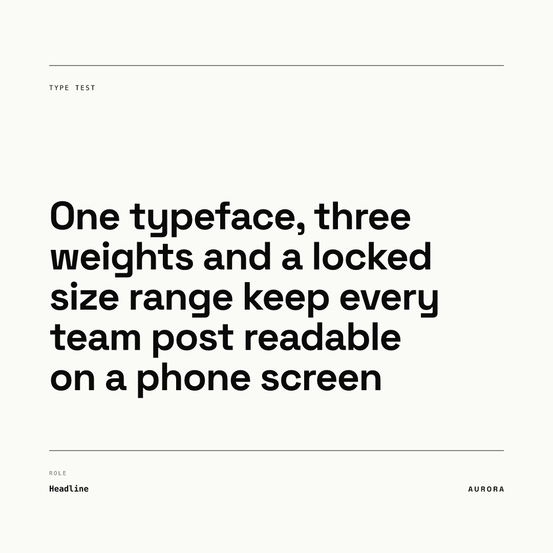
The engine shrank the type a notch (our measurement: from 92 px to roughly 80 px) to fit instead of letting it spill. In Chikaboom the designer sets an ideal size and a floor (this headline starts at 92 px with a 56 px floor and allows 5 lines); if the text still does not fit at the floor, it ends in an ellipsis. Nobody on the team can push the text past the box or below the floor. That is the practical argument for locked templates: type decisions are made once by the person who understands them.
Does the long headline still read at phone size?
Below is the same template and copy rendered natively at 393 by 393 px, close to the width of a phone screen. It is a fresh render, not a shrunk copy of the 1080 image, so the line breaks differ.
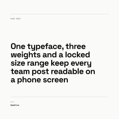
Our observation: the headline stays readable. Be aware this demo template's 56 px floor is below our own 72 px headline recommendation: it is about 20 pt on a full-width phone view (56 / 2.75), fine for a long headline but a counter-example for a short one. In your own templates, set the floor at 72 px or more for headlines. The small labels are the weakest elements: in this template they sit near the 32 px floor we recommend, and at 393 px they are barely readable, so treat them as decoration. Run this check on every template you ship: render it at 393 px and read it at arm's length. You can try it yourself in the live demo.
How do WCAG rules apply to text in images?
In our view, contrast matters more than any size rule. WCAG is written for web content, and its contrast criterion covers images of text; applying its ratios to social images is our recommendation, not a platform requirement. It requires 4.5:1 for normal text and 3:1 for large text, where large means 18 pt or bigger, or 14 pt bold or bigger (about 24 px and 19 px in CSS terms). Note that WCAG sets no minimum font size, only size-dependent contrast thresholds, and it warns that images of text do not scale as well as live text. For a deeper look at color pairs, read our color contrast guide.
Spacing is a different case. Criterion 1.4.12 names line height of 1.5 times the font size, paragraph spacing of 2 times, letter spacing of 0.12 em and word spacing of 0.16 em, but it asks that content survive when users apply those values, not that designs use them. It cannot apply to a flattened PNG, so use the numbers only as a reference. Our line-height recommendations in the table are tighter for headlines on purpose.
Because users cannot resize text in an image, put the real message in the caption and alt text as well.
A typography checklist before you publish
- Headline 72 px or larger, anything essential 40 px or larger, nothing at all below 32 px.
- One sans serif, three weights at most, no thin or light weights.
- Headline at least 1.5x the supporting text (72 px over 48 px at the tightest).
- Contrast of 4.5:1 for small text, 3:1 for text of 24 px (18 pt) or more in WCAG terms. Remember the 1080 px canvas is scaled down, so check real size.
- Headline tested at its longest allowed length and at 393 px wide.
- Floor size set for every text slot, so longer copy shrinks and ellipsizes instead of overflowing.
- Letter spacing tightened for display sizes and opened for small caps.
- Text inside platform safe zones. See the full size reference and the Story and Reel safe-zone guide.