A LinkedIn single image ad takes one JPG, PNG or GIF of up to 5 MB in one of three shapes: 1200 x 628 px (1.91:1), 1200 x 1200 px (1:1) or 720 x 900 px (4:5), and the vertical shape only serves on mobile. Design it so a single offer reads in a glance, and let the headline and intro text fields carry the explanation.
Specs below come from LinkedIn's own pages, checked on October 5, 2026. Anything marked as our recommendation is our judgment, not a LinkedIn rule. For every other LinkedIn format, see the LinkedIn post design hub.
What are the LinkedIn single image ad specs?
LinkedIn's single image ad specification page lists JPG, PNG or GIF files (animated GIFs up to 250 frames), a 5 MB limit and these dimensions:
| Shape | Recommended | Minimum | Maximum | Where it serves |
|---|---|---|---|---|
| Horizontal 1.91:1 | 1200 x 628 px | 640 x 360 px | 7680 x 4320 px | Desktop and mobile |
| Square 1:1 | 1200 x 1200 px | 360 x 360 px | 4320 x 4320 px | Desktop and mobile |
| Vertical 4:5 | 720 x 900 px | 360 x 640 px | 2430 x 4320 px | Mobile only |
Two details on that page affect design. Images under 401 px wide are shown as thumbnails, and thumbnails with a ratio between 3:2 and 16:9 crop the least. LinkedIn also states plainly that paid vertical assets only serve on mobile devices.
The text fields sit outside the image:
| Field | Advised length to avoid truncation | Hard limit |
|---|---|---|
| Introductory text | 150 characters | 3,000 characters |
| Headline | 70 characters | 200 characters |
| Description | 100 characters | 300 characters |
| Destination URL | 2,000 characters |
Where do LinkedIn's own pages disagree?
LinkedIn publishes these specs in more than one place, and the pages do not match exactly. The Marketing Solutions ads spec page lists three vertical sizes (628 x 1200, 600 x 900 and 720 x 900 px), says a 1:1.91 vertical image gets borders on both sides, and recommends 4:5 to avoid them. It gives the description as 70 characters and only for the LinkedIn Audience Network, where the Help Center says 100. Another help page on single image ads advises keeping the headline under 60 characters, tighter than the 70 on the spec page. LinkedIn's Sponsored Content best practices page still quotes 1200 x 627 px. Our recommendation: design to the stricter number each time (4:5 for vertical, a headline under 60 characters, 1200 x 628 px for landscape).
Which ratio should you choose?
Start with the square. LinkedIn's ads page says it recommends 1:1 for delivery across both desktop and mobile, so one file covers every placement. Add a 4:5 version when your audience is mostly on phones: the same page credits vertical images with the best click-through rate on mobile, which is LinkedIn's claim about its own platform, not a guarantee for your account. Use 1.91:1 when you are reusing a blog header or webinar banner that already exists in landscape.
In our view, running square and vertical side by side in one campaign is the simplest test you can set up, because the message stays the same and only the shape changes.
How should you lay out each ratio?
The three renders below come from our AURORA demo brand, one per ratio. The offers are placeholders for layout only.
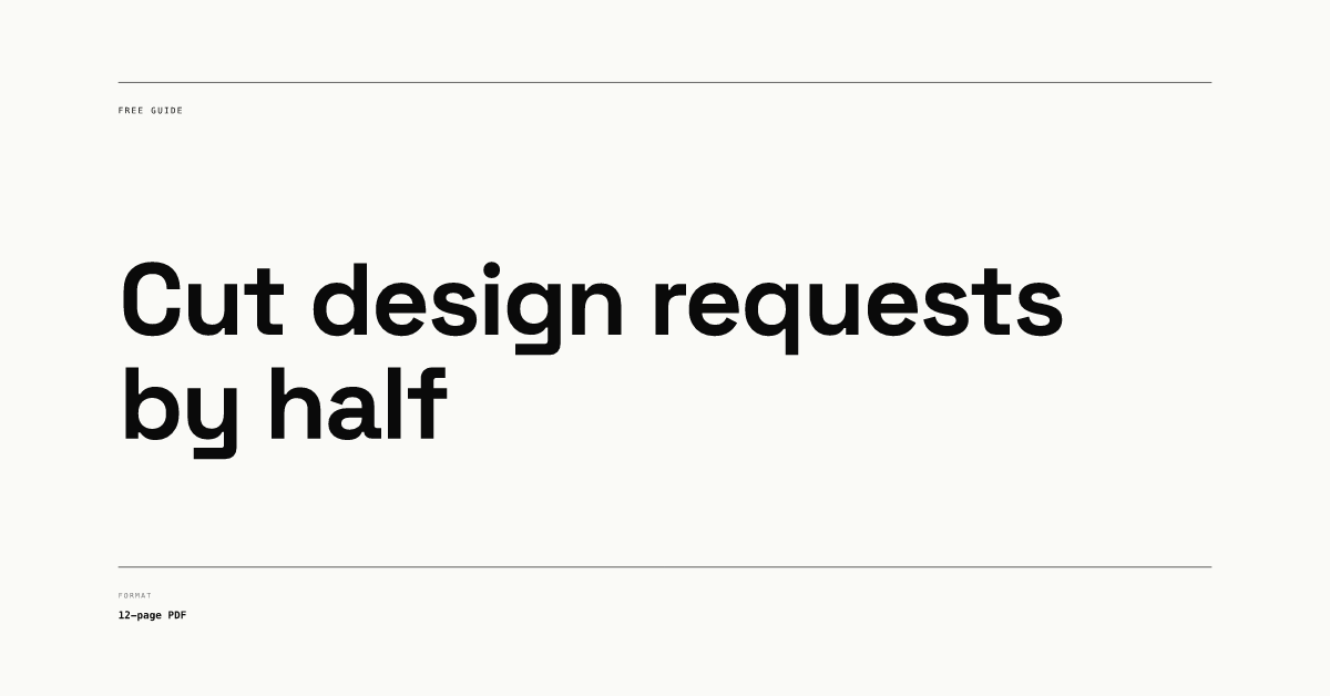
Landscape has the least height, so the headline needs to stay at two lines. Keep labels short, because at feed size they shrink to a few points tall.
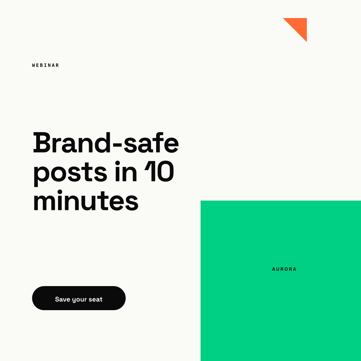
The square gives you room for a headline, a visual anchor and a cue that matches the real call to action. If you echo the action in the image, use the same verb as the button you pick in Campaign Manager, such as Register for a webinar.
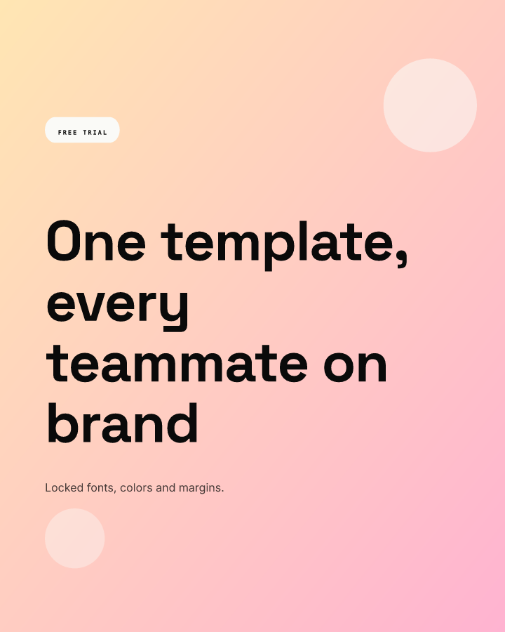
Vertical takes the most space in a mobile feed. Because it is only 720 px wide, every element is smaller in pixels than on the 1200 px formats, so check the smallest line on a real phone before launch.
Our layout rules for all three:
- One offer per image. If you need "and", make two ads.
- A headline of about 3 to 7 words. The headline field below the image can say the rest.
- Logo small and in the same corner on every ad in the campaign.
- Keep text at least 5 percent of the width from every edge, so a thumbnail crop cannot cut a word.
- Strong contrast between text and background; our color contrast guide has the ratios.
How big should text be in a LinkedIn ad?
LinkedIn sets no minimum. Here is our arithmetic. A 1200 px wide ad shown across a phone about 390 points wide is scaled by 390 / 1200 = 0.325, so 1 point equals about 3.1 canvas pixels. Apple's typography guidelines set 11 pt as the minimum text size on iOS, which is 11 x 3.1 = about 34 px at 1200 wide. Feeds rarely run edge to edge, so our recommendation is 44 px or more for anything the reader must understand on a 1200 px ad, and 26 px or more on a 720 px vertical one (11 pt at 720 / 300 points of feed width, our assumption for an inset feed). The minimum font size guide walks through the same math for other canvas sizes.
What does LinkedIn say works in ads?
LinkedIn's Sponsored Content best practices page says content with larger visuals tends to get up to 38% higher click-through rates. It also suggests running 4 to 5 ads per campaign, and every 1 to 2 weeks pausing the weakest one and replacing it with new creative. The single image ads help page adds that the format supports six objectives, from brand awareness to job applicants, and that Sponsored Content with images and video tends to perform better. Treat all of these as LinkedIn's own claims.
That rotation advice means you need several on-brand variants every month, which is where design time goes. A template with locked fonts, colors and margins lets a marketer swap the headline and offer without opening a design tool. In Chikaboom, a designer builds each ad layout once, the team fills the text fields, and text shrinks inside its box instead of overflowing. You can try it in the live demo.
How do you plan variants for testing?
Change one thing per variant, so the result tells you something. Here is the grid we would start from (our recommendation):
| Variant | What changes | What stays fixed |
|---|---|---|
| A | Baseline: square, offer headline | Everything |
| B | Same as A in 4:5 | Headline, colors, logo |
| C | Headline rewritten as a question | Ratio, layout, colors |
| D | Headline replaced by one number | Ratio, layout, colors |
| E | Photo of a person instead of a flat background | Headline, ratio |
Five variants also match LinkedIn's suggestion of 4 to 5 ads per campaign. For organic versions of the same message, see the LinkedIn Page branding guide, our guide to employee advocacy graphics and the LinkedIn image sizes reference.
Checklist before you launch
- Ratio chosen on purpose: 1:1 for all placements, 4:5 for mobile, 1.91:1 for reused landscape art.
- Export at 1200 x 628, 1200 x 1200 or 720 x 900 px, JPG or PNG, under 5 MB.
- One offer, a headline of about 3 to 7 words, logo in a fixed corner.
- Essential text at 44 px or more on 1200 px canvases, 26 px or more on 720 px.
- Intro text under 150 characters, headline under 60 to satisfy both LinkedIn pages.
- Alt text filled in; LinkedIn lists it as optional, but it costs nothing.
- Four or five variants ready, each changing one thing.