A founder's LinkedIn visuals should introduce a person first and the company second: a clear headshot, a profile cover that states what you help people do, and a small set of post templates that carry your name in the company's fonts and colors. Four templates cover most founder posts: a point of view, a quote, a lesson and a story carousel.
Profile specs below come from LinkedIn's Help Center, checked on October 5, 2026. Layout advice is our recommendation, not a LinkedIn rule. For general post layout, see our LinkedIn post design guide.
What should a founder's profile photo and cover look like?
Start with the two images every visitor sees before reading a word.
| Asset | LinkedIn spec | Our recommendation |
|---|---|---|
| Profile photo | 400 x 400 px to 7680 x 4320 px, PNG or JPG, 8 MB max, no GIFs | A recent, well-lit headshot, face filling most of the frame, plain background |
| Profile cover | 1584 x 396 px, JPG or PNG, under 8 MB | One line on what you help people do, kept in the right half |
| Featured section | Posts, articles, links and media, no stated maximum | Two or three of your best posts, so the templates show up again |
LinkedIn says the cover image sits behind your profile photo in the introduction section, and that its appearance changes with browser window size and screen resolution. It does not publish a safe zone. It also notes that photos tend to look better than images with logos when quality degrades. Our rule: assume the photo covers part of the left side, keep text in the right half, and test on a phone and a laptop before you call it done.
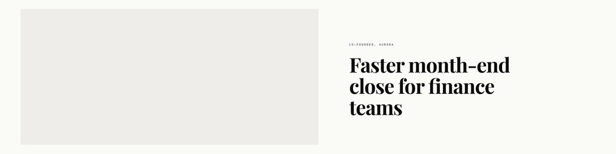
The cover says what the company does for whom, not "Founder and CEO". Your headline field already carries the title.
How should a founder's visuals relate to the company brand?
Borrow the system, change the speaker. A founder account that looks exactly like the company Page reads as an ad. One with no link to the company wastes the recognition you have built. This split is our recommendation:
| Element | Company Page | Founder profile |
|---|---|---|
| Typeface | Brand family | Same family |
| Colors | Full palette | Two of the brand colors, often the calmer ones |
| Logo | Prominent | Small wordmark or none |
| Voice on the image | "We" | "I" |
| Name and role | Rarely | On every quote and point-of-view post |
| Formats | Updates, launches, stats | Opinions, lessons, stories |
The company's own Page branding is covered in our guide to LinkedIn company Page branding.
Which templates belong in a founder's set?
We rendered a starter set from our AURORA demo brand. The founder, quotes and figures are invented for layout only.
Point of view: when you are making an argument
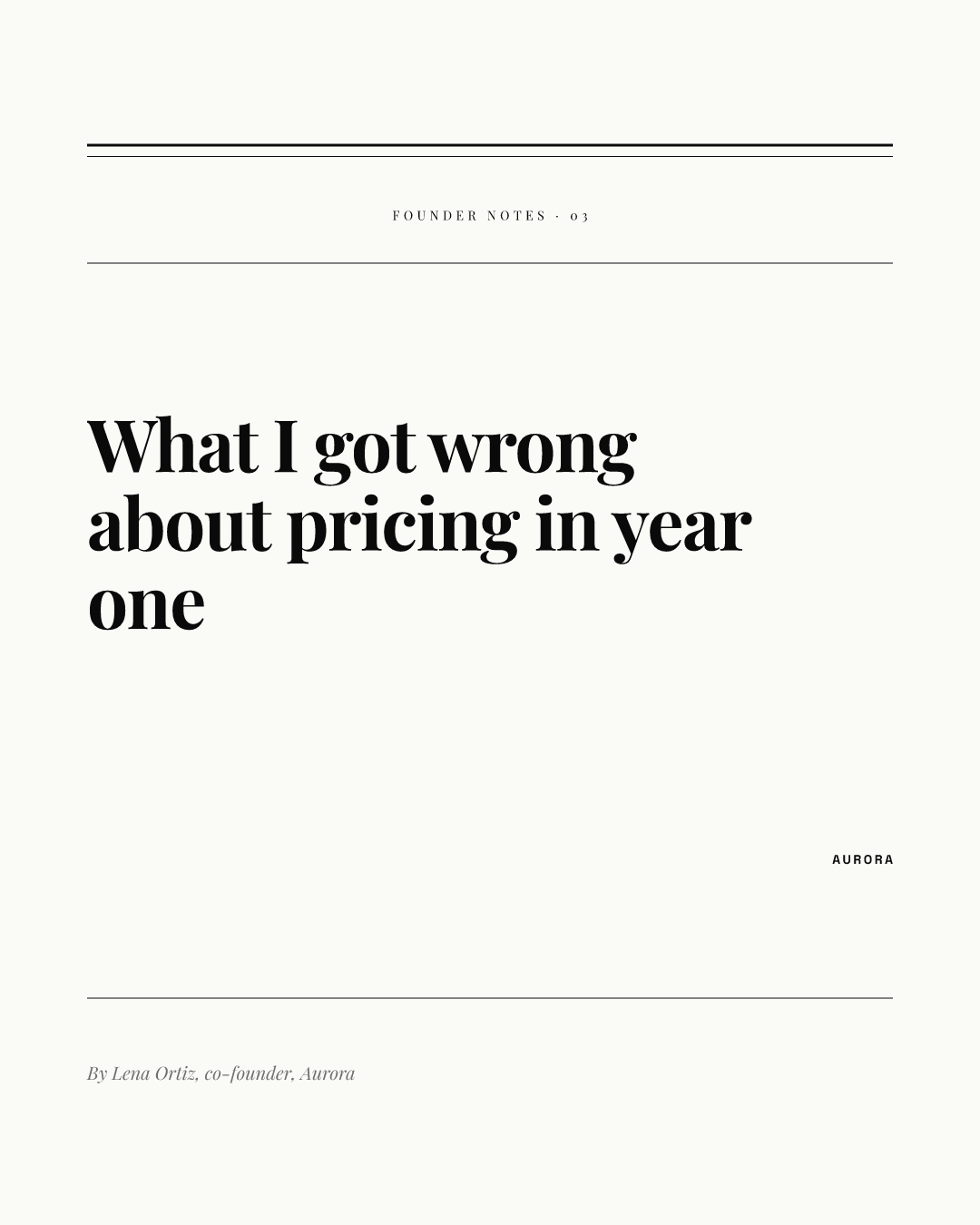
A serif headline and a byline make the post feel like a column. Use it with a long caption that makes the case. The 1080 x 1350 portrait size is our recommendation for personal posts, since LinkedIn publishes no personal post size.
Quote: when one sentence does the work
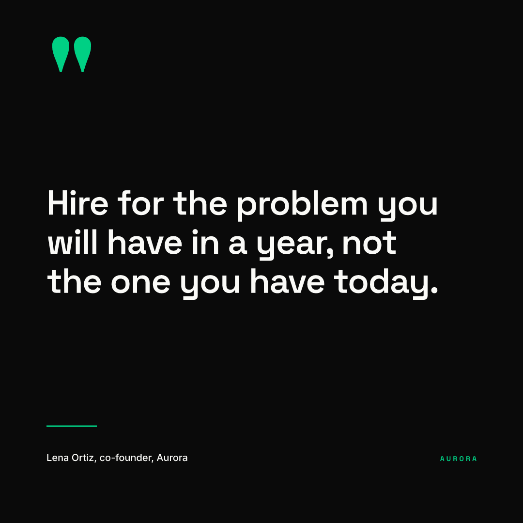
Quote yourself only when the line is short and you would stand behind it in a year. The name on the card matters because images get reshared without their captions.
Lesson: when you have a numbered habit
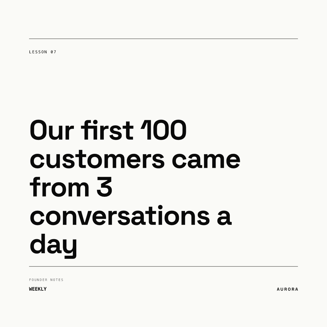
A numbered series gives readers a reason to come back and gives you a reason to keep posting. If a number appears in the headline, the caption should explain where it came from.
Story carousel: when the idea needs several steps
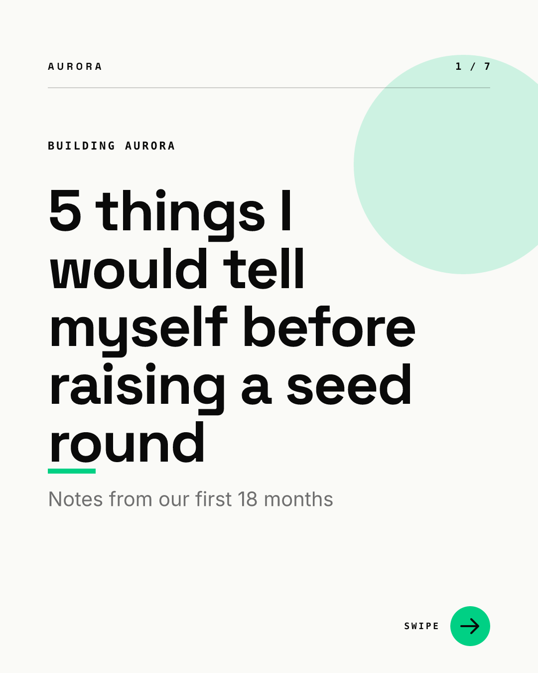
Founder stories often run longer than one image. LinkedIn carousels are uploaded as documents; our guide to the LinkedIn carousel cover slide covers what makes people swipe. Keep in mind the promotion limit below.
Can the company put ad budget behind a founder's posts?
Yes, through LinkedIn's Thought Leader Ads, which promote posts from members, creators or your own employees. The founder has to approve each request by email, the profile has to show a full name, and the post has to be public. The format rule affects design choices:
- Eligible: single image posts, video posts, text posts, article and newsletter posts, and LinkedIn Live event attendee posts.
- Not eligible: documents, polls, multi-image posts, celebrations and reposts.
So if a post might get promoted later, make it a single image, not a carousel document. Our LinkedIn single image ad design guide covers image ads in general.
Who should make a founder's visuals?
The founder should write; someone else should handle the design. In our experience, founders post when it takes minutes and stop when every post is a design project. The workable split is a designer or marketer who builds the templates once, and a founder who types a headline into one of them.
In Chikaboom, a designer builds templates once, a team member fills the text fields, and text shrinks to fit its box. A post can also go through approval before it is scheduled. You can test the flow in the live demo. Whatever tool you use, keep the founder set separate from the company set so the two do not blur.
Checklist for a founder's LinkedIn visuals
- Headshot between 400 x 400 px and 7680 x 4320 px, face clearly visible.
- Cover at 1584 x 396 px, one line in the right half, no logo wall.
- Four templates: point of view, quote, lesson, story carousel.
- Company typeface and two brand colors; your name on every quote and point of view.
- Two or three posts pinned in the Featured section.
- Posts you might promote are single images, not documents.
- Every number on an image has a source in the caption.