Our recommendation: to lay out a social post so people read the right thing first, give one element clearly more weight than everything else, then align and space the rest so they support it. That comes down to four principles: hierarchy, grid, whitespace and emphasis.
The principles below are our recommendation for social graphics, built on research about interfaces. Where a number or definition comes from a source, it is linked. We illustrate each principle with a template rendered by the Chikaboom engine from our AURORA demo brand, at native size.
What does "read the right thing first" actually mean?
Nielsen Norman Group defines visual hierarchy as arranging elements so the eye consumes them in the order of intended importance. On a social post you decide that order before the viewer does. People meet your image mid-scroll, so the first element they land on is the one that decides whether they stop.
NN/g's F-shaped pattern research found that readers of web pages scan a top bar, a shorter second bar and then down the left edge, and that they rarely read word by word. That study covers text-heavy web pages, not feed images. Our assumption, not something that study tested on images, is that the same habit carries over to feed graphics: put the point at the top left of the text block and front-load the first words.
Use the squint test from the same NN/g article: blur your design, or step back from the screen, and see what still stands out. If it is not the thing you meant, change the layout, not the copy.
Principle 1: How does hierarchy work on a single post?
In our summary of NN/g's article, hierarchy comes from scale, contrast and grouping. NN/g's guidance is to keep to no more than three size variations and no more than two oversized elements. Our recommendation for a 1080 px post is three levels: a headline, one supporting line and a small label.
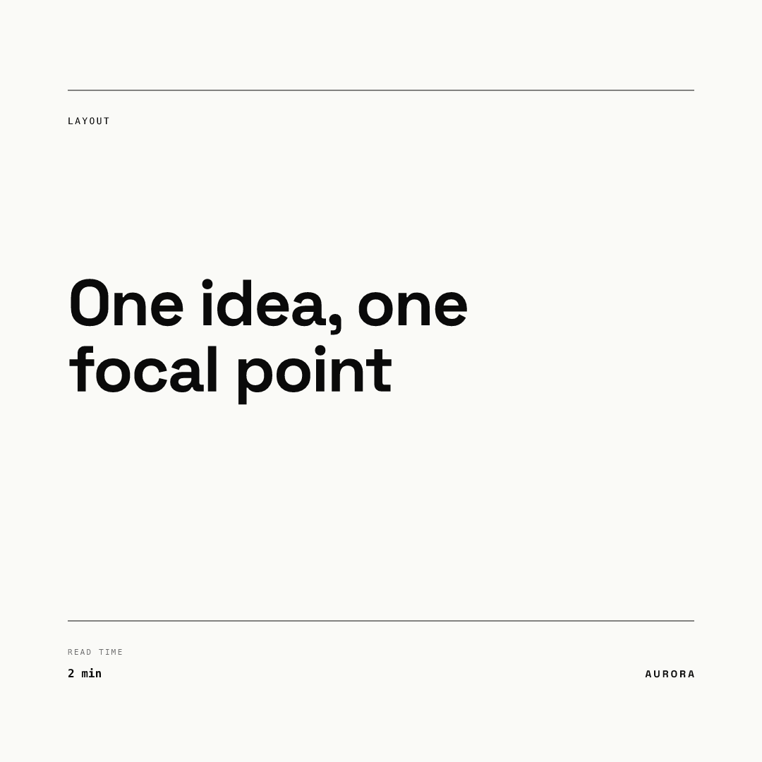
In this Swiss-style layout the headline is the only large element. The label and the metadata sit far below it in size, so the squint test returns one blob: the headline. The small items are not there to compete. They answer "what is this" and "how long will it take".
Principle 2: Why use a grid for a single image?
A grid is a repeated unit that decides where things may sit. Material Design 3 builds its spacing on an 8dp scale and separates padding (inside an element), gaps (between elements) and margins (outside them). Applying the idea to a social post is our recommendation, not a platform rule: pick one unit, such as 24 or 40 px at 1080, and use only multiples of it.
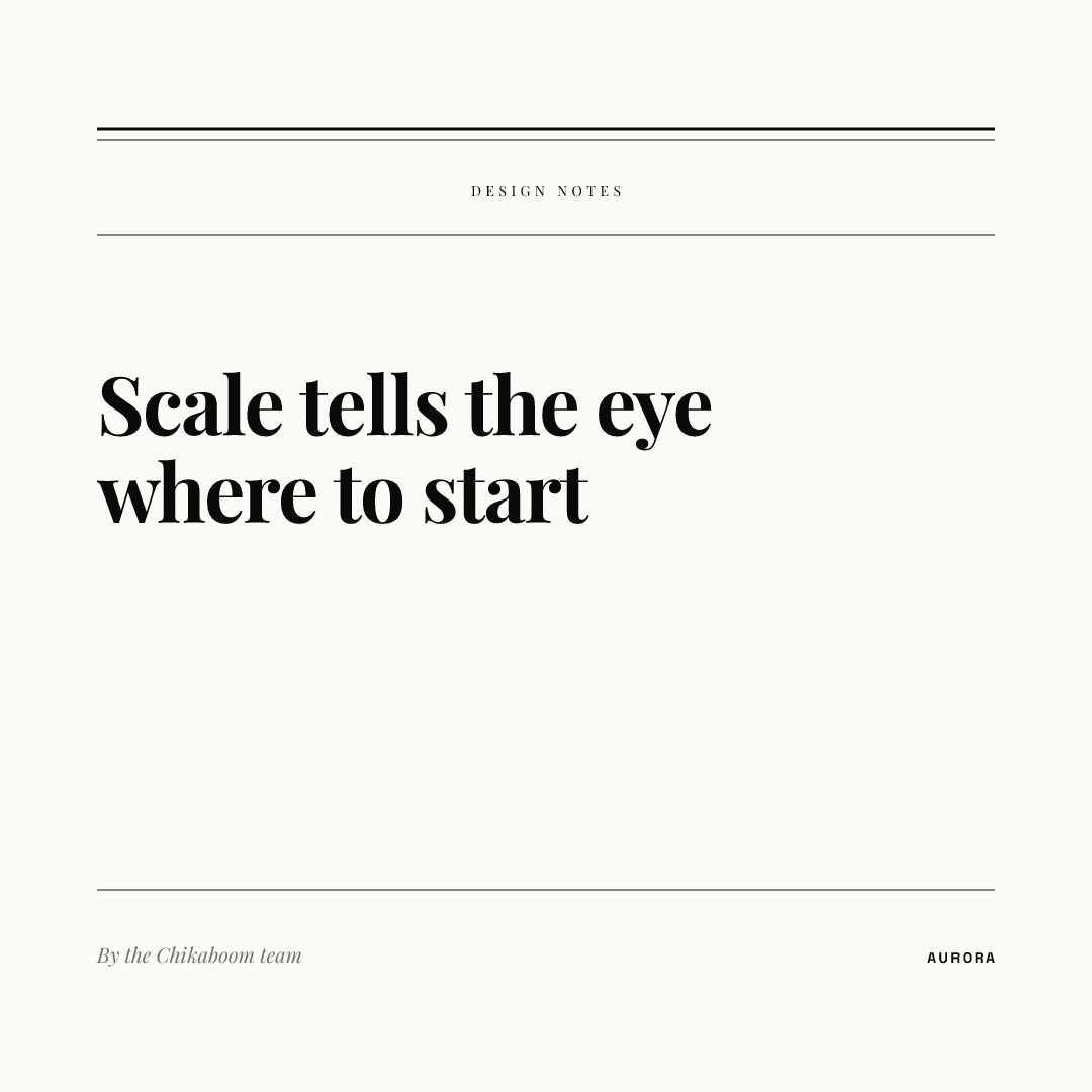
The editorial layout shows the payoff. The category label, headline and byline share one left edge, and the gaps between them repeat. Nothing looks placed by feel, so the eye moves down the stack without hunting. The same left edge also fits the top-left scanning habit above.
Principle 3: How much whitespace is enough?
NN/g describes whitespace as a way to balance a design and make it easier to scan and read, and recommends a consistent spacing system together with the proximity principle. Its proximity article adds that items near each other are perceived as a group, and that this can override similarity of color or shape.
For a post, that gives a simple rule of ours: space inside a group should be clearly smaller than the space between groups. A stat and its label belong together, so keep them close. Separate them from the footnote.
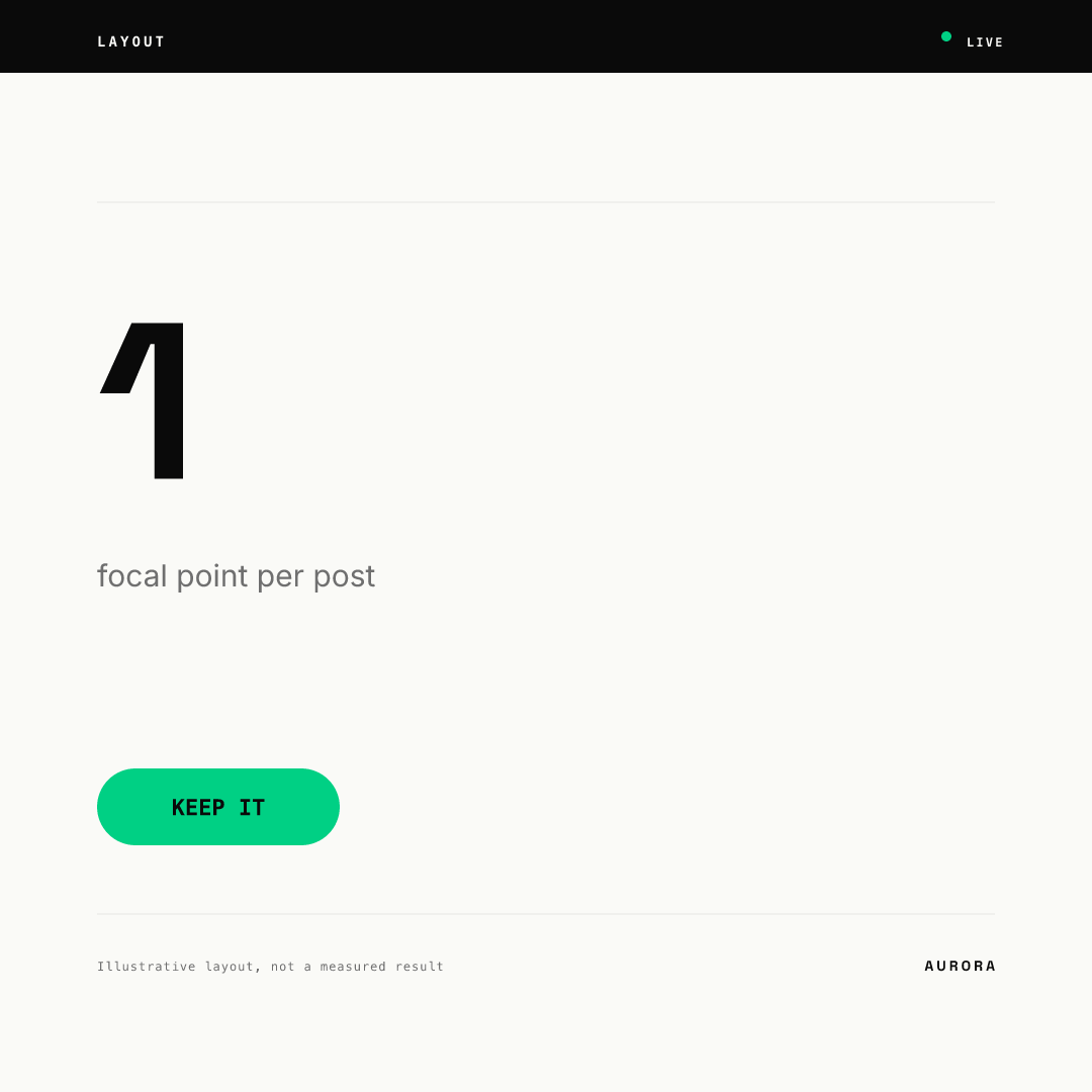
The data card puts the number and its label in one group, with generous room around them. The footnote is small and set apart. The number on this card is a layout illustration, not a measured result.
Principle 4: How do you emphasize one thing without shouting?
In our framing, emphasis is hierarchy turned up to its limit: one element, one treatment. NN/g also advises limiting the palette to a few colors and not relying on color alone, which matters for accessibility. See color contrast for social media and WCAG for ratios.
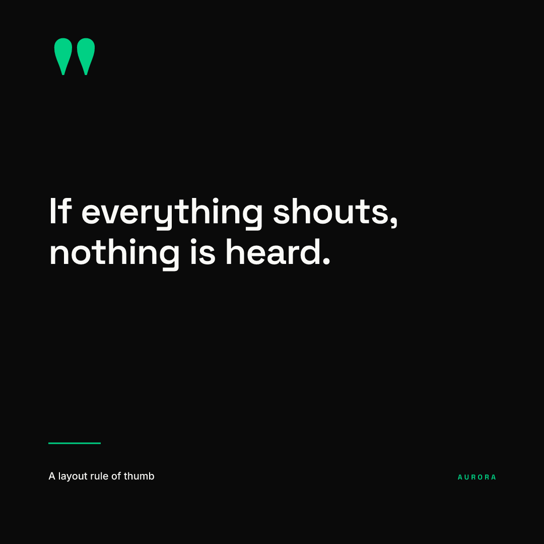
The brutalist quote is loud on purpose, but it still has only one loud thing. Style is a choice about weight and edges, and the hierarchy underneath is the same as in the quiet Swiss layout: one focal element and one small supporting line. For type choices that carry emphasis, see typography for social media posts.
What is a quick layout checklist?
| Check | Our rule of thumb | Principle |
|---|---|---|
| Squint test | One element survives the blur | Hierarchy |
| Text sizes | Two or three, no more | Hierarchy |
| Left edge | Label, headline and byline share it | Grid |
| Spacing unit | One base unit, only multiples of it | Grid |
| Group gaps | Inside a group smaller than between groups | Whitespace |
| Edges | Margin kept clear on all four sides | Whitespace |
| Emphasis | One treatment, used once | Emphasis |
| Contrast | Passes WCAG, not color alone | Emphasis |
Before you finalize, check your canvas size and safe areas in the social media image sizes guide. In our experience, platforms overlay their own interface on posts, so a layout that works at 1080 x 1080 can still lose its label at the edge. For Stories and Reels, see safe zones explained, which cites Meta's ad safe zones.
How do you keep a layout consistent across a team?
Layout decisions are easiest to keep when they are locked into a template rather than remembered. In Chikaboom, a designer builds the layout once, and the team only fills in text. Sizes, spacing and fonts stay fixed, and text shrinks inside its box instead of overflowing, so the hierarchy survives a longer headline. You can try this in the live demo.
Where do I go next in this cluster?
This page is the hub for layout. The sibling guides cover typography, color and contrast and image sizes, which together with layout make up the visual system for a post. To lock those decisions in for a whole team, read brand guidelines for small teams, and for a platform-specific application see LinkedIn post design.