Text on a social post needs a contrast ratio of at least 4.5:1 against its background, or 3:1 if the text is large. Those are the WCAG 1.4.3 numbers, and W3C states them as 4.5:1 for normal text and 3:1 for text of 18 point or larger, or 14 point bold. WCAG is written for web content, so applying it to the text inside your Instagram or LinkedIn graphics is our recommendation, not a platform rule.
Below: the formula, what each WCAG level asks for, and measured ratios from real renders of our AURORA demo brand. For the wider system, see our brand guidelines guide for small teams.
Does WCAG apply to social media images?
Not directly. WCAG covers web content, and a feed post is an image inside someone else's app. Two criteria still make it a sensible yardstick. 1.4.3 explicitly treats "images of text" as text, so a headline baked into a PNG is held to the same ratios as live text. And 1.4.5 Images of Text (Level AA) prefers real text over pictures of text, except where the presentation is essential or the image is customizable, with logotypes as the standard example.
In our experience, social networks rarely let you post live text over an image, so 1.4.5 is the honest caveat: a graphic with text in it is a compromise. Our recommendation is to keep the text short, repeat the key message in the caption and write alt text, and make the pixels meet 1.4.3 anyway.
What contrast ratio do you need, by level?
| Criterion | Level | Normal text | Large text | Applies to |
|---|---|---|---|---|
| 1.4.3 Contrast (Minimum) | AA | 4.5:1 | 3:1 | Text and images of text |
| 1.4.6 Contrast (Enhanced) | AAA | 7:1 | 4.5:1 | Text and images of text |
| 1.4.11 Non-text Contrast | AA | 3:1 | 3:1 | UI components and graphics needed to understand content |
Three details matter in practice:
- No rounding. W3C says computed values are not rounded, so 4.499:1 fails 4.5:1.
- Exemptions. Logotypes, purely decorative text, inactive controls and incidental text in photos with other visual content are exempt.
- Graphics. An icon, chart line or button outline that carries meaning needs 3:1 against its neighbor under 1.4.11, while text inside the graphic is judged under 1.4.3.
Large text is defined in points, which a PNG does not have. Our working assumption for a 1080 px graphic: treat a headline that is clearly big on a phone screen as large, and treat everything else, especially small eyebrow labels and footers, as normal text that needs 4.5:1.
How is contrast ratio calculated?
The formula comes from the WCAG definitions. Convert each 8-bit channel to 0 to 1, linearize it (divide by 12.92 when the value is at most 0.04045, otherwise raise (value + 0.055) / 1.055 to the power 2.4), then weight: relative luminance L = 0.2126 R + 0.7152 G + 0.0722 B. The ratio is (L1 + 0.05) / (L2 + 0.05), with L1 the lighter color. Pure white against pure black gives 21:1, the maximum.
Green carries most of the weight, which is why bright green and yellow look light and why a saturated green can feel punchy yet fail against white. WebAIM makes the same point: contrast is about luminance difference, not hue difference.
What do passing renders measure?
We rendered four templates from the AURORA demo brand at native size, then computed ratios with the formula above from the brand's palette values and from pixels sampled in the PNGs.
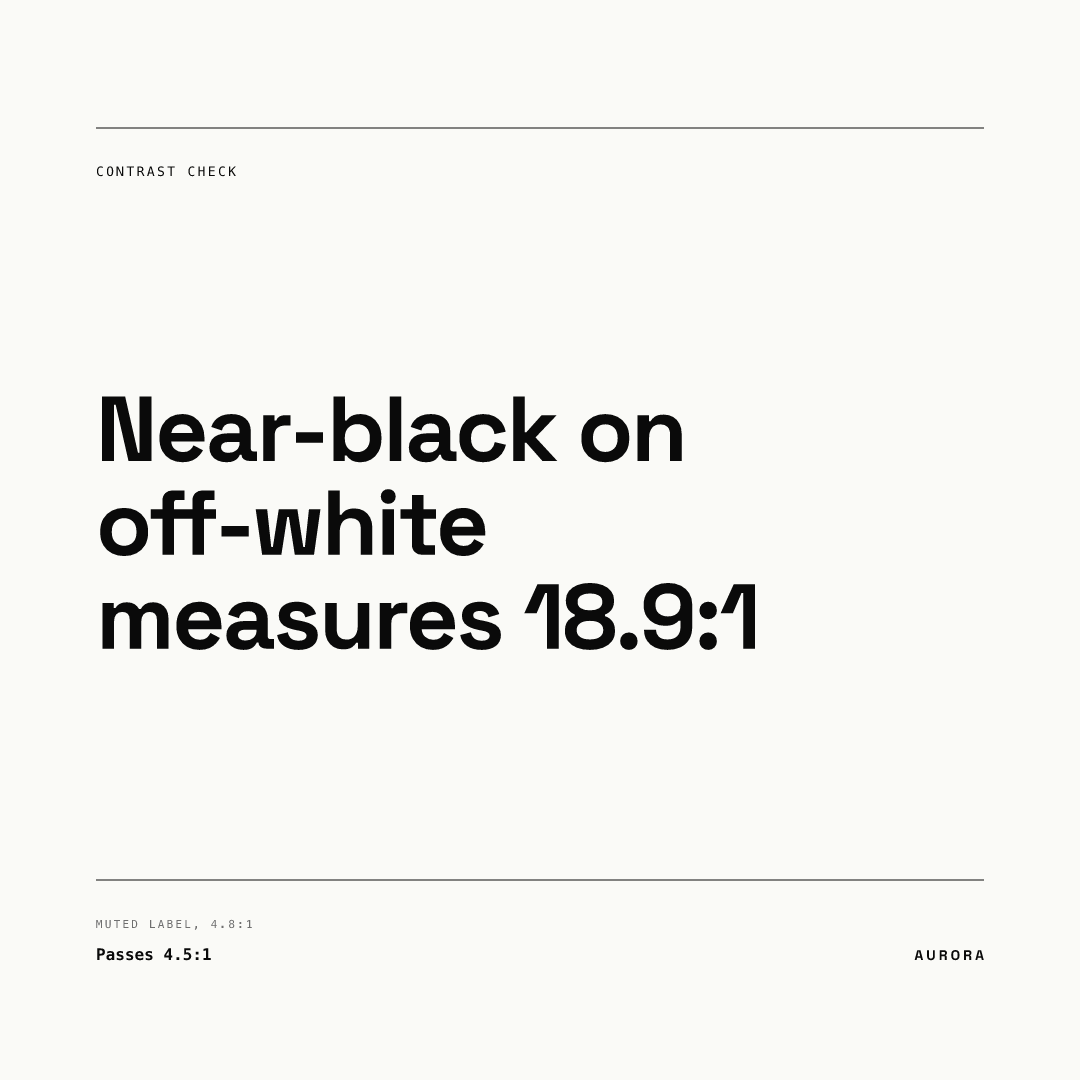
Near-black #0A0A0A on off-white #FAFAF7 measures 18.93:1. The small grey footer label uses #6F6F6F, and its sampled pixels measured 4.81:1 against the background. That clears 4.5:1 by a thin margin, and it is tiny text, so it is the one element on this post we would keep an eye on.
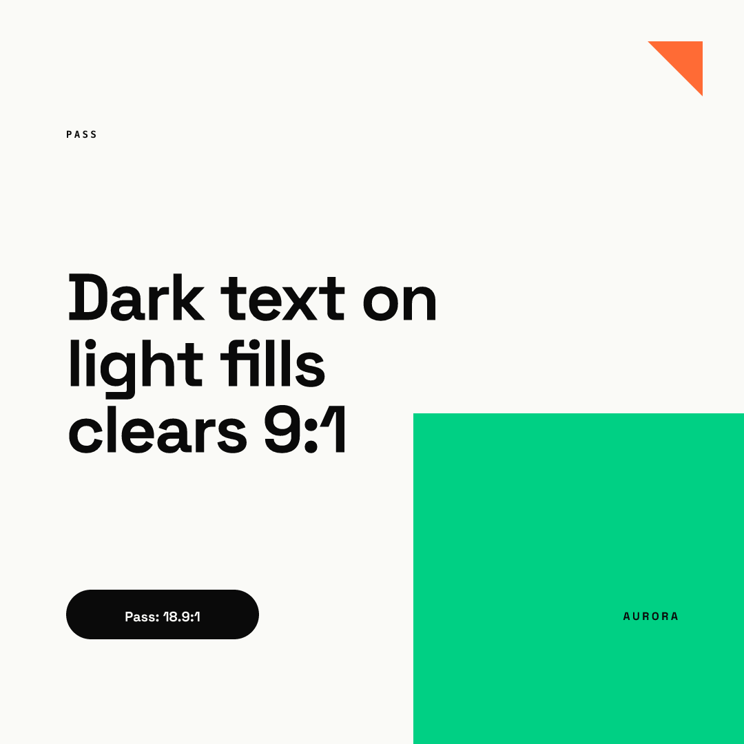
This one pairs near-black with two different light fills. The headline, the small PASS label and the pill's off-white text on black all measure 18.93:1 in the sampled pixels. The small AURORA wordmark sits on the green block, and near-black on green #00D084 measures 9.76:1. Green is a good fill for dark text and a poor color for text itself; the reverse pair, green on near-black, is the same 9.76:1 by symmetry of the formula.
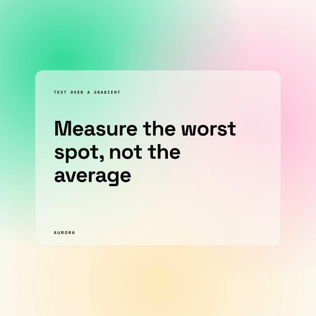
Text over a gradient has no single ratio, so measure the worst spot. WebAIM notes WCAG gives no method for gradients and suggests testing the area with the lowest contrast. The headline here sits on a frosted card; sampling every background pixel under it, the lowest ratio we sampled was between about 15 and 17, and the small eyebrow label over a greener patch sat near the low end of that range.
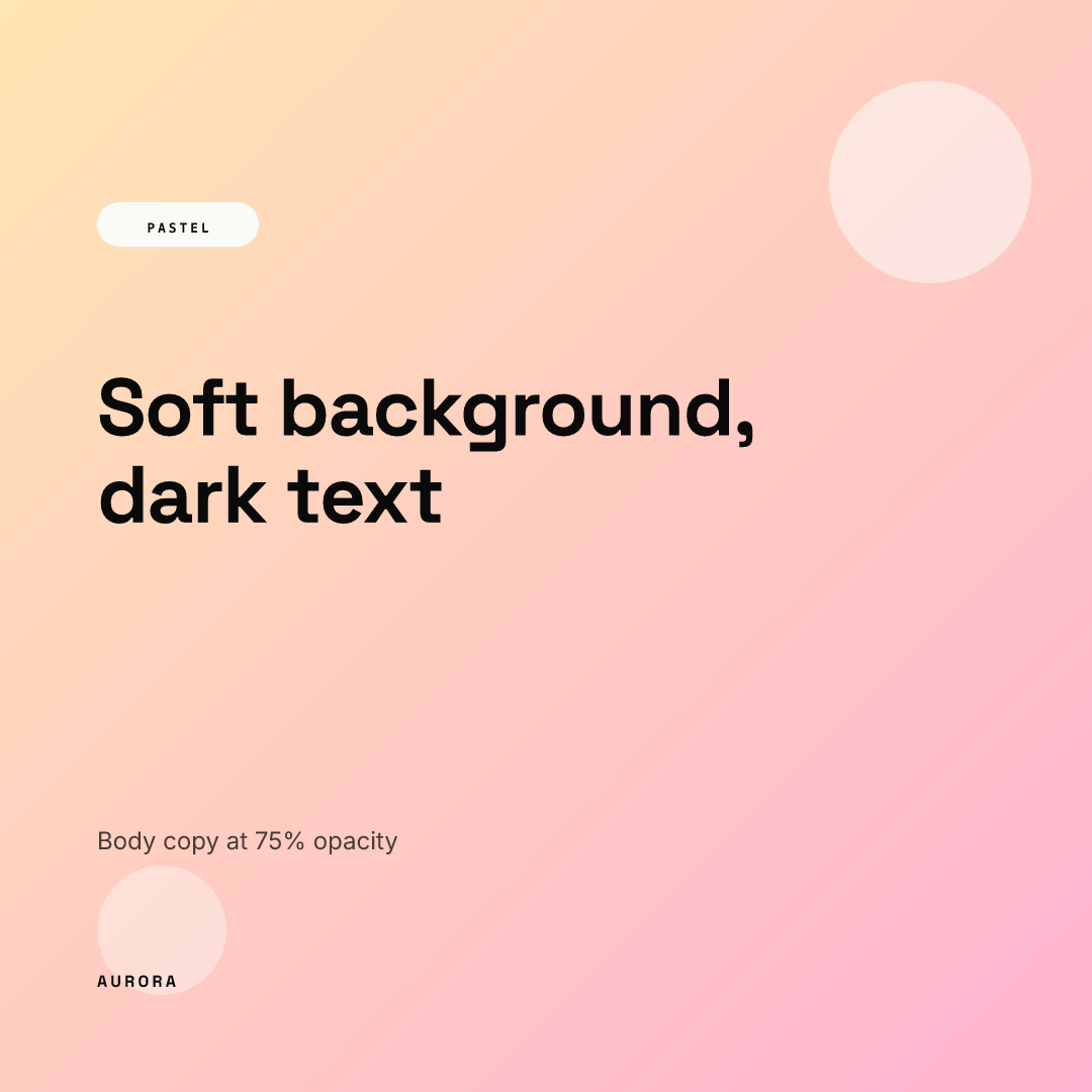
Opacity lowers contrast too. This template sets body copy at 75% opacity; the blended text color measured above 7:1 against the peach background, still comfortably above 4.5:1.
| Text | Background | Ratio | 4.5:1 | 3:1 |
|---|---|---|---|---|
| Near-black #0A0A0A | Off-white #FAFAF7 | 18.93 | Pass | Pass |
| Muted grey #6F6F6F | Off-white #FAFAF7 | 4.81 | Pass | Pass |
| Near-black #0A0A0A | Green #00D084 | 9.76 | Pass | Pass |
| Green #00D084 | Near-black #0A0A0A | 9.76 | Pass | Pass |
| Headline and eyebrow over gradient card (lowest sampled) | Frosted gradient | about 15 to 17 | Pass | Pass |
| Body at 75% opacity | Peach to pink gradient | above 7 | Pass | Pass |
Which combinations in our palette fail?
All four renders pass because the template colors are locked to a palette that was checked once, not each time someone writes a post. We did not render a failing post: the engine never lets a member pick a bad color, which is the point. But the same palette contains pairs that would fail if someone used them, computed with the same formula:
| Text | Background | Ratio | 4.5:1 | 3:1 |
|---|---|---|---|---|
| White #FFFFFF | Green #00D084 | 2.03 | Fail | Fail |
| Off-white #FAFAF7 | Green #00D084 | 1.94 | Fail | Fail |
| Green #00D084 | Off-white #FAFAF7 | 1.94 | Fail | Fail |
| Orange #FF6B35 | Off-white #FAFAF7 | 2.71 | Fail | Fail |
| Muted grey #6F6F6F | Pink #FFB3D1 | 3.02 | Fail | Pass |
The white-on-green row is the common trap. White text on a bright brand green looks fine on a good monitor and fails by more than half. Bright accent colors are best used as fills for dark text, as in the green block render above.
How do you check contrast on your own graphics?
- Write down every text and background pair in your template, including labels, footers and button text.
- Compute each ratio with the formula above or any WCAG contrast checker, using exact hex values, never screenshots of compressed images.
- Hold normal text to 4.5:1. Allow 3:1 only for text that is clearly large on a phone.
- For text over gradients or photos, measure the worst point under the text, or put a solid or semi-opaque panel behind it.
- Check opacity: a 60% text color is a different color.
- Do not rely on color alone to carry meaning, such as red versus green for good and bad (WCAG 1.4.1 Use of Color).
- Re-check when the brand palette changes, not when a post is written.
Typography decides which text counts as large, so read our typography for social media posts guide next, and see our layout principles for social media graphics for placing text over busy areas. If you want the checking built into the workflow, Chikaboom locks template colors so members fill in text without changing them; you can try it in the live demo.