A branded LinkedIn company Page needs three things: a 1512 x 256 px cover with its message kept clear of the edges, a 400 x 400 px square logo that reads on light and dark backgrounds, and feed posts built from one or two templates. Get those right and the Page looks like one company everywhere a member meets it: on the Page itself, in search and in the feed.
Every spec below comes from LinkedIn's own Help Center and Marketing Solutions pages, checked on October 5, 2026. Anything labeled as our recommendation is our judgment, not a LinkedIn rule. For post layouts in general, start with our LinkedIn post design guide.
What sizes does a LinkedIn company Page need?
LinkedIn publishes one spec page for Pages and Career Pages. Here is everything on it that affects branding.
| Asset | Size | Format and limit | LinkedIn's note |
|---|---|---|---|
| Logo | 400 x 400 px recommended, 268 x 268 px minimum | PNG or JPEG, 3 MB | Shown on light and dark backgrounds; transparent logos sit on white |
| Cover image | 1512 x 256 px (minimum and recommended) | PNG or JPEG, 3 MB | May be trimmed horizontally or vertically to fit the screen |
| Page post image | 1200 x 627 px (1.91:1), 200 px minimum width | Not stated on this page | Not cropped on mobile; other ratios get light white padding |
| Life tab main image | 1128 x 376 px | PNG, JPEG or a Vimeo or YouTube link, 3 MB | None |
| Life tab custom module | 502 x 282 px | PNG, JPEG or a Vimeo or YouTube link, 3 MB | None |
| Company photos | 900 x 600 px recommended, 264 x 176 px minimum | PNG or JPEG, 3 MB | Photos at the minimum appear small |
LinkedIn also says that for the best resolution you should use the recommended dimensions and pick a high-resolution JPEG over a PNG. If your cover looks blurry, it suggests uploading a version with a larger file size. Our LinkedIn image sizes guide compares these with profile and ad sizes.
How do you design a cover image that survives cropping?
Treat the cover as a strip that will lose some of its edges. LinkedIn's spec page says the cover might be trimmed horizontally or vertically, asks for limited text, and tells you to keep key details away from the edges, especially the lower-right corner. It also recommends putting important information in the center so it stays visible on every screen size. LinkedIn does not explain why the lower-right corner is singled out, and it publishes no safe-zone measurements.
Our recommendation, since there is no official safe zone:
- One line of text at most, and make it a promise rather than a slogan list.
- Keep text vertically centered with a wide margin on every side, and leave the lower-right corner empty.
- Do not repeat your logo in the cover. The logo already sits next to it on the Page.
- Use one brand color field or a calm photo. Busy photos fight with small text at phone size.

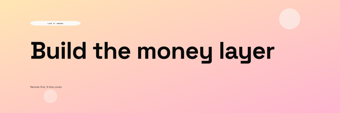
In this render the headline sits on one line in the vertical middle, ends well before the right edge, and nothing but a faint circle sits near the lower-right corner. If LinkedIn trims a sliver from any side, the message still reads.
How should a logo work on a LinkedIn Page?
Your logo shows up far more often than your cover. It appears beside every post, in comments, in search results and in job listings, usually at a small size. LinkedIn says the logo is displayed on both light and dark backgrounds, and that a transparent logo is shown on white.
That last point decides the file. A dark wordmark on a transparent background can look fine in light mode and still sit on a white tile in dark mode. Our recommendation:
- Upload a square version of your mark on a solid brand-color background, at 400 x 400 px.
- Use the symbol, not the full wordmark, if the name becomes unreadable when you shrink the file to the size of a fingertip.
- Leave padding around the mark, so a circular or rounded crop in any view does not cut it.
- Check it next to a post in both light and dark mode before you publish.
How do you make Page posts look like one brand?
Use the size LinkedIn recommends for Page post images, 1200 x 627 px at 1.91:1, and build two or three layouts that share fonts, colors and margins. LinkedIn notes that images are not cropped on mobile and that other ratios appear in full with light white padding, so square and portrait posts also work. The two renders below are from our AURORA demo brand at 1200 x 627 px. The figures and quote are placeholders for layout only.
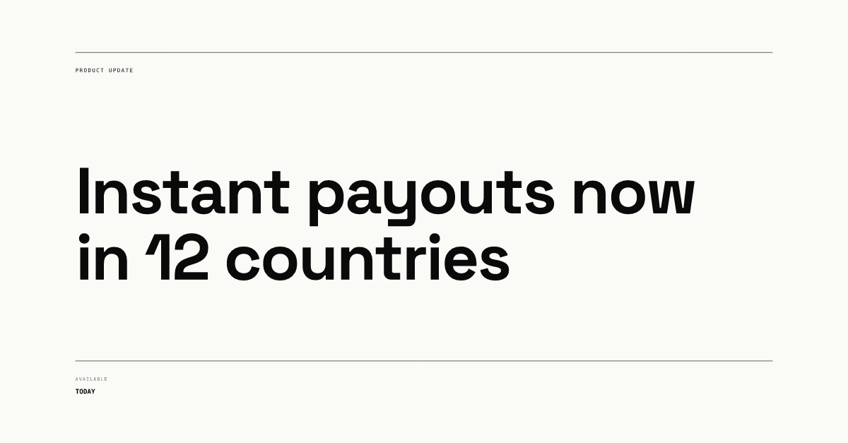
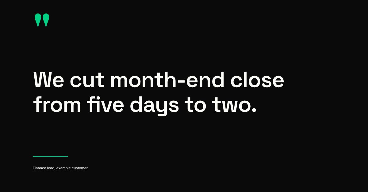
The update and the quote look different, yet a reader can tell they come from the same company: same typeface, same left margin, same small caps for labels. That is the whole trick. In Chikaboom, a designer builds each layout once and the team fills only the text fields, with text shrinking inside its box rather than spilling over the margin. You can try it in the live demo.
For which post types to template first, see the four layouts in our LinkedIn post design guide. If your Page posts often promote openings, our guide to hiring post design covers role cards in detail.
What else makes a LinkedIn Page look complete?
LinkedIn's Pages best-practices page claims that Pages with complete information get 30% more weekly views. It lists the parts of a complete Page as a logo, a cover image, an overview, organization details and a call-to-action button. That is LinkedIn's own figure about its own platform, so treat it as a direction rather than a promise.
Two more branded surfaces are easy to forget:
- Featured posts. A Page super admin can feature up to six posts at the top of the Home tab. Job posts, event posts and targeted posts cannot be featured. Pick posts that show your templates at their best, since they are the first posts a visitor sees.
- The Life tab. If you have Career Pages, the main image is 1128 x 376 px. It is a wider-than-usual strip, so the same cover rules apply: one line, centered vertically, nothing critical at the edges.
How often should a company Page post, and who sees it?
LinkedIn says companies that post weekly see a 2x lift in engagement. Our recommendation for a small team is one to three posts a week, rotating two or three templates so no single layout wears out.
Your employees are the fastest audience to reach. LinkedIn lets a Page admin use Notify employees on an important post. The two official pages disagree on how often: the Help Center says an admin can notify employees once per day, while the best-practices page says up to once a week. The Help Center also requires two or more associated employees, excludes targeted posts, and notes that delivery can take several hours. Our recommendation is to reserve it for posts you would want employees to share, and to give them graphics they can post themselves. Our guide to employee advocacy graphics shows how.
Checklist: is your LinkedIn Page on brand?
| Check | Target | Source |
|---|---|---|
| Logo file | 400 x 400 px, solid background, readable when tiny | LinkedIn spec, our recommendation for the background |
| Logo in dark mode | Looks intentional, not a white tile | LinkedIn says it shows on light and dark |
| Cover image | 1512 x 256 px, one line, centered vertically | LinkedIn spec |
| Cover edges | Nothing important at the edges or lower-right corner | LinkedIn advice |
| Page post template | 1200 x 627 px, same fonts, colors and margins | LinkedIn spec, our recommendation for the template |
| Featured posts | Up to six of your best-designed posts | LinkedIn Help |
| Life tab image | 1128 x 376 px, same rules as the cover | LinkedIn spec |
| Page details | Overview, organization info and call-to-action button filled in | LinkedIn best practices |
If the logo, cover and posts share one typeface family and two or three colors, the Page will read as one brand even before anyone opens the About tab.