Our recommendation: design each LinkedIn post around one idea, one format and one image that can be read in about a second. In our experience, a B2B team gets more from a small set of repeatable layouts than from a new design every time.
This is our hub for LinkedIn design. Sizes live in the LinkedIn image sizes guide, carousels in the LinkedIn carousel guide. Platform facts below link to LinkedIn's own pages, checked on October 2, 2026. Everything labeled as our recommendation is our judgment, not a LinkedIn rule.
What stops the scroll on LinkedIn?
LinkedIn does not publish a formula for it. What it does say, on its Pages best-practices page, is that images typically get a 2x higher comment rate, and that custom collages of 3 to 4 images do especially well. The same page credits regular video with 5x more engagement and live video with 24x, so images are one option among several formats, not the only one. Treat these as LinkedIn's claims about its own platform, not guarantees for your account.
Our working assumption is that a post stops the scroll when three things are true at phone size: the main claim is readable without tapping, the layout looks like it belongs to a brand you recognize, and the image says something the text above it does not repeat. The rest of this guide turns that into decisions.
Which post format should you choose?
Pick the format by the size of the idea, not by habit.
| Format | Use it when | What LinkedIn says |
|---|---|---|
| Single image | One claim, number, quote or announcement | Page posts: 1200 x 627 px, 1.91:1, PNG or JPEG, 3 MB |
| Document (carousel) | A process, a framework, 4 or more steps | PDF, PPT, PPTX, DOC or DOCX, up to 100 MB and 300 pages, same size on every page |
| Text only | A short opinion that needs no visual | No spec; our recommendation is to save it for genuine opinions |
| Image collage | A launch or event with several visuals | 3 to 4 image collages called out by LinkedIn |
Once a document is posted, only its description can change. LinkedIn notes that moving elements flatten into still images, and asks you to give the document a title that tells members what it covers. If the idea is a sequence, read how to design LinkedIn carousels before opening a design tool.
How should a B2B team lay out a LinkedIn image?
These are our rules, tested on our own templates rather than published by LinkedIn.
- One idea per image. If you need "and", make two posts or a document.
- Headline of about 10 words or fewer. Everything else is secondary.
- Keep text at least 5 percent of the width from every edge. On mobile, LinkedIn does not crop images; those with other ratios show whole, with light padding. Our reasoning: nothing guards text near the edge, so keep it inside the margin.
- Use two colors and one typeface family from your brand, with strong contrast between text and background.
- Put the logo small and in the same place every time. Recognition builds through repetition.
- Do not repeat the post copy in the image word for word. The image is the hook, the copy is the explanation.
For size, our recommendation for personal and organic posts is a 1080 x 1080 square, since LinkedIn publishes no personal-post size. Page posts can follow LinkedIn's 1200 x 627 recommendation. Vertical 4:5 is a supported ratio for ads, at 720 x 900 px, mobile only.
Which four post types should you template first?
Below are four renders from our AURORA demo brand, each at 1080 x 1080 px. In our view, they cover most of what a B2B account posts. The figures and quote are placeholders for layout only.
Stat card: when you have a number
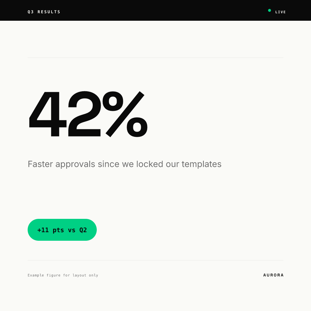
Use it for results, benchmarks, survey findings and milestones. The number is the headline, so make sure it is real and sourced, and put the source in the footnote. Skip it when the number needs three sentences of context.
Quote card: when someone else says it better
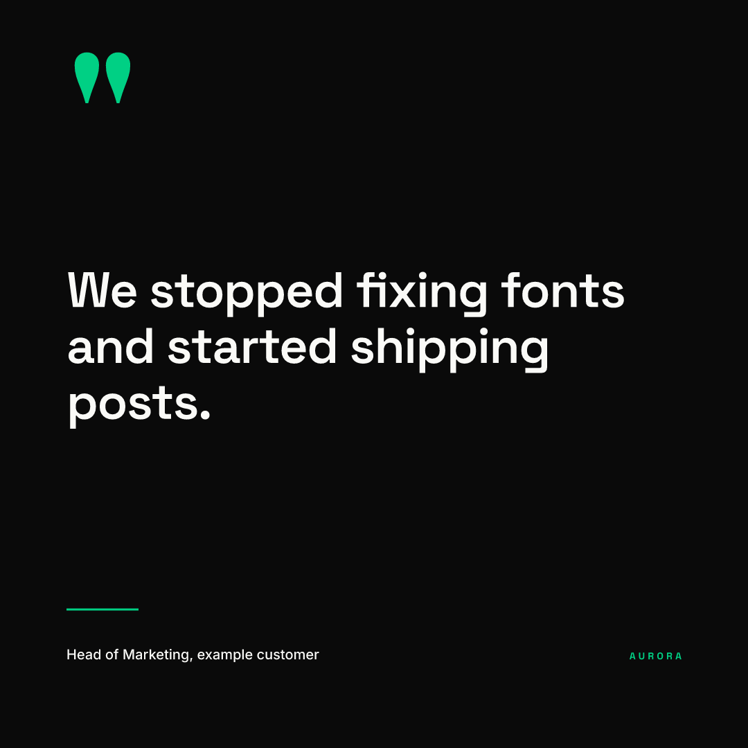
Use it for customer quotes, expert comments and event takeaways. Keep the quote to one sentence and always name the person and role. Skip it for anything you wrote yourself and attributed to "the team".
Announcement: when something shipped
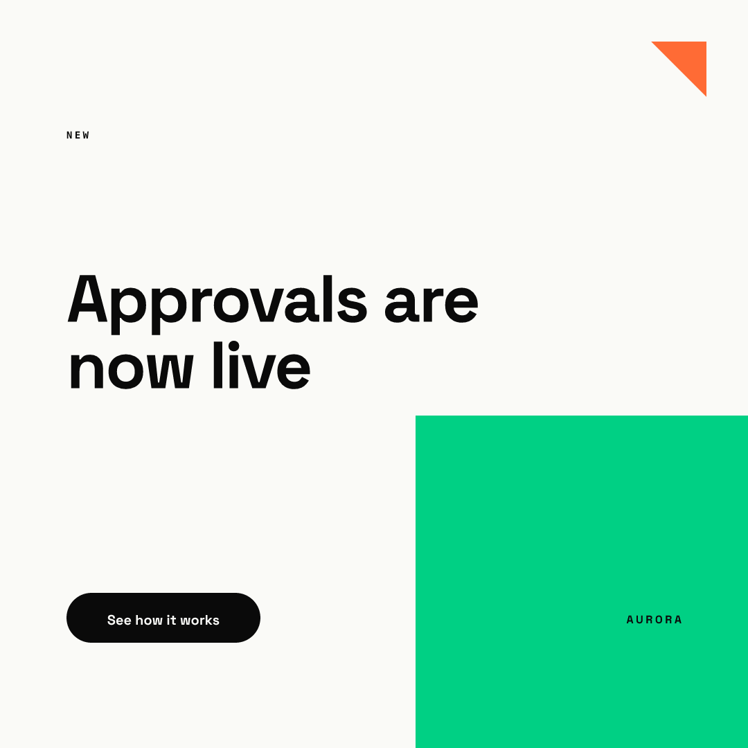
Use it for launches, hires, events and webinars. Lead with what changed for the reader, not the feature name, and end with one action. Skip it if there is nothing to click or do, and write a plain text post instead.
Editorial: when you have a point of view
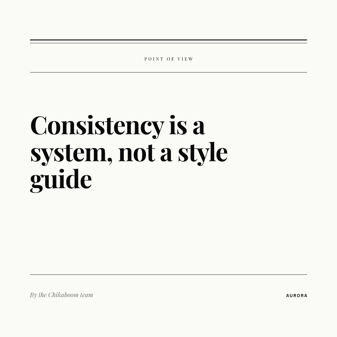
Use it for opinions, essays and thought leadership. In our view, a calmer serif look signals a considered argument. Pair it with a longer caption that makes the case. Skip it for time-sensitive news, where the bold announcement layout reads faster.
How do you keep a LinkedIn feed looking like one brand?
Templates do the work. Fix the sizes, fonts, colors and margins once, then let people change only the words. In Chikaboom, a designer builds each layout once, the team fills the text fields, and text shrinks inside its box rather than overflowing. You can try the four layouts above in the live demo.
In our experience, a repeatable system suits B2B teams, where marketing, founders and sales all post and the feed should still look like one company. Our B2B SaaS content strategy explains how to split content types across a month, and the guide on repurposing blog posts for LinkedIn shows how one article becomes a stat card, a quote and a document.
How should the caption and image work together?
LinkedIn publishes no rule for how a caption and an image should split the message, and we did not find a published character cutoff for where posts collapse behind a see-more link. These are our recommendations, not LinkedIn specs.
- Let the image carry the claim and the caption carry the reason. If the stat card says 42%, the caption explains where it came from.
- Put the most useful sentence first in the caption, since the start is what most readers see before deciding to expand it.
- Do not paste the headline into the caption as the opening line. Open with context the image lacks.
- Add the source, date or link in the caption, so the image stays clean.
How often should you post?
LinkedIn's Pages page says companies posting weekly see a 2x lift in engagement with their content. It also suggests mixing custom images, video, documents and scheduled posts. Our recommendation is a rotation of the four layouts above across the week, so no single format wears out.
Checklist before you publish
- One idea, one image, headline of about 10 words or fewer.
- Format matches the idea: image for a claim, document for a sequence.
- Text sits inside the margins at your chosen size (1080 x 1080 or 1200 x 627).
- Any number has a source and a date in the footnote or caption.
- Logo, fonts and colors come from the template, not from memory.
- The image adds something the caption does not repeat.
- A document has a title and one consistent page size.