A LinkedIn carousel cover slide gets swipes when it makes one specific promise that someone can read in about a second on a phone: what they will get, and why it is worth the next page. The 10 patterns below are the ways we phrase that promise most often, each rendered from our AURORA demo brand at 1080 x 1350 px.
LinkedIn publishes no data on which cover styles perform best, so treat these as our recommendations, not platform rules. Facts about LinkedIn below link to its own pages, checked on October 5, 2026.
What makes a carousel cover slide work?
A carousel on LinkedIn is a document post, and the cover is its first page. It is the only page people see before they decide to swipe. LinkedIn's carousel ad guidance says the first card is fully visible in the feed and that short carousels should establish the theme at the start. That page is written for ads, but the logic carries over to document posts: the cover has to state the topic on its own.
In our experience, a cover that works has five parts:
- A specific promise. "7 checks before a post goes live" beats "Our process".
- Meaningful words first. Nielsen Norman Group found that people scanning lists often see only the first two words of a heading or link. Lead with the number, the topic or the outcome, not "Introducing" or "Here is".
- A reason to continue. A count ("7 steps"), a gap ("Three causes, three fixes") or a time box ("in 10 minutes").
- A small, fixed brand cue. Logo or wordmark in the same corner on every carousel.
- A swipe cue. A page counter like 1 / 8 or an arrow tells people there is more.
What are 10 cover slide patterns that get swipes?
Each pattern below shows the render, when to use it and the trap to avoid. The figures and claims in the renders are placeholders for layout.
1. The numbered promise
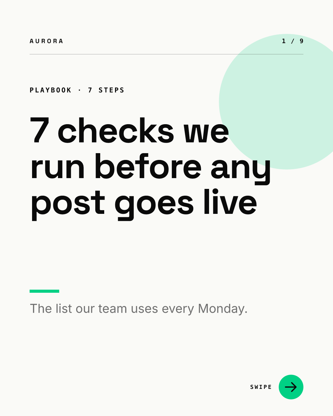
Use it for lists, steps and checklists. The number sets expectations and makes the length feel finite. Make sure the count matches the slides: 7 checks plus a cover and a closing page is 9 pages, as the counter shows.
2. The big number
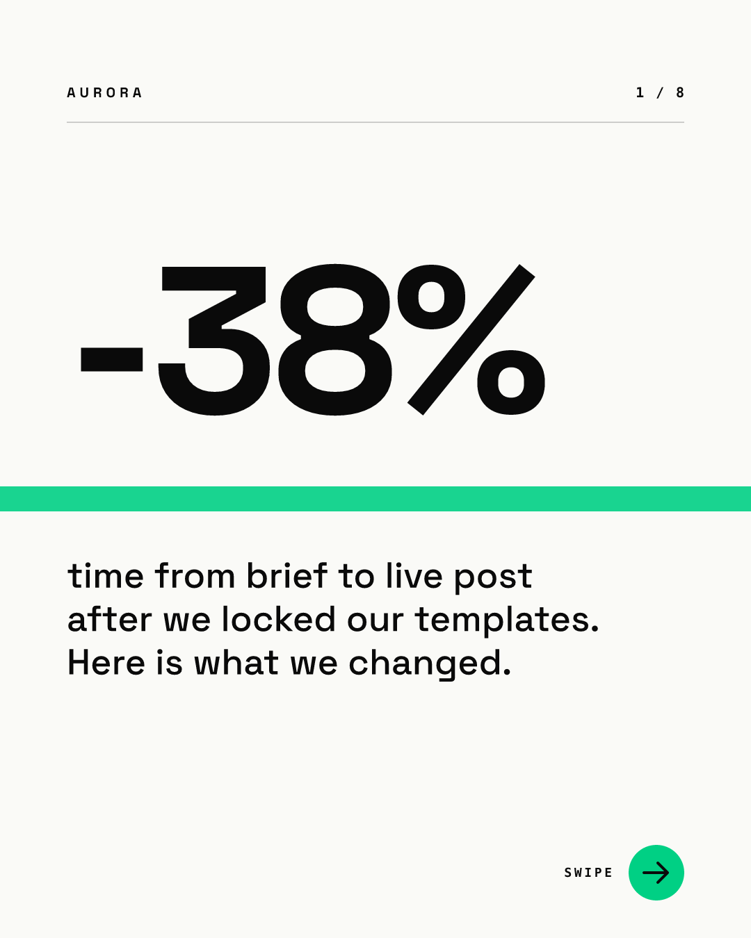
Use it when the result is the story. The number stops the eye, and the label turns it into a promise of how you got there. Only use a real, sourced figure, and name the source on a later slide or in the post description.
3. The question
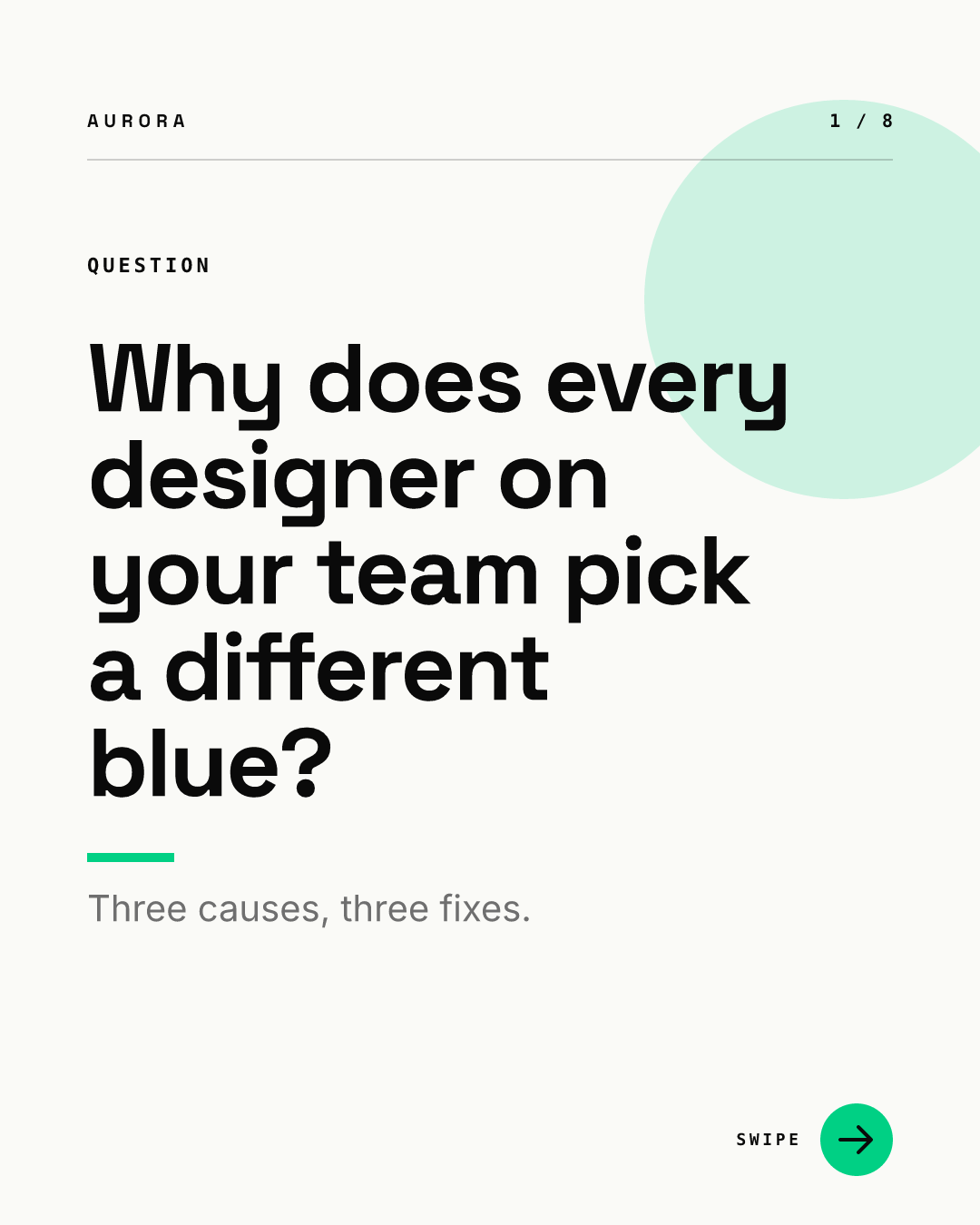
Use it when your audience already feels the problem. A good question names a situation the reader recognizes. Avoid questions with an obvious yes or no answer, and promise the answer in the subline.
4. The mistake
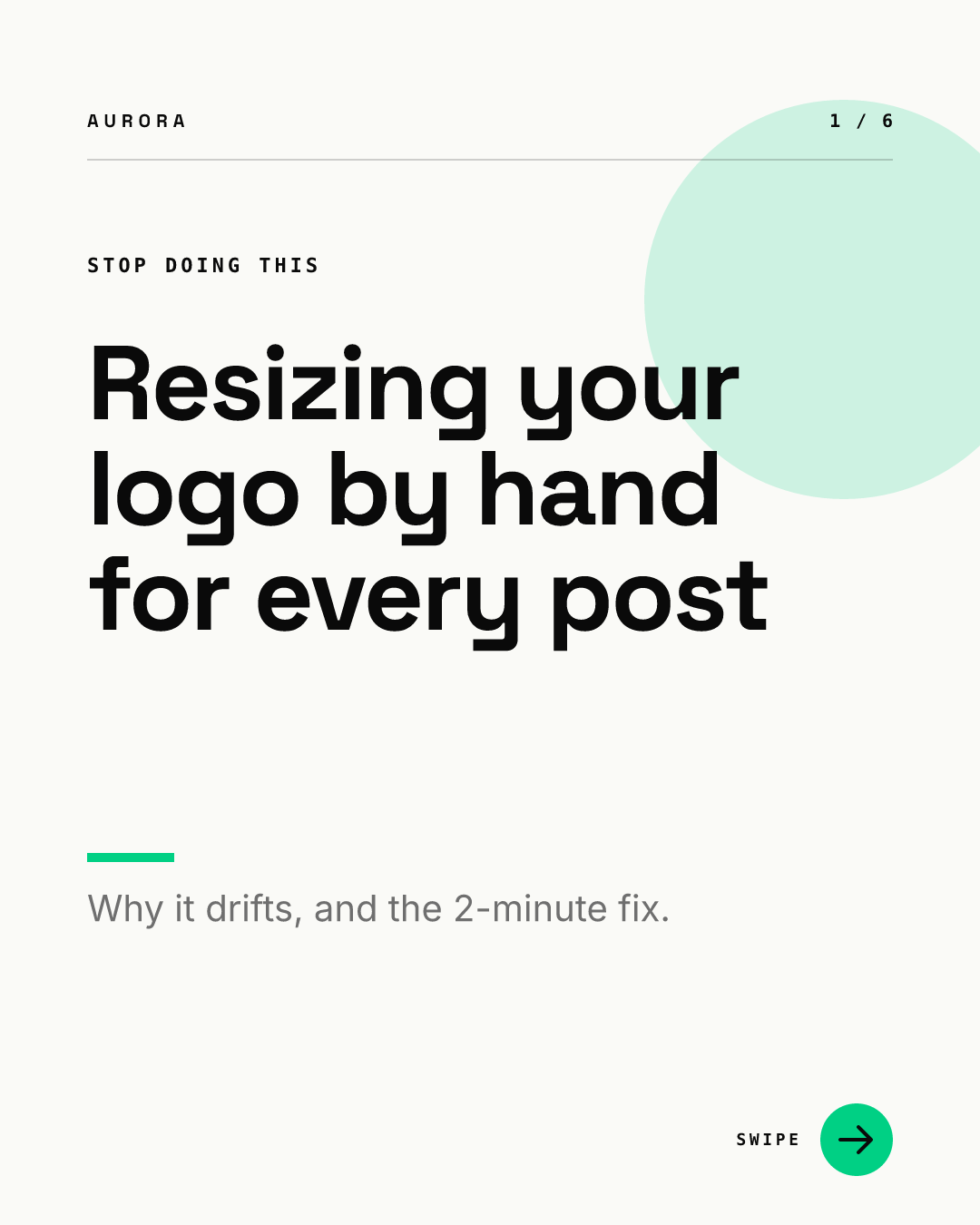
Use it for habits your audience has and should drop. Name the behavior, not the person. Pair it with a fix, or the carousel reads as a complaint.
5. Before and after
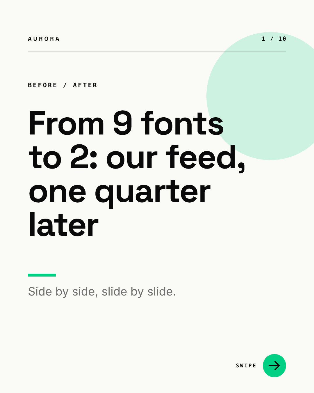
Use it for redesigns, process changes and case studies. The "from X to Y" shape gives the reader both ends of the story at once. It needs visual proof inside, so plan paired before and after slides.
6. The how-to with a time box
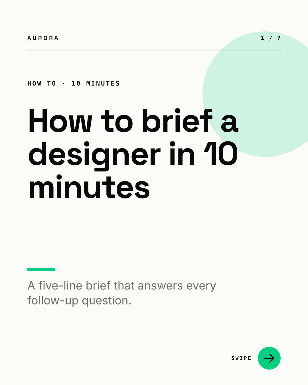
Use it for procedures. The time box lowers the cost of reading. Keep the promise honest: if the method takes an afternoon, say so.
7. Myth versus fact
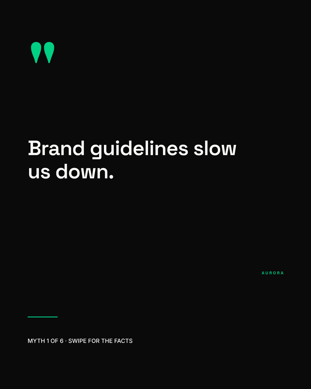
Use it to correct a belief your audience holds. Quoting the myth as if someone said it makes the tension visible. Label it clearly as a myth on the cover, so nobody screenshots the slide as your opinion.
8. The named framework
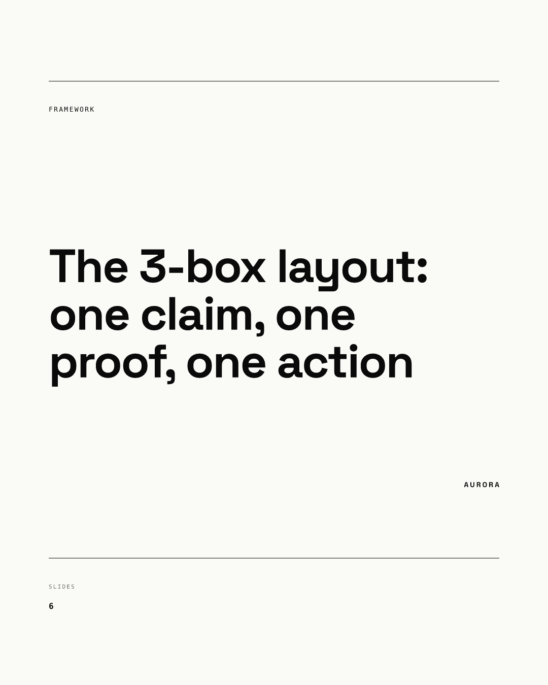
Use it when you have a model people can reuse. A name makes it memorable and easy to share. Spell out the parts on the cover, since a framework name alone promises nothing.
9. The give-away checklist
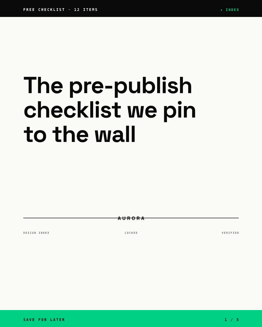
Use it for reference material people will come back to. "Save for later" fits here, because readers can download a document as a PDF. Make the checklist complete inside the carousel rather than gating it behind a comment.
10. The point of view
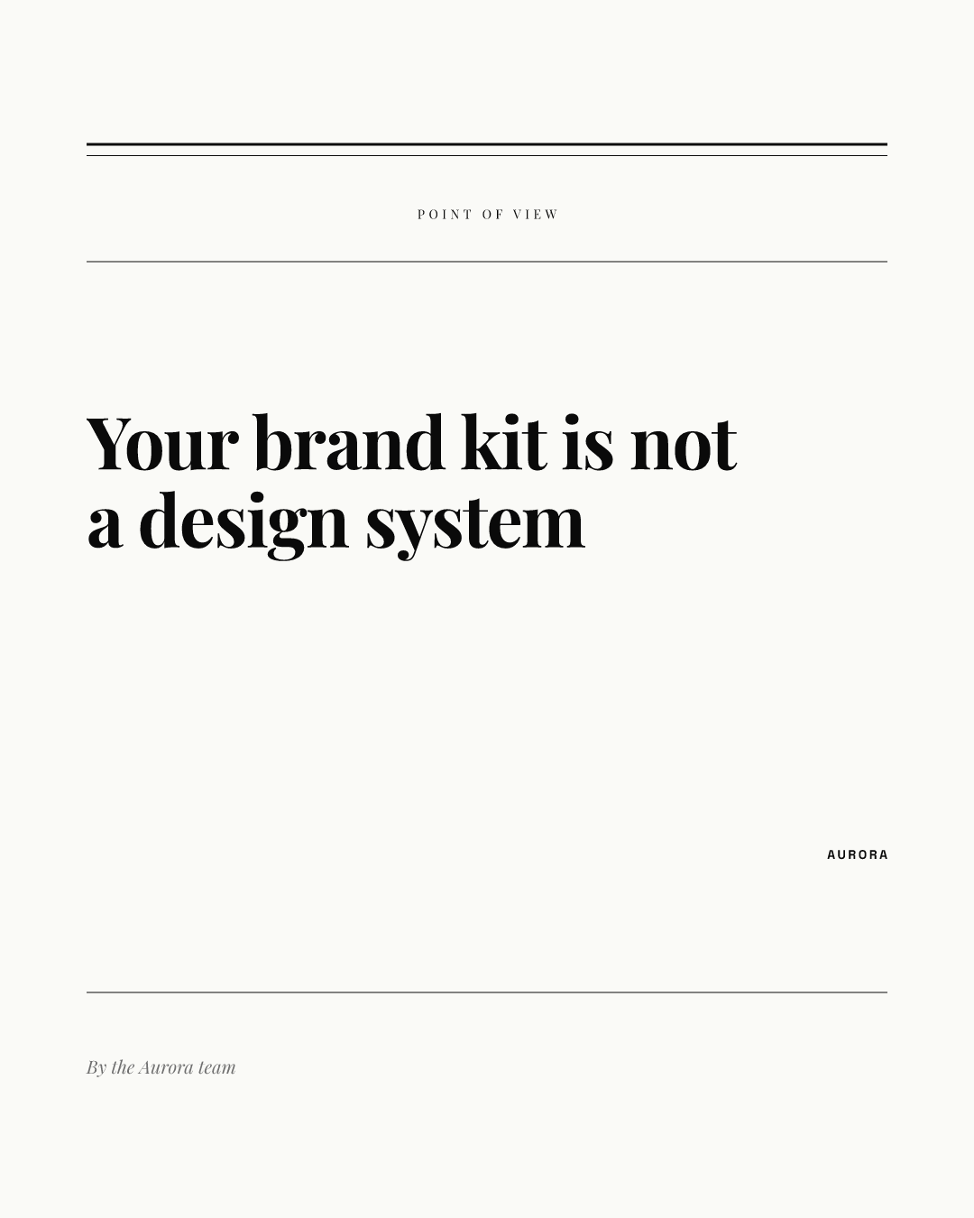
Use it for opinions and arguments. A quieter serif layout signals that the carousel makes a case rather than a list. The headline must be an actual claim someone could disagree with.
Which pattern fits which carousel?
| Pattern | Best for | Signal word on the cover | Main risk |
|---|---|---|---|
| Numbered promise | Lists, steps | A number | Count does not match the slides |
| Big number | Results, research | The figure | Unsourced or vague number |
| Question | Known pain points | Why, how, what | Yes or no questions |
| Mistake | Habits to drop | Stop, avoid | Sounds like blame |
| Before and after | Redesigns, case studies | From, to | No visual proof inside |
| How-to with time box | Procedures | How to, in X minutes | Overpromising speed |
| Myth versus fact | Correcting beliefs | Myth | Myth read as your view |
| Named framework | Reusable models | The X method | Name without parts |
| Give-away checklist | Reference material | Checklist, template | Gated content |
| Point of view | Opinions | A claim | No real claim |
How big should the text on a cover slide be?
LinkedIn gives no minimum size for document text, but its document ads best practices advise against small fonts and ask for accessible color combinations. For contrast, the W3C sets 4.5:1 for normal text and 3:1 for large text under WCAG 1.4.3. Our color contrast guide shows how to check a palette.
Our recommendation for a 1080 x 1350 cover: a headline of about 10 words or fewer that fills three to five lines of the width, one short subline, and small labels only for the eyebrow, counter and brand. In the renders above, every headline stays inside its margins because the template shrinks long text to fit its box; in Chikaboom that is how a cover template behaves when someone types a longer headline than the designer planned. For type choices in general, see our typography guide for social posts.
What should a cover slide never do?
- Say "Swipe" with nothing else. The arrow or counter does that job; the words should carry the promise.
- Repeat the post description word for word. Let the cover hook and the description explain.
- Use a stock photo with no text. A picture alone rarely tells people what the pages contain.
- Bury the topic under a long eyebrow or logo lockup.
- Promise something the last page does not deliver.
How do you test which cover works?
For ads, LinkedIn reports clicks and impressions by card in carousel ads and suggests testing card order. For organic document posts, our recommendation is simpler: rotate two or three patterns from the table across similar topics for a month and compare the results you can see for each post. Change only the cover pattern between tests, not the topic and the cover at once.
Once the cover works, the rest of the carousel needs the right length and a clean file. Read how many slides a LinkedIn carousel should have and how to upload a PDF carousel. For where carousels sit among other post formats, start at our LinkedIn post design hub, and our older LinkedIn carousel guide covers content formats. To try a cover template with your own headline, open the live demo.