Our recommendation is 5 to 10 slides for a LinkedIn carousel, counting the cover and the closing slide, with one idea per slide. LinkedIn allows up to 300 pages in a document post but gives no ideal length for organic carousels; the closest official number is its advice to keep document ads under 10 pages.
Below is what LinkedIn actually says, what usability research adds, and a table of slide counts by carousel type that we use when planning. Platform facts link to LinkedIn's own pages, checked on October 5, 2026.
What does LinkedIn actually say about carousel length?
LinkedIn publishes several numbers, and they apply to different formats. None of them is a rule for how long an organic carousel should be.
| Format | LinkedIn's number | What it means | Source |
|---|---|---|---|
| Document post (organic) | Up to 300 pages, 100 MB | A hard limit, not a target | Upload and share documents |
| Document ad | Under 10 pages recommended | Advice for paid documents | Document ads specs |
| Document ad | "Avoid lengthy documents" | The player has no search | Document ads best practices |
| Carousel ad | 2 to 10 cards, start with 3 to 5 | Image cards, not a PDF | Carousel ads best practices |
| Carousel ad | 6 or more cards for richer stories | Test long and short separately | Carousel ad tips |
The two official pages on carousel ads lean slightly differently. The Help Center version says to start with 3 to 5 cards; the Marketing Solutions page agrees but adds that longer carousels suit richer stories and should be tested on their own. We read them as consistent: start short, go longer when the content needs it.
What does usability research say about swiping?
Nielsen Norman Group studied carousels in mobile apps and sites and found that most people stop after 3 to 4 items, recommending that the last item be reachable in 3 to 4 swipes. That research is about product carousels and app home screens, not LinkedIn documents, so do not treat it as a LinkedIn number.
What it does tell you is that attention drops with every swipe. Our takeaway: put the most useful idea early, and make sure a reader who stops at slide 4 still leaves with something.
How many slides for each type of carousel?
These counts are our recommendations, including the cover and the closing slide. They come from planning carousels on our own templates, not from LinkedIn.
| Carousel type | Slides | Structure |
|---|---|---|
| Single insight with proof | 4 to 5 | Cover, claim, evidence, takeaway, closing |
| Numbered list or checklist | List items + 2 | Cover, one item per slide, closing |
| How-to | 6 to 8 | Cover, outcome, 3 to 5 steps, closing |
| Case study | 6 to 8 | Cover, situation, problem, change, result, lesson, closing |
| Data story | 5 to 7 | Cover, 3 to 5 charts or figures (one per slide), closing |
| Framework | 5 to 7 | Cover, the model, one slide per part, example, closing |
| Before and after | 6 to 10 | Cover, then pairs of before and after slides, closing |
If a list needs more than 8 items, that is usually two carousels. In our experience, a "12 tips" carousel at 14 pages often has three strong tips and nine fillers; publishing the strong ones first and saving the rest for a follow-up tends to read better.
What should every slide position do?
A carousel has three jobs: stop the scroll, deliver, and close. Here is how a 7-slide checklist carousel maps to that, rendered from our AURORA demo brand at 1080 x 1350 px.
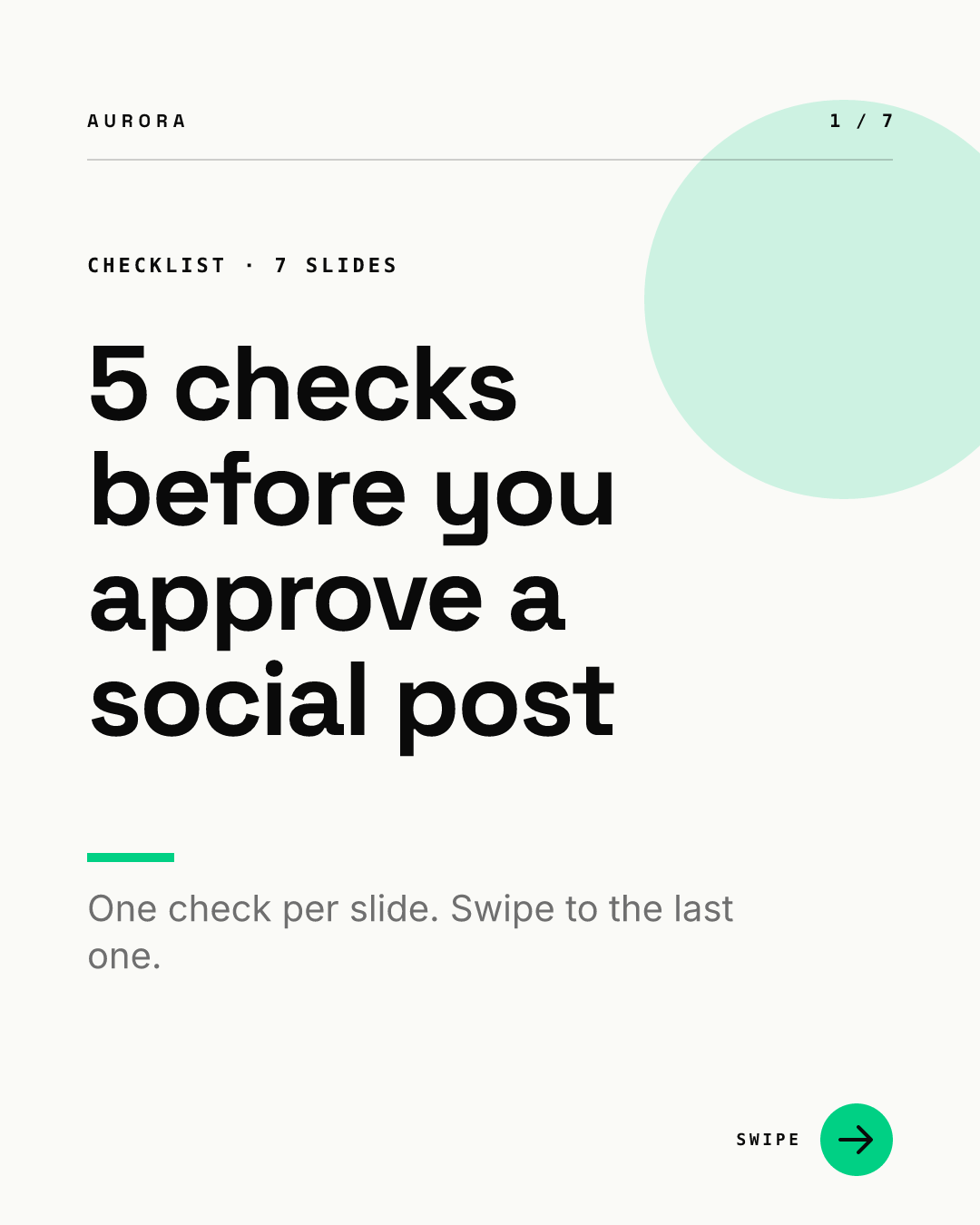
Slide 1, the cover, makes the promise and states the count. For phrasing ideas, see our 10 cover slide patterns.
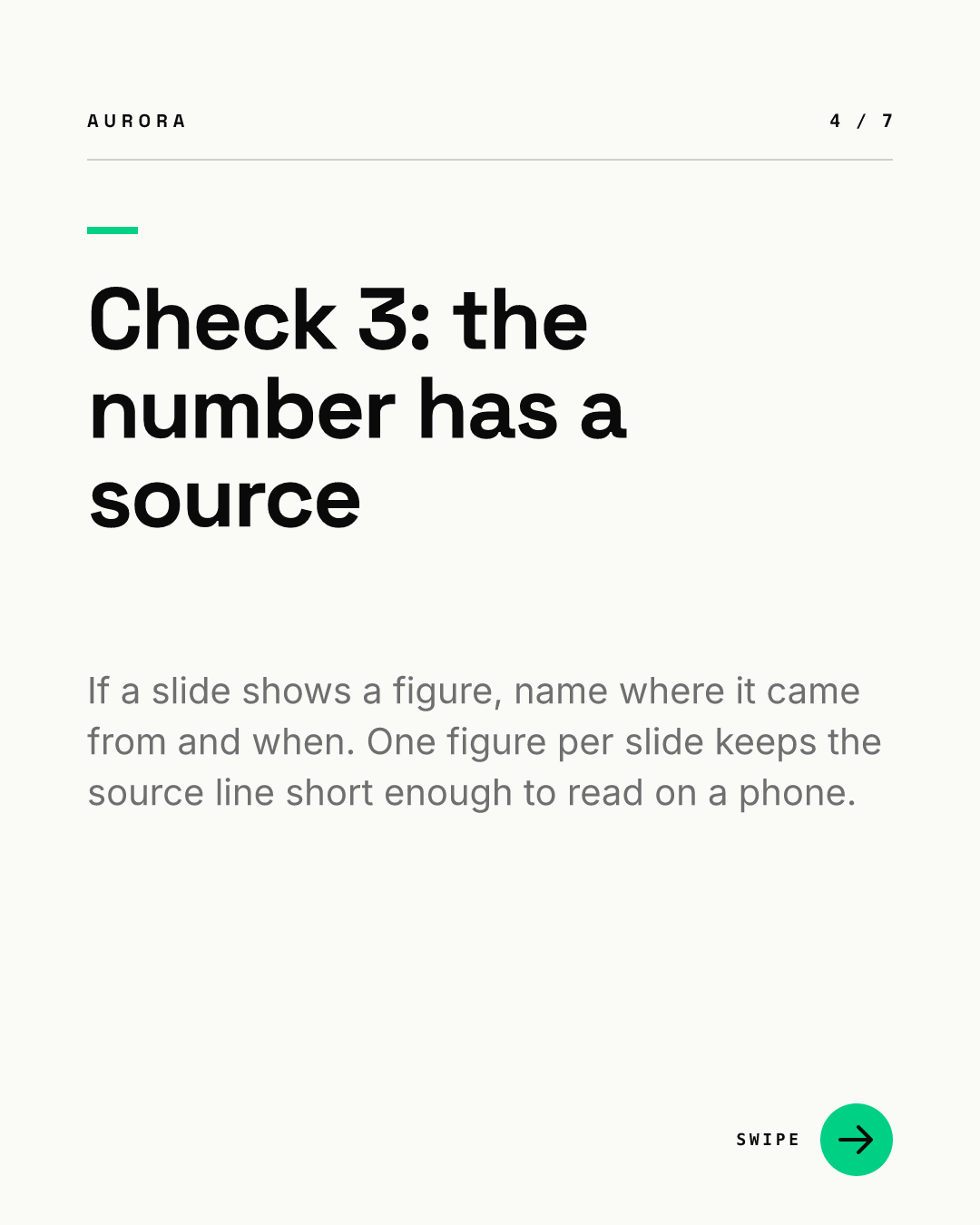
Slides 2 to 6 carry one check each. Notice the slide number and the check number differ by one, because the cover takes position 1. The counter in the corner shows the reader exactly how far they are, which matters more as a carousel gets longer.

Slide 7, the close, gives one next step and drops the swipe arrow, since there is nothing left to swipe to. Our recommendation is one action only: a comment keyword, a follow, or a link in the description, not all three.
How do you cut a carousel that is too long?
When the draft runs past 10 slides, we cut in this order:
- Merge the intro slides. A cover plus a "why this matters" slide plus an "in this carousel" slide is one cover with a good subline.
- Drop the recap slide. A slide that repeats every point is length without new information.
- Remove the weakest list items. Rank them, keep the top ones, and change the number on the cover.
- Split the topic. Part 1 and Part 2 posts a week apart are easier to read than one 16-page document.
- Move detail to the description. Sources, links and caveats belong in the post text, which you can edit after posting. The document itself cannot be changed.
Does a longer carousel get more reach?
LinkedIn publishes no data showing that more pages earn more reach, and we have not found an official statement that time spent swiping is a ranking signal. You will see that claim on many blogs; it is not something LinkedIn documents. What we can say is practical: a 6-slide carousel that people finish is a better result than a 15-slide one they abandon at slide 3, because the closing slide with your call to action only works if people reach it.
Length also has a production cost. Every extra slide is more copy to write, more layout to check and more chances for a typo you cannot fix after posting. A fixed set of slide templates (cover, text, stat, closing) keeps that cost down: in Chikaboom, a designer builds those layouts once and the team fills only the text, so a 6-slide and a 10-slide carousel look like the same brand. You can try the slide templates in our live demo.
How should you plan the slide count before writing?
Our recommendation is to decide the count before you write a word:
- Write the cover promise first. If it contains a number, that number plus two is your slide count.
- Write one sentence per content slide. If you cannot, the slide does not have an idea yet.
- Read only slides 1 to 4. If a reader who stopped there would learn nothing, reorder.
- Check the total against the table above, then build.
For where carousels fit among other post types, see the LinkedIn post design hub. When the slides are ready, upload the PDF carousel with one page size throughout, and see our older LinkedIn carousel guide for content formats that suit B2B teams.