Our recommendation: keep brand guidelines for a small team to one page covering the colors, fonts, logo rules, voice and layout choices people make every week. Everything else (motion rules, sub-brand systems, partnership lockups) can wait until you actually need it.
This is the pillar of our brand series. It gives you a one-page template at the end, and it links to the deeper posts on each part.
What do brand guidelines actually contain?
Look at what published guidelines cover. Spotify's brand site lists logo, color, typography, photography and illustration under visual identity, then design principles, copy principles, motion, sub brands and partnerships. Atlassian's design foundations cover color, typography, logos, spacing, grid, iconography, illustration and content guidance, plus design tokens that store those decisions by name. Mailchimp's content style guide runs from voice and tone through grammar, social media writing, accessibility and a word list.
Nielsen Norman Group describes style guides as visual standards such as colors, typography and logos, plus content guidance like tone of voice. Our assumption is that the companies above maintain these sites with dedicated people. You have two to ten, so our recommendation is the core, not the full site.
What should a small team include?
Our recommendation is six sections, ordered by how often people hit the question:
- Color: one primary, one or two accents, neutrals, and the exact values. Say which color is allowed behind text. See color contrast for social posts.
- Typography: one or two typefaces, which weight is for headlines, and a minimum text size. See typography for social media posts.
- Logo: which version goes where, and the one or two mistakes you see most (stretching, recoloring).
- Voice: three adjectives with a "we say / we do not say" example each. Mailchimp's guide makes a useful distinction: voice stays the same, tone shifts with context.
- Layout: where the headline sits, margins, how many words fit, and the safe areas for each platform.
- Ownership: who can change the rules and where the files live.
If you are unsure what to hand people alongside this, read what a brand kit actually is.
What can you skip for now?
Skip anything you cannot yet say a concrete rule about. Our recommendation for a team under ten:
- Brand story and mission essays. Keep one sentence of positioning at the top.
- Motion and sound rules until you publish video regularly.
- Sub-brand and partner lockups until a partner asks.
- Photography direction beyond two or three do and do-not examples.
- Long grammar sections. A 20-word list of terms people get wrong is enough.
What does the one-page template look like?
Copy this table into a doc and fill every cell. If a cell is empty, you have a decision to make, which is the point.
| Section | Fill in | Example answer |
|---|---|---|
| Positioning | One sentence: who we help and how | "Scheduling for small agencies" |
| Primary color | Hex, and where it is allowed | "#5046E5 for buttons and blocks, never body text" |
| Accent and neutrals | 1 to 2 accents, 3 grays, hex values | "Accent #10B981, grays #F9FAFB to #111827" |
| Text on color | Approved text and background pairs | "White on primary only" |
| Typefaces | Name, weights, role | "Inter 700 headlines, 400 body" |
| Minimum text size | One number per format | "No text under 28 px on a 1080 px post" |
| Logo | Versions, minimum size, clear space | "Full logo on light, mark only under 64 px" |
| Logo mistakes | Top two | "No stretching, no recoloring" |
| Voice | 3 adjectives, each with a do and a do not | "Plain: 'one click', not 'seamless solution'" |
| Headline length | Max words | "Under 10 words" |
| Layout | Margins, headline position, CTA position | "Headline top left, CTA bottom, 64 px margin" |
| Punctuation habits | The 3 to 5 you enforce | "No exclamation marks, no all caps headlines" |
| Owner and files | Who approves changes, where assets live | "Maya, shared drive /brand" |
The example values are illustrative, not rules for your brand. Replace each one.
What does drift look like in practice?
Here is the same announcement twice. Both renders use one template from our engine with our AURORA demo brand; only the text differs. The first follows rules like the template above (short eyebrow, a headline under 10 words, one clear CTA). The second is what a well-meaning teammate writes when nothing limits them.
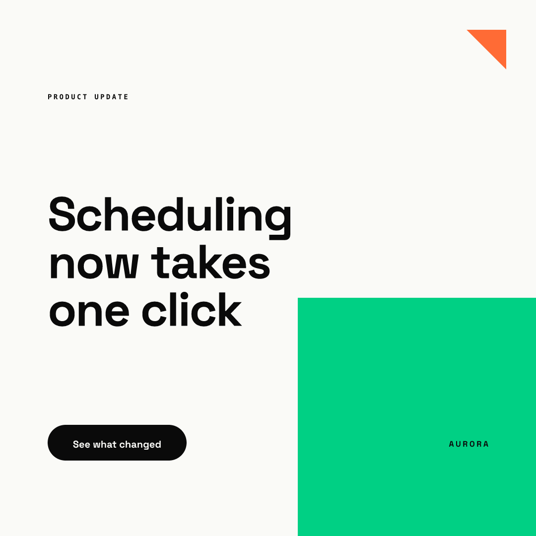
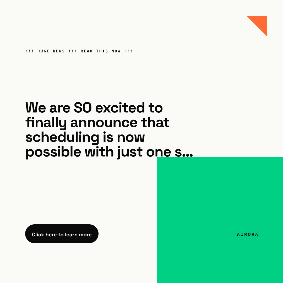
Notice that colors and fonts stayed identical in both, because the template locks them. What drifted is the part a template cannot judge: voice, length and punctuation. That is why we split rules into two kinds.
Which rules belong in a document and which in a template?
Our recommendation: write down only what needs human judgment, and lock everything else. Colors, fonts, sizes and spacing are a poor fit for prose, because every teammate has to remember them under deadline. Voice, claims and image choice are a good fit, because no tool can decide them.
Our working assumption is that this split is why PDFs go unread: they contain mostly lockable rules. We explain the failure pattern in why your team keeps going off-brand, and how a template-based approach differs from a shared kit in Canva Brand Kit limitations. With Chikaboom, an owner builds the template once and members only fill text fields; you can try that in the live demo.
How do you roll the guidelines out?
- Write the one-page version (our estimate: about an hour). Use real examples from your last ten posts.
- Have everyone who posts read it once, then review three live posts together against it.
- Keep a "mistakes we saw" list. When an item appears twice, add a rule or lock it in a template.
- Review the page each quarter. Cut anything nobody used.
Where to go next
If you want the business argument before investing the hour, see the business case for brand consistency. For a sector example of rules applied under trust pressure, see social media design for fintech startups.
Go deeper on each part:
- The kit itself: what a brand kit actually is
- Color: color contrast for social posts
- Type: typography for social media posts
- Layout: layout principles for social media graphics
- Enforcement: why your team keeps going off-brand and Canva Brand Kit limitations
- Platform example: LinkedIn post design
Start with the table, send it to your team, and add detail only when a real mistake asks for it.