A LinkedIn newsletter cover image should be 1920 x 1080 px, the size LinkedIn recommends for the cover of each edition, and LinkedIn crops covers to 16:9. The newsletter also has a separate square logo, for which LinkedIn recommends 300 x 300 px.
This guide covers both images: the specs LinkedIn publishes, what it leaves unsaid, and three cover layouts rendered from our AURORA demo brand. Platform facts link to LinkedIn Help, checked on October 5, 2026. Anything labeled as our recommendation is our judgment, not a LinkedIn rule.
What size is a LinkedIn newsletter cover image?
LinkedIn publishes the same cover size on three Help pages, for personal newsletters, articles and Page newsletters. Here is everything it states, in one table.
| Image | LinkedIn's spec | Source |
|---|---|---|
| Edition cover, recommended size | 1920 x 1080 px | Newsletters best practices |
| Edition cover, aspect ratio | Cropped to 16:9 | Images and rich media in articles |
| Edition cover, file types | JPEG, JPG, PNG, WEBP | Images and rich media in articles |
| Edition cover, GIF | No longer allowed for covers | Images and rich media in articles |
| Page newsletter edition cover | 1920 x 1080 px | Publish as your LinkedIn Page |
| Newsletter logo | 300 x 300 px recommended | Newsletters best practices |
| Cover file size limit | Not stated on these pages | None found |
| Text safe zone | Not published | None found |
Two gaps are worth knowing. We did not find a file size limit for article covers on these pages, and LinkedIn publishes no safe zone for text on a cover. Third-party guides quote other sizes, such as 1280 x 720; 1280 x 720 is the same 16:9 shape, so it will not be cropped, but LinkedIn's own pages name 1920 x 1080.
LinkedIn's article publishing page also lets you upload a video as the cover instead of an image. This guide covers still covers only.
What is the difference between the newsletter logo and the edition cover?
They are two separate images with two separate jobs.
- The logo belongs to the newsletter as a whole. You add it when you create the newsletter and can change it later in the newsletter settings, along with the title, description and publishing frequency, as LinkedIn's newsletter management page describes. It is square and small.
- The edition cover belongs to one issue. You upload it above the title each time you write an edition. It is wide, 16:9, and changes with every issue.
Our recommendation: treat the logo like a masthead that never changes, and the cover like a magazine front that changes every issue but keeps the same layout.
How does LinkedIn crop the cover?
LinkedIn says covers are cropped to 16:9. It does not say where the crop is anchored, so if you upload a square or portrait image, you cannot be sure which part survives. The simple fix is to upload at exactly 16:9, ideally 1920 x 1080 px, so there is nothing to crop.
LinkedIn also does not publish how small the cover appears in feeds, notifications or link previews. Because of that, our recommendation is to keep any text at least 10 percent of the width away from every edge and large enough to read when the whole image is shrunk to a phone-width thumbnail. If the cover only works at full size, it does not work.
Should you put text on a newsletter cover?
LinkedIn's guidance on cover content is about imagery, not text: its newsletter best practices suggest avoiding clipart and generic stock images, and say images with faces and people tend to resonate with audiences.
On text, these are our recommendations:
- Keep it short. The edition title appears as real text with the article, so the cover does not need to repeat it in full. A short topic line, or the series name and issue number, is enough.
- Make it a series signal. A fixed label such as "THE BRAND DESK · ISSUE 12" in the same place every time tells subscribers which newsletter this is before they read a word.
- One idea. A cover with a headline, a subtitle, a date, a logo and a call to action is five things competing at thumbnail size.
- Check contrast. Text on a photo needs a solid band or a plain area behind it. Our color contrast guide covers the ratios.
Which cover layouts work for a newsletter?
Here are three layouts at 1920 x 1080 px, all rendered from the same AURORA demo brand. Each one keeps the issue label and the headline in a fixed place, which is what makes a series recognizable.
Editorial serif
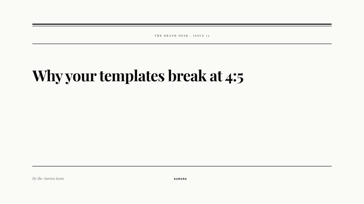
Best for essays and opinion pieces. The serif headline and thin rules read like a print column. The wide empty middle gives the crop and the preview room to breathe.
Label strip
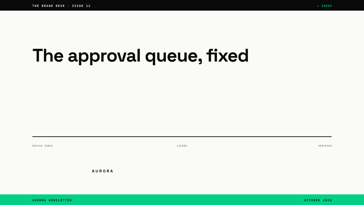
Best for news and updates. The top and bottom strips carry the series name and date, so the headline can change freely while the frame stays the same.
Swiss minimal
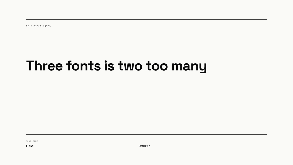
Best for practical how-to issues. The read-time label sets expectations, and the plain layout keeps attention on the headline.
How do you design the newsletter logo?
The logo is small, so it needs fewer elements than the cover. Our recommendation: the newsletter name in one or two words, or a monogram, on a plain or simple background, exported at 600 x 600 px or larger so it stays sharp when LinkedIn scales it to its recommended 300 x 300 px.
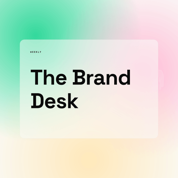
This render is 600 x 600 px. At 300 px, the two words still read, but the tiny "WEEKLY" label would not, so in a real logo we would drop it. Anything that matters in a logo should survive at half size.
LinkedIn also asks you to avoid emojis in newsletter titles. We apply the same restraint to the logo: no emoji, no decorative icons that blur at small sizes.
How do you keep every edition consistent?
The cover that changes every week is where brands drift: a new font here, a different crop there, a logo that moves. The fix is a cover template with fixed positions for the series label, issue number and headline, so the person publishing only types the new words. In Chikaboom, a designer builds that template once and the team fills the text fields, and text shrinks to fit its box instead of spilling past the margins. You can try a template like this in the live demo.
The newsletter often sits next to your company Page in readers' minds, so it helps to borrow the same type and colors. Our guide to LinkedIn company page branding covers the Page side, and our LinkedIn post design hub covers feed posts. If you turn an edition into a slide deck for the feed, see how to upload a PDF carousel.
What should you check before you publish an edition?
- Cover at 1920 x 1080 px, JPEG, PNG or WEBP, not a GIF.
- Text at least 10 percent from every edge and readable as a small thumbnail.
- Series label and issue number in the same place as last time.
- Headline short; the full title lives in the title field.
- No clipart or generic stock; a real photo, a face or a clean typographic layout instead.
- Newsletter logo square, simple, and still legible at 300 x 300 px.