A hiring graphic that works makes the role title the biggest thing on the image, adds the location, work model and pay range, and says exactly where to apply. Use one role per image, and let the job post and the caption carry the details.
LinkedIn facts below come from LinkedIn's Help Center, checked on October 5, 2026, and legal points link to the agencies that publish them. Design rules are our recommendations. For LinkedIn layouts in general, see our LinkedIn post design guide.
What should a we're hiring graphic include?
Most hiring graphics fail the same way: "We're hiring!" in huge type, the role in small print, and no hint of where the job is or what it pays. A candidate scrolling past needs to decide in about a second whether the role is for them. Build the image around that decision.
| Element | Why it is there | Our recommendation |
|---|---|---|
| Role title | It is what candidates scan for | Largest text on the image, exact title from the job post |
| Hiring label | Tells people what kind of post it is | Small label, "We're hiring" plus the team |
| Location and work model | Rules people in or out fast | "Remote, US", "Hybrid, Austin" |
| Pay range | The most-asked question about any role | Minimum and maximum, if you can share it |
| Where to apply | Turns interest into action | "Apply on LinkedIn" or "Link in comments" |
| Logo | Ties the post to the company | Small, same corner every time |
What to leave out: perk lists, long requirement lists, stock photos of people high-fiving, and more than one role on one card. Several roles belong in a document carousel or a simple list in the caption.
What size should a hiring graphic be?
For a company Page post, LinkedIn recommends 1200 x 627 px at 1.91:1, and says mobile images are not cropped: other ratios show in full with light white padding. LinkedIn publishes no separate size for personal posts. Most hiring posts get their reach from employees and hiring managers sharing them, so our recommendation is a 1080 x 1080 square or a 1080 x 1350 portrait, which take up more of a phone screen. Our LinkedIn image sizes guide lists every other format.
Which hiring layouts should you template?
These three renders come from our AURORA demo brand. Roles and pay ranges are invented for the example.
The bold announcement

Good for a role you want to stand out in the feed. The role title is the headline and the call to action is a button shape people already recognize. What it lacks is location and pay, so the caption has to carry them.
The role card
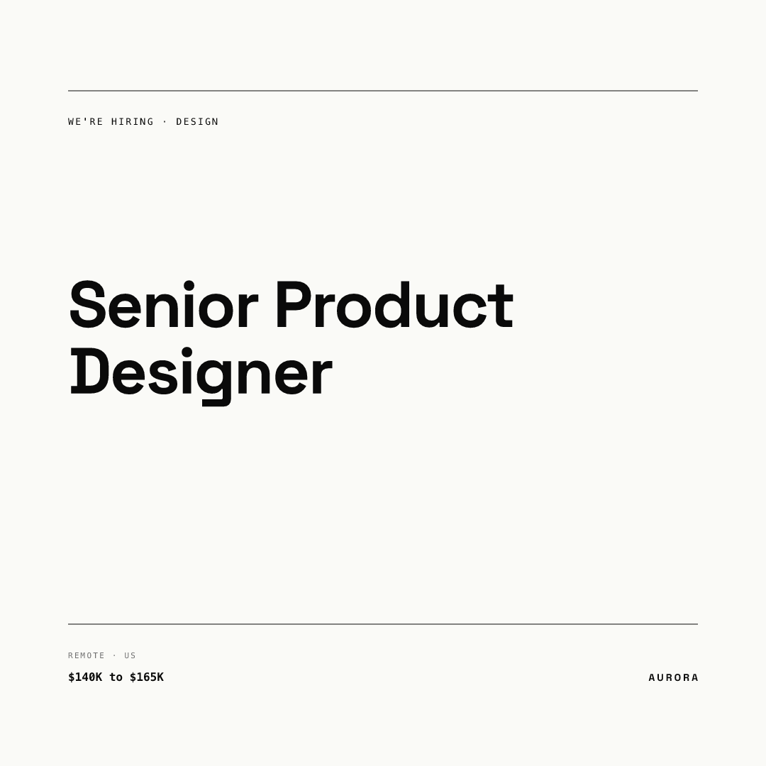
This is our default. Role, team, location and pay all fit on one calm card, and it works as a series: every role gets the same card, so your hiring posts look like a set instead of a pile.
The portrait role card
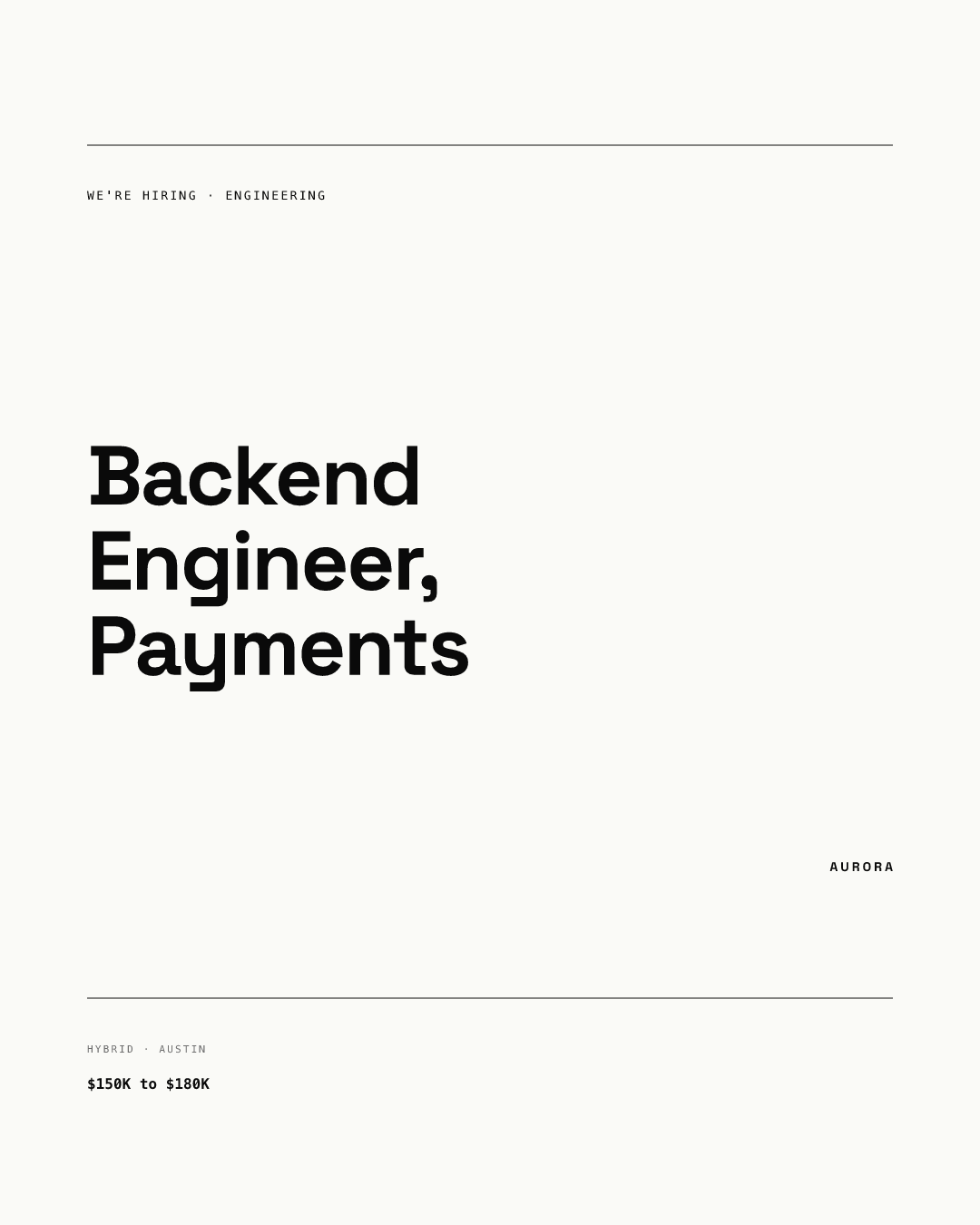
The same template at 1080 x 1350 px for personal posts. A longer title wraps to three lines and the details still sit in the same place, which is what you want when ten hiring managers fill the same template.
How do LinkedIn's #Hiring features fit with your graphic?
LinkedIn has its own hiring tools, and your graphic should point to them rather than compete. When you create or share a job from your profile, LinkedIn adds the #Hiring frame to your photo, features you in the job's Meet the hiring team section, and notifies relevant first and second-degree connections. You can add up to 10 job posts you did not create to your profile. The frame comes off when you delete the job post from your profile.
Our recommendation: share the job through #Hiring so the application link and the frame do their work, then post your graphic as a separate image post that sends people to it. Keep the role title identical in both places so candidates know they found the right job.
What words should a hiring graphic avoid?
Short copy makes careless phrases more visible, not less. In the US, the EEOC says it is illegal for a job ad to show a preference for, or discourage, applicants because of race, color, religion, sex (including transgender status, sexual orientation and pregnancy), national origin, age (40 or older), disability or genetic information. Its own example: asking for "recent college graduates" may discourage older workers.
On a graphic, that rules out phrases such as "young, hungry team" or "digital natives". It also applies to images: if you use team photos, show the team you actually have, with their consent. This is general information, not legal advice.
Should you put the salary on the image?
If you can, yes. It answers the first question candidates have. In some places it is also the law for job ads. New York City, for example, requires employers covered by its Human Rights Law to state a good faith minimum and maximum salary in every advertisement for a job performed in the city. Its definition of an advertisement includes internet postings, though it does not name social media. Whether a social graphic counts is a question for your counsel, so the safe habit is to show the same range as the job post.
Write the range with "to" ("$140K to $165K") rather than a dash, and never an open end such as "$120K+". NYC's guidance says an open-ended range does not meet its rule.
How do you keep hiring graphics readable for everyone?
A hiring card is an image of text. W3C guidance says its alt text should contain the same words the image shows, so write out the role, location, pay range and where to apply. For contrast, WCAG asks for at least 4.5:1 for normal text and 3:1 for large text. Small labels like location and pay are where most designs fall short.
How do you keep every hiring post on-brand?
Template it once and let hiring managers fill it in. In Chikaboom, a designer builds the role card once, a hiring manager types the role, location and pay into text fields, and long titles shrink to fit their box instead of breaking the layout. Try it in the live demo. When employees reshare the role from their own accounts, our guide to employee advocacy graphics shows how to keep those posts consistent too, and our company Page branding guide covers the Page they land on.
Checklist before you post a hiring graphic
- One role per image; the title matches the job post exactly.
- Location and work model on the image.
- Pay range as a minimum and maximum, matching the job post.
- One clear next step: where to apply.
- No wording or imagery that signals a preferred age, sex or other protected group.
- Alt text repeats the role, location, pay and next step.
- Small labels pass 4.5:1 contrast.
- The job is shared through #Hiring, and the graphic points to it.